
First, we want to emphasize the speculative nature of our forecasts and these markets, in particular, with their very high level of volatility. We definitely could be wrong. Also, implementation is another risk factor. We believe the markets will continue to be very risky with huge price moves up and down for a time – making it very difficult to not lose money, unfortunately. We believe emotionally charged markets like these increase the difficulties of being successful. As always, past success, of ours or anyone else’s, does not guarantee future results. Please read all the disclaimers all over our website. Be careful and be safe.
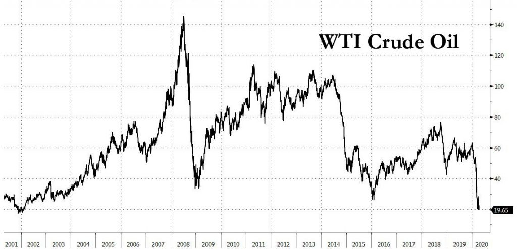
Second, please look at the long term oil price graph above. Note its all-time top way back in 2008. Also note, how it resumed its downturn from 2011 to 2014 and again in 2018. People generally are not aware that the big cycles peaked way back in 2008; even back as far as 1999 if prices are adjusted for inflation.
Introduction – This blog (in reverse chronological order below) will document and discuss our forecast for the Resumption of the unfortunately very very large economic contraction. This time we will include all the previous elements of the older blogs (- Deflation Watch – Elements of Market Tops– Major Trend Changes ) (where we forecasted the 2006-2007 major top and the Financial Crash bottom in 2009) into this single blog: “The Contraction Resumes” for the next super top.
As from the 2000 top (see our Annual Forecasts) and the 2006-2007 top, we believe “The Contraction” will be evident in all sorts of areas. Of course, it will be reflected in declining prices of assets (like commodities, equities and real estate) and in increasing yields, especially of lower quality bonds. We believe it will also be evidenced in increasing levels of discord in all sorts of areas – we are using such examples as a confirmation of the resumption of the contraction. Unfortunately, we’ve begun to see a lot of signs of discontentment, not only abroad but now in the United States.
Please note that, as we’ve discussed before, tops are usually rounded with various indices and media discussions occurring spread out over a longer time period than bottoms where they all spike down to the low together. For example, the Commodities (CRB index) peaked April 2008 with a lower (20% lower) secondary peak in April 2011 – these tops have not been eclipsed, while certainly many other indicies have had new rebound highs since then. Also note, the size of a rebound generally indicates the period of time required for all the various areas to top; thus, a very large top takes a long time to put itself in place. For example, the 2000 equity top actually saw some indices topping back as far as 1998 and as late as late 2000; the 2006/2007 equity top was actually spread out over four years. With that said, this downturn will almost certainly be just as large and we think even larger, unfortunately.
Taxable Junk bonds (as measured by Bloomberg Barclays High Yield Bond ETF (“JNK”)) also have a highest ever peak (December 2007) before the Financial Crash that has not been eclipsed. Its rebound peak since the 2009 Financial Crash bottom is July 2014. Since then it put in a spike low in February 2016. From there it rebounded to a lower high August 2017 and has been heading down from there ahead of the pack in the current down cycle. To be fair, a large portion of the taxable junk bond market is related to oil, which trended along behind the CRB index, as detailed above. Oil had its highest peak in June 2008 at $161, with its crash bottom January 2009 at $50, and a lower rebound high at $127 April 2011; then crashing down to $36 January 2016 before putting in a lower high of $74 June 2018 and heading down, also ahead of the pack, from there.
Similarly, the KBW Bank Index (“BKX”), representing national money center banks and leading regional institutions, had its highest ever peak in May 2007 (before the Financial Crash) that has not been eclipsed, barely. After dropping by over 84% to a low in February 2009 at the Financial Crash bottom, it rebounded to a double top – both times just barely below its 2007 all time top – on 1-21-2018 and 3-4-2018 with a dip in between. From there it dropped 29% down to a low on 12-16-2018 before rebounding to a lower high on 1-20-2019. Note, this index, in many ways has led the trend of the rest of the equity markets since 2007.
Another example for this cycle’s top is the high grade bond market (remember interest rates up = prices down so the top is when interest rates start rising). The tops of the various maturities are spread out over several years (from 2012 to 2016) – see the next few paragraphs.
Yields on the Freddie Mac 30 year Mortgage bonds bottomed late 2012 (its bond market top). (Its yield shot up pretty high in 2013 but it fell again to a higher low in 2016, which is why it didn’t hurt the real estate market that much; however, from 2016 it stair-stepped upwards, passing its 2013 yield top in mid 2018, to a new high in yields, which did start to take a toll on real estate.)
The One Month T-Bill yield bottomed at essentially zero in 2014 and started to rise in late 2015 (its market top). The Three Month T-Bill similarly saw its yield bottom in late 2015 (its market top), as also did the One Year T-Note.
The Five Year T-Note yield bottomed in mid 2016 (its bond market top). Similarly with the U.S. Ten Year T-Note and the U.S. Thirty Year T-Bond (Long Bond) and the Bond Buyer Municipal Bond Index – it also had its price top in mid 2016.
((***Note that these U.S. Treasury yield bottoms were taken out in early 2020 during a flight to quality from the general market crash.***))
Please note: most people will have no idea that this huge cycle started topping so early – 2008 for commodities & oil and taxable junk bonds (and lower rebound peaks of 2011, 2011, and 2014, respectively) and 2012 for high grade bonds, because more popularly followed stocks and real estate topped years later. Also, note, if adjusted for inflation peaks began in 1998 and 1999 depending upon the category.
__________________________________________________
The Reverse Chronological Commentary Starts, Here Below:
5-14-2021
From our most recent call for The Top of The Mania on 5-10-2021 after several private cyber currencies puked around 40%, big capitalizatin stocks (S&P 500, Dow Jones Industrials, etc.) dropped about 4% last week, before percentage rebound retracements that are typical in a BEAR MARKET. We continue to note (as detailed below) that several equity and equity-like indices including junk taxable bonds and the small cap stocks peaked a month or two ago. Even the NASDAQ peaked back a bit ago on 4-26-21 before the large cryptocurrency drop. We also note that the cryptocurrencies that dropped also experienced fairly large percentage rebound retracements typical of a BEAR MARKET. Still we want to see some more lower lows before we say “the top is definitely in.”
5-14-2021
Below is our recent performance. We have continued to lag in the current one year period because we are holding fairly high levels of cash as it has been very difficult for us to purchase bonds of the downside protection and current yield we are seeking at this point in various investment cycles (that we detail in these pages). We expect that we will outperform going forward. While we believe we have done exeptionally well for the risk taken over the recent shorter year periods, in addition to that, our five year and longer performance far outperforms on an “absolute basis” and even more on a “risk-adjusted basis.”
Stamper Capital & Investments, Inc.
Separately Managed Accounts (National Tax-Free) vs. Tax-Free Municipal Bond Indices
Annual Total Returns, Period Ended 4-30-2021
| PERIOD | Morningstar Muni Short Category | SCI Separately Managed Tax-Fee Municipal Accounts Composite Net of Fees | SCI Separately Managed Accounts Net Pre-Tax Equivalent* | Bloomberg Barclay’s 3 Year Tax-Free Muni Bond Index |
|---|---|---|---|---|
| 1 Year | 3.69% | 1.74% | 2.68% | 3.60% |
| 3 Years | 2.44% | 2.33% | 3.58% | 2.99% |
| 5 Years | 1.60% | 2.16% | 3.32% | 1.87% |
| 10 Years | 1.62% | 1.99% | 3.07% | 1.81% |
| 15 Years | 2.11% | 2.55% | 3.93% | 2.68% |
| Since Inception (1/1/1995) | N/A | 3.81% | 5.86% | N/A |
Note: Indices do not have fees (trading costs, custody fees, management fees, etc.) deducted from their returns. We now have a much more reasonable index to compare to – the Bloomberg Barclay’s 3 Year Tax-Free Municipal Index. We still aim for similar or better returns with less risk – The key with this table is that our longer term pre-tax municipal bond returns are noticeably higher than the bond market index but with What We Think is less risk – we will see when rates start to rise and/or credit quality yield spreads widen.
Please see the Disclaimer and Footnotes at the bottom of the page for more information.
* at 35% Federal tax rate
5-10-2021 “Top of the Mania To You!?!”
Dogecoin USD – Peaked Saturday 5-8-2021, after hours at $0.7387 and collapsed to $0.4245 on early Sunday morning (5-9-2021) before rebounding to $0.5783 a day later on Monday, 5-10-2021. So it fell 42.5% over two days, then rebounded by 36.2%.
Ethereum (Grayscale Ethereum Classic Trust) – Peaked late Thursday 5-6-201 at $95 then plummented to $53.55 on 5-7-2021, Friday Morning. Then rebounded to $64.20 mid-day Monday 5-10-2021 but closed down at $47.55. So this one fell 43.6% over one day and then rebounded 20% the next trading day before its next drop which made the total “Drop from The Top” – down 50%! Wow – that is some action for a “currency!”
Was that the top of this Mania? Very well could be. But, even with those huge drops we do not yet have a lower low. Still, it could be the parabolic rises have been broken. Of course, we will see. Short or Long or on the sidelines, be careful out there! We believe the volatility we are seeing in these private cryptocurrencies could quickly spread over to other markets given the all the information we have documented over the years.
5-9-2021
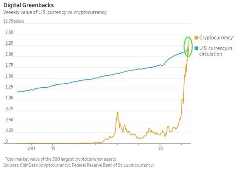
We have read that “Cryptocurrencies crossed a key threshold in the last week, surpassing the value of all physical US dollars in circulation…“ And, here is the graph:
4-25-2021
Market Mania – S&P 500 and Dow Jones Industrial Averages put in slight new highs; however, other indices peaked back in Mid March 2021, including the small caps, Russell 2000, S&P 600 Small Cap Index, etc. Other indices that typically peak before the major stock market indices including junk bonds (“JNK”) and high yield municipal bonds (“HYD”) peaked in Mid February 2021. In addition, Bitcoin fell 15%, a week ago last Sunday (4-18-2021); todady (4-25-2021) it (BTCUSD) is at $47,934, down 24% from its $63,381 all time top on 3-15-2021. Also, Dogecoin (another private block chain “currency” – hmmm, there is no limit to the supply of these private “currencies” as there are no barriers to entry, currently) which had risen 18,000% from around a year ago (not that difficult to get such huge percentage when you start at essentially zero) has dropped about 40% since 4-19-2021 – in over just six days! (Note: we are not an expert on these coin securities as they are brand new and may or may not be reported correctly nor correlate with the underling “currency”- but we think what we have reported is accurate.)
Given the incredible action in the Block Chain based currencies including their huge percentage-increase parabolic rises that we documented above and have documented previously, we believe we – not just the U.S., but most of the world World, is in a HUGE MANIA even bigger than 1630’s Tulip Mania when a single Tulip bulb sold for more than a house before dramatically collapsing in prices in February 1637. – At least you can plant a tulip bulb. Confirmation of the Mania is that it seems to exist in other areas of society besides private “currencies” – We seem to be in very crazy times.
Given the recent, large drops in prices of Bitcoin and Dogecoin (detailed above), it appears to us that their large, near vertical parabolic rises have just been broken. If this is correct, expect the fall in their prices to continue all the way down to “true value” (remember, there are no barriers to entry with private block chain currencies (government currencies are a different matter)). The size of this market of private (non-government) block chain “currencies” or “E-coins” is now huge, in part because there are so many but, mostly, because their prices have gone up so much (“on the margin” – remember, when there is a trade at a price, all of that coins of that issue (Bitcoin, Doge or whatever) are valued at that same price).
We just found a webside: https://coinmarketcap.com/all/views/all/ that lists over 400 “E-coins,” their market capitalizations, etc. We do not know if their data is reliable. They give the market cap of Bitcoin at $893,435,303,805 – wow – that is huge! That is the largest one – but, there are at least 400 more smaller ones listed. Thus, there is plenty of “money” (or however you want to categorize it – say “wealth” or, probably more accurately, “perceived wealth”) to evaporate (even faster than it was created) and, then, to implode other markets in a huge ripple, unfortunately.
We believe this Mania has spilled over into other markets. It is kind of the euphoria that we’ve seen at other markets tops (the 2000 Tech Top, the 2006-2007 Housing Bubble Top, etc.) but on steroids. Valuation separates from reality, enhanced by a “suspension of disbelief” by enough market participants (enthusiasts) to dramatically overcome the skeptics, for a while – sometimes a long while. It is typically reflected the most in one market – usually the one with the shortest track record & the least understanding – like private block chain currencies! (or tulip bulbs, or electric companies when they were brand new). When it cracks, likely all other markets that were overvalued (in a mania or in bubbles) will follow along with it, down to notable bottoms. Unfortunately, that scenario fits with most of all the information and opinion we have published in these pages.
4-11-2021
Interest rates of shorter municipal bonds dropped (prices rose) and a poor performing month dropped off the current twelve month performance, resulting in a large total return for the category for the current twelve months ending 3-31-2021. Our performance lagged the current twelve months as we held substantial amounts of cash as we were unable to buy the defensive bonds we were seeking and we had outperformed during the month that dropped off. However, as you can see in the chart we continue to outperform for all longer periods, especially when adjusted for risk.
Stamper Capital & Investments, Inc.
Separately Managed Accounts (National Tax-Free) vs. Tax-Free Municipal Bond Indices
Annual Total Returns, Period Ended 3-31-2021
| PERIOD | Morningstar Muni Short Category | SCI Separately Managed Tax-Fee Municipal Accounts Composite Net of Fees | SCI Separately Managed Accounts Net Pre-Tax Equivalent* | Bloomberg Barclay’s 3 Year Tax-Free Muni Bond Index |
|---|---|---|---|---|
| 1 Year | 3.06% | 1.81% | 2.78% | 3.50% |
| 3 Years | 2.26% | 2.36% | 3.63% | 2.81% |
| 5 Years | 1.56% | 2.16% | 3.32% | 1.88% |
| 10 Years | 1.61% | 2.00% | 3.08% | 1.84% |
| 15 Years | 2.07% | 2.56% | 3.94% | 2.67% |
| Since Inception (1/1/1995) | N/A | 3.82% | 5.87% | N/A |
Note: Indices do not have fees (trading costs, custody fees, management fees, etc.) deducted from their returns. We now have a much more reasonable index to compare to – the Bloomberg Barclay’s 3 Year Tax-Free Municipal Index. We still aim for similar or better returns with less risk – The key with this table is that our longer term pre-tax municipal bond returns are noticeably higher than the bond market index but with What We Think is less risk – we will see when rates start to rise and/or credit quality yield spreads widen.
Please see the Disclaimer and Footnotes at the bottom of the page for more information.
* at 35% Federal tax rate
3-10-2021
Interest rates increased the speed of their rise last month as we discussed in our 2-26-2021 Commentary, below. Accordingly, our performance increased its lead over the Morningstar Short Muncipal Bond Fund category Average over most periods as shown in the table below. Note our increase was principally due to having less interest rate risk.
Stamper Capital & Investments, Inc.
Separately Managed Accounts (National Tax-Free) vs. Tax-Free Municipal Bond Indices
Annual Total Returns, Period Ended 2-28-2021
| PERIOD | Morningstar Muni Short Category | SCI Separately Managed Tax-Fee Municipal Accounts Composite Net of Fees | SCI Separately Managed Accounts Net Pre-Tax Equivalent* | Bloomberg Barclay’s 3 Year Tax-Free Muni Bond Index |
|---|---|---|---|---|
| 1 Year | 1.16% | 1.99% | 3.07% | 1.80% |
| 3 Years | 2.18% | 2.41% | 3.71% | 2.69% |
| 5 Years | 1.51% | 2.17% | 3.34% | 1.77% |
| 10 Years | 1.61% | 2.03% | 3.12% | 1.85% |
| 15 Years | 2.05% | 2.61% | 4.02% | 2.64% |
| Since Inception (1/1/1995) | N/A | 3.83% | 5.89% | N/A |
Note: Indices do not have fees (trading costs, custody fees, management fees, etc.) deducted from their returns. We now have a much more reasonable index to compare to – the Bloomberg Barclay’s 3 Year Tax-Free Municipal Index. We still aim for similar or better returns with less risk – The key with this table is that our longer term pre-tax municipal bond returns are noticeably higher than the bond market index but with What We Think is less risk – we will see when rates start to rise and/or credit quality yield spreads widen.
Please see the Disclaimer and Footnotes at the bottom of the page for more information.
* at 35% Federal tax rate
2-26-2021
Interest rates rose since our last report, as we expected. The yield on the U.S. Thirty Year rose notably from 1.91% on 2-10-21 by 39 basis points up to a 2.30% on 2-25-201 – that is a 20% rise in yields! The Ten Year all the way down to the Three Year rose similarly. And, the markets finally took note, probably, in addition to the size of the move, because prices (prices down when yields go up) dropped to sitting on “critical support” according to the technical types; thus, most of them are very nervous now, which, makes it likely we will get a bit of a rebound in prices (down in yield) before the main trend (up in yields) resumes.
That sharp rise in yields is attributed to causing the Dow Jones Industrial to drop about 1,000 points – given the huge level it dropped from, the amount of the drop, and the form of the drop (among other factors), we can make the case that the top is “in;” however, given how irrational the markets are – at such high levels when the economy had dropped so much, “don’t bet the ranch.” Still, given the continuing trend in interest rates in such a highly leveraged enviornment, we think it is highly probable that the top is here (somewhere, if not just passed).
Bitcoin also rose to put in a “Notable High” (see our 2021 Annual Forecast) of around $59,000 on 2-21-2020 before dropping down to around $45,000 on 2-26-2021 – a drop of almost 24% in just a few days! (how is that volatility for a “currency”!?). This drop also attributed to the recent rise in interest rates (which will probably be just a blip, although the start of the ramp up in yields (down in prices), in the long term scheme of things).
Inflation and gold. Many are expecting a large to huge inflation and even runaway inflation because of their speculations about increases in the money supply and also increased fiscal stimulus. However, price action in gold (and sliver) we have been forecasting is giving a different signal. Also attributed to the recent rise in interest rates, the price of gold continued its decline (that started on 8-6-2020 at $2,069) from $1,842 on 2-20-2021 down $114 to $1,728 on 2-26-2021 – that recent continuation is a drop of over 6%. So there is a difference of opinion on future inflation between the gold market and what many pundits are saying. We expect debt to default quicker than money is printed and bailouts are passed. This situation would be similar to that of the Financial Crash (2006 down into 2009) but likley larger from higher levels – both prices and debt levels, unfortunately.
2-12-2021
Here is our current performance. Please note we have been postured very conservatively with respect to rising interest rates and declining credit quality.
Stamper Capital & Investments, Inc.
Separately Managed Accounts (National Tax-Free) vs. Tax-Free Municipal Bond Indices
Annual Total Returns, Period Ended 1-31-2021
| PERIOD | Morningstar Muni Short Category | SCI Separately Managed Tax-Fee Municipal Accounts Composite Net of Fees | SCI Separately Managed Accounts Net Pre-Tax Equivalent* | Bloomberg Barclay’s 3 Year Tax-Free Muni Bond Index |
|---|---|---|---|---|
| 1 Year | 1.99% | 2.06% | 3.17% | 2.54% |
| 3 Years | 2.32% | 2.41% | 3.70% | 2.83% |
| 5 Years | 1.64% | 2.16% | 3.33% | 1.92% |
| 10 Years | 1.71% | 2.04% | 3.13% | 1.92% |
| 15 Years | 2.10% | 2.64% | 4.07% | 2.67% |
| Since Inception (1/1/1995) | N/A | 3.83% | 5.89% | N/A |
Note: Indices do not have fees (trading costs, custody fees, management fees, etc.) deducted from their returns. We now have a much more reasonable index to compare to – the Bloomberg Barclay’s 3 Year Tax-Free Municipal Index. We still aim for similar or better returns with less risk – The key with this table is that our longer term pre-tax municipal bond returns are noticeably higher than the bond market index but with What We Think is less risk – we will see when rates start to rise and/or credit quality yield spreads widen.
Please see the Disclaimer and Footnotes at the bottom of the page for more information.
* at 35% Federal tax rate
2-12-2021
Markets have continued in their choppy ever so slightly rising upward slants at incredibly high valuation levels, even in the face of the incredibly increased RISKS of these times in addition to all the stuff we have documented over the last few years. They have even rebounded enough to erase the huge drop into March 2020 related to the Corona Virus, etc. Even with record levels of debt climbing ever higher in almost all issuing categories. Mortgage payments and rent payments being further furloughed making the current debts ultimately even higher & higher, for example. The lack of rationality in the markets is appalling but, you can sell at those prices — there are buyers.
I can (and have in these pages) document all kinds of fundamentals that show vast over-valuation in essentially all investment categories. However, in markets this irrational that knowledge does not help much, at least not in the short term (or, in the case of the last several years, the intermediate term). We think we are in one Overall Super Bubble. Given regular “Fundamental Analysis” and even our Upside Potential/Downside Protection(/Current Yield) analysis and investment style doesn’t really help a lot right here, other than to be very conservatively postured – as we say at times, “Give up some upside potential to pick up a more than proportionate amount of downside protection” & we usually continue “& current yield” but right now the yields are so low. However, we have other methods of looking at these markets.
Interest Rates – Interest rates have continued to chop up to new rebound highs. The U.S. 30 Year yield which had an All-Time yield bottom on 3-9-2020 at 1.02% moved up to 1.88% on 1-11-2021. Even though still an absolute low interest rate (1.88%), that rise is almost 90%! The U.S. 10 Year is in a similar configuration. It put in its All-Time low yield on 8-4-20 at 0.508%. It chopped up to its rebound yield high of 1.145% on 1-11-2021, a rise of 125%. Again, a considerable rise but still at an absolute low yield level. Still, these yield rises have dropped the corresponding bond prices notably. The recent yield rises almost look like breakouts, to the upside. If (and when) yields shoot up more, it will take a toll on pretty much all asset prices as in this Super Bubble, pretty much all assets are heavily leveraged, unfortunately.
Importantly, The Dow Jones Industrial Average put in a new, ever so slight, All-Time Market top on Thursday 1-14-2021. Other indices had either peaked earlier and/or did not quite put in new All-time Market tops but they are all close if not there. But, Importantly, the next day, on Friday, we see the possible beginning of “The Decline from the Tops.” Every Equity indice that we looked at has that appearance to us – that of starting significant potential declines (some starting before 1-14-2021). We believe these declines could be the start of something big, even huge. We also have a huge, steep parabolic rise in BitCoin (and other E-coins); however, it looks like that steep parabolic rise has been broken (either way, we think this is a casino market – not “investing,” and certainly not “currency” or “money” at least not at this juncture). Of course, we will see but that very well could be the end of this incredible move up in asset prices from the Financial Crash lows (2009 to 20012, depending upon the category).
1-17-2021
Although we have continued to do very well on a longer term basis, both in absolute terms (below) and on a risk-adjusted basis (since the risk we think we are taking is very low), we have lagged a bit on for the current one year absolute performance (see chart below) as we have been upwards of 40% in cash over the last several months because we have not been able to purchase the extra safe bonds we want at the prices we are bidding. However, for the longer periods you can see we easily beat the index and that is even with a much lower risk profile.
Over the past 31 years of professionally managing 4 mutual funds in three different bond fund categories and these private accounts since 1995, we have often had difficulties staying invested near market tops, especially, if we are trying to position in what turns out to be the best way. So, with our extra conservative posture right now, we would not be surprised to see a turn up in rates and an increase in concern for lower quality credits.
Stamper Capital & Investments, Inc.
Separately Managed Accounts (National Tax-Free) vs. Tax-Free Municipal Bond Indices
Annual Total Returns, Period Ended 12-31-2020
| PERIOD | Morningstar Muni Short Category | SCI Separately Managed Tax-Fee Municipal Accounts Composite Net of Fees | SCI Separately Managed Accounts Net Pre-Tax Equivalent* | Bloomberg Barclay’s 3 Year Tax-Free Muni Bond Index |
|---|---|---|---|---|
| 1 Year | 2.27% | 1.99% | 3.07% | 2.96% |
| 3 Years | 2.21% | 2.40% | 3.70% | 2.80% |
| 5 Years | 1.67% | 2.17% | 3.34% | 2.00% |
| 10 Years | 1.66% | 2.03% | 3.13% | 1.90% |
| 15 Years | 2.10% | 2.65% | 4.08% | 2.67% |
| Since Inception (1/1/1995) | N/A | 3.84% | 5.90% | N/A |
Note: Indices do not have fees (trading costs, custody fees, management fees, etc.) deducted from their returns. We now have a much more reasonable index to compare to – the Bloomberg Barclay’s 3 Year Tax-Free Municipal Index. We still aim for similar or better returns with less risk – The key with this table is that our longer term pre-tax municipal bond returns are noticeably higher than the bond market index but with What We Think is less risk – we will see when rates start to rise and/or credit quality yield spreads widen.
Please see the Disclaimer and Footnotes at the bottom of the page for more information.
* at 35% Federal tax rate
12-21-2020
The net for most asset prices from last month was a lot of choppy, slightly upwards price movements, some to ALL-TIME Highs but not by much, a few days ago.
Today was the Winter Solstice (shortest day of the year) and, also, quite possibly much more importantly, the tightest conjunction of Jupiter and Saturn in around 796 years but, this time, the first in modern history in Aquarius. Jupiter and Saturn moved into Aquarius staggered a few days ago.
Stocks put in a small top a few days ago. Obviously, all our concerns about lack of downside protection and huge amounts of downside potential are as strong as ever and even stronger given new All-Time Highs in some indices. We would not be surprised to see a noteable acceleration down in price in stocks and bonds (up in yields), especially lower quality and longer term bonds. Yup that is speculative; however, at these levels, our opinion is that peope are not “investing,” they are “speculating,” likely wildly. Of course, we will see.
11-15-2020
As we forecasted last month, we did experience quite a lot of fireworks in the markets just before and after the election. As some things still are not resolved, we are expecting more fireworks to come.
Just after the election, some stocks and indices broke upward very sharply but then turned around and, before the close, plummeted in notable partial retracements of their rises. At this time some of those sharp inter-day peaks have not been eclipsed; however, over the past few days some of the indices have run up yet again to new All-Time Highs! Numerous inter-market divergences continue to indicate a huge topping process in progress as we’ve talked about too many times. Thus, we are still waiting for some remaining Final All-time Highs & it could be a while; however, when it happens, at this point, we believe the turn down will be swift and notable. Given all the data we’ve gone over so many times before, we believe the upside is severely limited while the downside potential is huge, unfortunately.
Gold – As stocks were shooting up in their temporary ascent, gold dropped almost $100 per ounce – a huge move and, importantly, has not rebounded notably since that drop. This drop makes the trend of gold downward more likely. It also put a hole in most “Inflation Theories.” Silver has performed similarly.
Bonds – Interest rates of the most intermediate U.S. Government Treasuries have continued to drift upwards, putting in higher highs and lower lows of yields. In fact, they’ve gone up enough, in most cases, to be declared “breakouts,” although, slight. As we have reviewed numerous times, we expect that the All-Time lows in interest rates are in our past. We expect the rises in interest rates to begin to accelerate. If and when they do, those with high debt levels, which includes most everyone these days, from individuals to companies to municipalities, etc. will very likely be in trouble as their debt service loads increase while asset values fall, unfortunately.
Credit Quailty & Yield Spreads – The effects of the shutdowns of the economy are continuing with many unfortunte consquences likely to surface more strongly. There will likely be huge negative consequences for landlords, renters, mortgagees & mortgagors and tax payment recipients that will result in defaults, unfortunately. This situation should first result in credit quality yield spreads blowing out from their ridiculously tight levels to probably, eventually, record wide levels given how widespread these problems are, unfortnately. Then, the official defaults. However, in the Financial Crash (2007-2009) we often saw downgrades from Investment Grade directly to default with no intermediate downgrade steps by the rating agencies. So far, almost the entire market has held up so, at this time, we expect a shockingly swift turn of events, unfortunately.
11-15-2020
We are continuing to do well compared to the pack even with the very high levels of cash we have been carrying and the market not going down substantially (yet). We continue to have difficulty finding the bonds that we want at the prices we would like to purchase at. Still, look how well we have continued to perform! When or if the market trades off, whether just due to rising interest rates (or credit quality yield spreads blowing out, as we expect they will), we think we will definitely outperform as we usually do in more hostile environments.
Stamper Capital & Investments, Inc.
Separately Managed Accounts (National Tax-Free) vs. Tax-Free Municipal Bond Indices
Annual Total Returns, Period Ended 10-31-2020
| PERIOD | Morningstar Muni Short Category | SCI Separately Managed Tax-Fee Municipal Accounts Composite Net of Fees | SCI Separately Managed Accounts Net Pre-Tax Equivalent* | Bloomberg Barclay’s 3 Year Tax-Free Muni Bond Index |
|---|---|---|---|---|
| 1 Year | 1.98% | 1.99% | 3.05% | 2.90% |
| 3 Years | 1.88% | 2.44% | 3.75% | 2.37% |
| 5 Years | 1.55% | 2.18% | 3.35% | 1.85% |
| 10 Years | 1.77% | 1.98% | 3.04% | 1.77% |
| 15 Years | 2.09% | 2.68% | 4.13% | 2.66% |
| Since Inception (1/1/1995) | N/A | 3.85% | 5.93% | N/A |
Note: Indices do not have fees (trading costs, custody fees, management fees, etc.) deducted from their returns. We now have a much more reasonable index to compare to – the Bloomberg Barclay’s 3 Year Tax-Free Municipal Index. We still aim for similar or better returns with less risk – The key with this table is that our longer term pre-tax municipal bond returns are noticeably higher than the bond market index but with What We Think is less risk – we will see when rates start to rise and/or credit quality yield spreads widen.
Please see the Disclaimer and Footnotes at the bottom of the page for more information.
* at 35% Federal tax rate
10-18-2020
The 9-2-2020 equity market tops that we speculated would be “All-Time”…”for those that hadn’t already topped (up to years ago)” during the Great Divergence have held for essentially all indices and most stocks. There have also been a lot of shorter term divergences above recent highs, but not “All-Time Highs,” for several indices that saw there “All-Time Highs” months to years before the 9-2-2020 “All-Time Highs” of other indices. The S&P 600 Small Cap Index as compared to the Dow Jones Industrial Average, for example.
Interest rates – Nothing much as changed since our previous updates. The previous All-Time Lows of the U.S. Treasury 10 year and 30 year are still intact with rates drifting slightly upwards with slightly higher highs and lower lows. Shorter term rates have been scraping sideways, somewhat above their lows, of May or July 2020 depending upon the duration.
We have “The Election” coming up, which could be accompanied by some wild market fireworks. Of course, we will see.
10-14-2020
We are still doing well in the short run (One Year Performance); although we have dropped a bit. We have been having a difficult time buying what we are seeking, and, accordingly, have been carrying much higher levels of cash. Thus, our risk downside risk level is even lower than normal. Of course, if rates rise, the extra defensive posture will help us outperform in a negative market even more than normal, we do believe.
Over the long run we continue look very good – Have a look at the table below.
Stamper Capital & Investments, Inc.
Separately Managed Accounts (National Tax-Free) vs. Tax-Free Municipal Bond Indices
Annual Total Returns, Period Ended 9-30-2020
| PERIOD | Morningstar Muni Short Category | SCI Separately Managed Tax-Fee Municipal Accounts Composite Net of Fees | SCI Separately Managed Accounts Net Pre-Tax Equivalent* | Bloomberg Barclay’s 3 Year Tax-Free Muni Bond Index |
|---|---|---|---|---|
| 1 Year | 2.19% | 2.09% | 3.21% | 3.53% |
| 3 Years | 1.91% | 2.44% | 3.75% | 2.42% |
| 5 Years | 1.59% | 2.19% | 3.37% | 1.93% |
| 10 Years | 1.46% | 1.98% | 3.05% | 1.80% |
| 15 Years | 2.08% | 2.71% | 4.15% | 2.67% |
| Since Inception (1/1/1995) | N/A | 3.86% | 5.94% | N/A |
Note: Indices do not have fees (trading costs, custody fees, management fees, etc.) deducted from their returns. We now have a much more reasonable index to compare to – the Bloomberg Barclay’s 3 Year Tax-Free Municipal Index. We still aim for similar or better returns with less risk – The key with this table is that our longer term pre-tax municipal bond returns are noticeably higher than the bond market index but with What We Think is less risk – we will see when rates start to rise and/or credit quality yield spreads widen.
Please see the Disclaimer and Footnotes at the bottom of the page for more information.
* at 35% Federal tax rate
9-20-2020
The likely Final Tops of the equities and indices that hadn’t already topped (over the past several years, as we have outlined, below), that we speculated would occur soon, likely happened on 9-2-2020. On 8-27-2020 we “speculate[d] that we [were] directly in the neighborhood of ‘The Equity Market Top’ (at least for those stocks and indicies at or near All-Time Highs)”…that hadn’t already topped.
Since 9-2-2020 we’ve seen fairly large drops in almost all equities and, importantly, of those few Indicies and equities that posted their All-Time-Highs (see 8-27-2020, below). Since those initial drops, we’ve seen a choppy sideways rebound shelf constructed. We believe prices will drop through that shelf. If they do, then we will have a set of lower lows and that will make this “call of the top” more solid. Next, we would need a lower high to confirm the trend is down. However, if the drops are very large, as we believe they could be, we believe “the tops will be in.”
Interest Rates – Since our last Market Comment, interest rates of the U.S. 10 and 30 year Treasuries have drifted up, leaving our previous comments (about an imminent rise in interest rates) intact.
Of course, we will see.
8-27-2020
Tippity Tippity Top(s)? Based on the analysis below we are going to go out on a limb and speculate that we are directly in the neighborhood of “The Equity Market Top” (at least for those stocks and indices at or near All-Time-Highs). If this is so, prices of essentially all assets will be falling along with them.
In our last update we were talking about major divergences. We want to add two major divergences versus the current All-Time-Highs in the NASDAQ and the S&P500 (that happened today).
One is the stock prices of the U.S. banks. We have talked many times over the years about the KBW Bank Index. However, we were asleep at the switch this time; but we have it now. The KBW Bank Index put in its All-Time-High in June 2018 followed by a sizeable drop into December 2018. From there it had a choppy rally to its next (lower) peak in December 2019, followed by another sizeable drop to late March 2020 (with the rest of the market). From there it has rebounded to a lower peak at the end of May 2020 (thus it has a series of lower lows and lower highs from its All-Time-Top) and started dropping down again (while the NASDAQ and the S&P 500 were/are putting in new All-Time-Highs).
Another equity investment category with a major divergence (however not over as long a time period) are the Utility stocks. Note that utilities are affected some what by the bond market (like bank stocks talked about above). The Dow Jones Utility Index’s spiked up to its All-Time-High on 2-18-2020, followed by a major drop down into mid/late March 2020. Since then it put in a couple of lower highs the highest (and also the most recent ) was on 6-8-2020, and another one almost as high on 8-10-2020 (again, a series of lower lows and lower highs since its All-Time-High) – since then it is down while the NASDAQ and S&P 500 put in there latest All-Time-Highs.
Yields (interest rates) breaking up – over the past two days Yields of most U.S. Treasuries have broken up above their previous highs. We have been trying to call the bottom of interest rates for quite a while. We note that the yield of the U.S. Treasury 30 year’s All-Time-Bottom was on 3-9-2020 at 1.02%!!!! (wow is that low); the Treasury 10 year’s All-Time-Low was later, just a few weeks ago on 8-6-2020 at only 0.54%. However, for us besides these extremely low levels, since those lows higher highs have given way to new higher highs. So, for us, the trend in yields is upwards. This is the case almost entirely across the U.S. Treasury yield curve. Importantly, because the yields are so low, it won’t take but small basis point rise in these yields to really push down bond prices. And, as we’ve pointed out so many times over the years, almost all assets these days are heavily financed from real estate to stocks to commodities. So if we do have a large (relative) rise in interest rates, that should push down asset pries. Unfortunately, downside potential from the lofty asset price levels is substantial even with a somewhat small rise in interest rates (because they are so incredibly low to start with).
August 16, 2020
Market Comment – The huge market Divergences that we have been writing about (and that essentially always accompany major market tops) are continuing (but a couple may have already morphed into a “change of trend”).
A great example is oil which we talk about at the top of this page. Below is the long term graph. While its current price is $42.01 (not reflected in the chart), the important concept is that its price is far far below its all time high back in 2008 and is below many highs since then, including the most recent one at the beginning of 2020 as shown in the chart. Its trend is clearly down over numerous long and intermediate time periods:
At the same time, we have a Record high in the NASDAQ, near record high in essentially all bond categories (interest rates down, bond prices up) including Treasuries, Corporates, High Yield Junk bonds, and Municipal bonds. Besides the huge divergences in the price of oil versus these other categories, we also have large divergences within those categories. Stocks for example, had the all time high in the NASDAQ but the small caps are lagging and are noticeably below their all-time highs.
Another major divergence within those markets is that while some equity indices are at record highs, essentially all stocks are not. How can this be? It is because this last drive up has been essentially driven by less than 8 stocks (as we outlined previously). So another major divergence is between those “special” stocks and the rest of the equity market. Astounding, but typical at major market tops!
Another major divergence from the price of oil is the price of another commodity, gold, which just eked out a new all-time high. Yet another major divergence related to that is the price of gold versus the price of silver, which is far below its all-time high.
(An Aside: Interestingly, everyone (well, most everyone) is obsessed with inflation due to the actions of the Federal Reserve (a subject we reviewed in more detail previously); however, major commodities, oil and silver, have prices substantially or noticeably below new highs. Also, interest rates are near record lows. Back when inflation was raging in the late 1970’s, you may remember, interest rates were around 17% not 1.71% like the U.S. Treasury Long Bond is currently. Of course, we make this point, in part, because it helps our case that we are going to experience a definite deflation. In addition, as we have discussed numerous times in these pages, we expect interest rates to shoot up, pushing prices of all heavily financed assets (which is essentially all assets) downwards substantially. While we have been searching for the bottom in interest rates for some time, it may be that we just passed it a week ago for the U.S. Ten Year Treasury yield and over five months ago for the U.S. Thirty Year Treasury yield – another divergence! and a possilbe “change in trend.”)
The divergence of gold prices versus silver prices is probably an excellent “real time” example because it has likely been followed by a change in trends! Not only did their fortunes diverge, with gold just eking out a new all-time new high and silver not being close to its all-time high (although both heading up strongly), but, importantly, they both just experienced substantial price drops. So, this may be an good example (if the new trend continues) of how a major divergence (one at a record high but not true for another similar category) turns into a “change in trend;” in this case downward; thus, marking a significant top. We expect to eventually see this behavior in all market categories.
Stamper Capital & Investments, Inc.
Separately Managed Accounts (National Tax-Free) vs. Tax-Free Municipal Bond Indices
Annual Total Returns, Period Ended 7-31-2020
| PERIOD | Morningstar Muni Short Category | SCI Separately Managed Tax-Fee Municipal Accounts Composite Net of Fees | SCI Separately Managed Accounts Net Pre-Tax Equivalent* | Bloomberg Barclay’s 3 Year Tax-Free Muni Bond Index |
|---|---|---|---|---|
| 1 Year | 2.14% | 2.27% | 3.49% | 3.15% |
| 3 Years | 1.92% | 2.44% | 3.76% | 2.41% |
| 5 Years | 1.61% | 2.18% | 3.36% | 2.00% |
| 10 Years | 1.50% | 1.98% | 3.05% | 1.80% |
| 15 Years | 2.11% | 2.71% | 4.18% | 2.69% |
| Since Inception (1/1/1995) | N/A | 3.87% | 5.96% | N/A |
Note: Indices do not have fees (trading costs, custody fees, management fees, etc.) deducted from their returns. We now have a much more reasonable index to compare to – the Bloomberg Barclay’s 3 Year Tax-Free Municipal Index. We still aim for similar or better returns with less risk – The key with this table is that our longer term pre-tax municipal bond returns are noticeably higher than the bond market index but with What We Think is less risk – we will see when rates start to rise and/or credit quality yield spreads widen.
Please see the Disclaimer and Footnotes at the bottom of the page for more information.
* at 35% Federal tax rate
July 20, 2020
Market Comment – Although it may not feel like it (as we will explain below), almost all stocks and stock indices continue to trade below their June 8, 2020 highs (or earlier in the case of the small cap stocks and small cap indicies like the Russell 2000 and S&P 600 Small Cap Index). The reason why is that the NASDAQ Composite and the NASDAQ 100 have zoomed back up to New All-Time Highs – and that is what the media attends to. In fact, almost all the up volume and price action is in just 7 stocks. I’m sure you’ve heard of them – we’ve highlighted most of them before: Apple, Google (Alphabet), Microsoft, Netflix, Amazon, Facebook and Tesla. A subset of these are called the FAANG stocks. We have also characterized the Bubble these stocks have caused the “E-Commmerce Bubble” which we think is more useful than the “All Everything Bubble” which some analysts call our current predicament.
The key is the huge divergence between the early All-time Toppers (small caps, etc.) and the Later Toppers (Dow Jones Industrial Average and the S&P500, etc.) and the E-Commerce Bubblers (NASDAQ, more specifically the seven stocks we mentioned above) is very typical behavior of a major market top – as we have explained so many times before – back at the 2000 top before the “Tech Wreck,” back at the Housing Bubble Top before the “Financial Crash” into 2009/2010, and now (well, over the past couple of years). Accordingly, all our previous forecasts stand. Also, importantly, we don’t think it is just stocks putting in a major top, but also Bonds – geeze, in many ways the Bond top is even more spectacular, which, unfortunately, means their crash (interest rates zooming up) will also be spectacular. We also believe commodities will resume their bear markets.
Stamper Capital & Investments, Inc.
Separately Managed Accounts (National Tax-Free) vs. Tax-Free Municipal Bond Indices
Annual Total Returns, Period Ended 6-30-2020
| PERIOD | Morningstar Muni Short Category | SCI Separately Managed Tax-Fee Municipal Accounts Composite Net of Fees | SCI Separately Managed Accounts Net Pre-Tax Equivalent* | Bloomberg Barclay’s 3 Year Tax-Free Muni Bond Index |
|---|---|---|---|---|
| 1 Year | 1.95% | 2.36% | 3.62% | 3.11% |
| 3 Years | 1.82% | 2.46% | 3.79% | 2.36% |
| 5 Years | 1.52% | 2.19% | 3.36% | 1.96% |
| 10 Years | 1.51% | 2.02% | 3.11% | 1.83% |
| 15 Years | 2.05% | 2.72% | 4.18% | 2.63% |
| Since Inception (1/1/1995) | N/A | 3.88% | 5.97% | N/A |
Note: Indices do not have fees (trading costs, custody fees, management fees, etc.) deducted from their returns. We now have a much more reasonable index to compare to – the Bloomberg Barclay’s 3 Year Tax-Free Municipal Index. We still aim for similar or better returns with less risk – The key with this table is that our longer term pre-tax municipal bond returns are noticeably higher than the bond market index but with What We Think is less risk – we will see when rates start to rise and/or credit quality yield spreads widen.
Please see the Disclaimer and Footnotes at the bottom of the page for more information.
* at 35% Federal tax rate
June 14, 2020
Market Comment – We note the decline in stocks we forecasted on June 8th 2020 (in these pages) has very likely begun. Last week we had one day where the Dow Jones Industrials was down Nealy 7%. If this trend continues and we think it will, we expect a replay of the huge declines experienced earlier in the year in all the same categories but this time we think the drops will, unfortunately, be larger. Of course, we will see – nothing is certain in “investing” or “speculating” which is what most of it is when your are at such extremely high price levels (and low yields) and with such huge amounts of debt financing pretty much everything. We ask, what could go wrong? Be careful out there – which likely means, take some risk off the table.
Our short term Municipal Bond Account Performance – We are still doing well, because we never dropped much in price. However, you can see the M.S. Short Category rebounded quite a lot but did not entirely recoup their earlier losses. The index really rebounded because it is at the full duration for the category. Importantly, even though the risk of default in municipal bonds has gone through the roof because of the Corona Lockdowns, municipal bonds are, after this months huge rebound, trading as if there has been no increase in default risk. In light of the huge increase in likely defaults in the municipal bond market, we ask, where are the municipal bond rating downgrades? Where is the huge increase in credit quality yield spreads? (in fact, the opposite happened during May 2020 – credit quality yield spread tightened up dramatically from the earlier widening). All we can say is, hold on to your hats if you have much credit risk or duratin risk in the municipal bond market.
Stamper Capital & Investments, Inc.
Separately Managed Accounts (National Tax-Free) vs. Tax-Free Municipal Bond Indices
Annual Total Returns, Period Ended 5-31-2020
| PERIOD | Morningstar Muni Short Category | SCI Separately Managed Tax-Fee Municipal Accounts Composite Net of Fees | SCI Separately Managed Accounts Net Pre-Tax Equivalent* | Bloomberg Barclay’s 3 Year Tax-Free Muni Bond Index |
|---|---|---|---|---|
| 1 Year | 1.88% | 2.43% | 3.74% | 3.39% |
| 3 Years | 1.66% | 2.47% | 3.80% | 2.19% |
| 5 Years | 1.44% | 2.18% | 3.36% | 1.96% |
| 10 Years | 1.27% | 2.03% | 3.13% | 1.64% |
| 15 Years | 2.06% | 2.73% | 4.20% | 2.65% |
| Since Inception (1/1/1995) | N/A | 3.89% | 5.98% | N/A |
Note: Indices do not have fees (trading costs, custody fees, management fees, etc.) deducted from their returns. We now have a much more reasonable index to compare to – the Bloomberg Barclay’s 3 Year Tax-Free Municipal Index. We still aim for similar or better returns with less risk – The key with this table is that our longer term pre-tax municipal bond returns are noticeably higher than the bond market index but with What We Think is less risk – we will see when rates start to rise and/or credit quality yield spreads widen.
Please see the Disclaimer and Footnotes at the bottom of the page for more information.
* at 35% Federal tax rate
June 8, 2020
Well, the stock market rectracement rally, of the huge drop earlier in the year, has retraced more and/or rebounded more than we thought. And, certainly, it is somewhat irrational. NABE just declared that a recession started in February of this year (2020) & unemployment is off the charts, etc. etc. etc. We previously documented that the economy was weakening back in the late 3rd quarter of 2019 based on Federal Reserve operations to the Bank Repo Lending Market (and again later in December 2019). The graph of the Fed’s balance sheet has now been published and it shows those times are when the Fed started dramatically growing its Balance Sheet (it had been contracting slowly for a couple of years, per their announced policies). Very importantly, we have yet to see the HUGE RIPPLE that is from the Corona Virus Lockdowns. Just around the corner are going to be multiple and huge bankruptcies – most obviously in the commercial real estate sector – but there will be lots and lots of sectors getting hurt and this contraction will spread from sector to sector to sector. Thus, it is amazing that stocks have been able to rebound so much. Another area is residential real estate – this sector should (eventually) be hit hard. We think this is true for all risky asset classes, especially those heavily financed with debt which most are. Certainly the risk level of essentially everything has stepped up dramatically, which means, in a rational market, buyers must be compensated more for the increased risk – by purchasing those assets at much lower prices. This goes for stocks, bonds, real estate, even precious metals (which are heavily financed and speculated in). In addition, at least the short term trend of high quality (U.S. Treasuries) interest rates is now upwards. We believe this small upward move is the beginning of a much larger move up in interest rates. One thing for Residential Real Estate is the mortgage rates have not gone up at all (even though the risk of default has skyrocketed). Although there has been a “stealth” rise in interest rates – We have read that it is now nearly impossible to get a jumbo loan – so while the quoted rate hasn’t risen, you can’t borrow at that rate; this situation is probably true for bank loans for any risky categories. In fact, we have read that several of the large banks have ceased to make automobile purchase loans! Unfortunately, we expect there will be all kinds of bad news about all these risky asset classes – how payments aren’t being made (or received) and how that is rippling around the economy.
Our belief is the stock market rally is about out of gas and the Huge initial drop that we forecasted will resume, with new a Huge drop down far below the low of earlier this year – with less liquid assets finally printing prices at much lower levels (so far mostly they are quoted as unchanged – think Residential Real Estate – there have been very few transactions/prints during the Lockdowns). Then, from that low, we should see another pretty big retracement before putting in the final leg down to an even lower low.
May 14, 2020
We continued to do well in these very volatile times. For April 2020, generally, the muni market got back a good part of its loses of the previous month during the first half of April, but then trended down (in price, up in yield) for the latter half of the month. In May, so far, the market has traded up (in price, down in yield) quite a bit. We find this amazing as the economic fundmentals being report are hugely negative and imply a definite large increase in default risk even possibly up to the highest credit-quality issuers. Of course, the wild card is government bailouts of which the municipal bond market is supposed to participate – just who or which, and how will be interesting.
Stamper Capital & Investments, Inc.
Separately Managed Accounts (National Tax-Free) vs. Tax-Free Municipal Bond Indices
Annual Total Returns, Period Ended 4-30-2020
| PERIOD | Morningstar Muni Short Category | SCI Separately Managed Tax-Fee Municipal Accounts Composite Net of Fees | SCI Separately Managed Accounts Net Pre-Tax Equivalent* | Bloomberg Barclay’s 3 Year Tax-Free Muni Bond Index |
|---|---|---|---|---|
| 1 Year | 0.86% | 2.46% | 3.78% | 2.07% |
| 3 Years | 1.26% | 2.48% | 3.81% | 1.72% |
| 5 Years | 1.06% | 2.17% | 3.34% | 1.53% |
| 10 Years | 1.34% | 2.05% | 3.15% | 1.69% |
| 15 Years | 1.97% | 2.71% | 4.16% | 2.53% |
| Since Inception (1/1/1995) | N/A | 3.89% | 5.99% | N/A |
Note: Indices do not have fees (trading costs, custody fees, management fees, etc.) deducted from their returns. We now have a much more reasonable index to compare to – the Bloomberg Barclay’s 3 Year Tax-Free Municipal Index. We still aim for similar or better returns with less risk – The key with this table is that our longer term pre-tax municipal bond returns are noticeably higher than the bond market index but with What We Think is less risk – we will see when rates start to rise and/or credit quality yield spreads widen.
Please see the Disclaimer and Footnotes at the bottom of the page for more information.
* at 35% Federal tax rate
April 16, 2020
As we forecast on March 14, 2020 (below) we more than caught up to the Morningstar average one year return for the period ending 3-31-2020, the only period we lagged. As we explained, during this recent very tumultuous period only the very very highest quality bonds rallied (prices up and yields down). In fact, what we didn’t expect was that even municipal bonds pre-refunded and escrowed in U.S. Treasuries would see their prices fall (yields rise). Of course, most of the mutual funds and privately managed accounts don’t have that high of credit quality so they fared worse. However, as we said last month, “Our credit quality is very high so we expect to earn monthly returns similar to those over the past many years” and that is how we performed. I would add to that that we had very low interest rate risk. So, during this very volatile period, we outperformed based on both credit quality and interest rate risk.
Stamper Capital & Investments, Inc.
Separately Managed Accounts (National Tax-Free) vs. Tax-Free Municipal Bond Indices
Annual Total Returns, Period Ended 3-31-2020
| PERIOD | Morningstar Muni Short Category | SCI Separately Managed Tax-Fee Municipal Accounts Composite Net of Fees | SCI Separately Managed Accounts Net Pre-Tax Equivalent* | Bloomberg Barclay’s 3 Year Tax-Free Muni Bond Index |
|---|---|---|---|---|
| 1 Year | 1.29% | 2.52% | 3.88% | 1.95% |
| 3 Years | 1.50% | 2.48% | 3.81% | 1.78% |
| 5 Years | 1.13% | 2.16% | 3.33% | 1.49% |
| 10 Years | 1.43% | 2.06% | 3.17% | 1.72% |
| 15 Years | 2.04% | 2.72% | 4.18% | 2.56% |
| Since Inception (1/1/1995) | N/A | 3.90% | 5.99% | N/A |
Note: Indices do not have fees (trading costs, custody fees, management fees, etc.) deducted from their returns. We now have a much more reasonable index to compare to – the Bloomberg Barclay’s 3 Year Tax-Free Municipal Index. We still aim for similar or better returns with less risk – The key with this table is that our longer term pre-tax municipal bond returns are noticeably higher than the bond market index but with What We Think is less risk – we will see when rates start to rise and/or credit quality yield spreads widen.
Please see the Disclaimer and Footnotes at the bottom of the page for more information.
* at 35% Federal tax rate
March 15, 2020
Whoa! Unfortunately, we pretty much nailed it when we wrote in these pages on January 27, 2020:
Importantly, we believe we can watch for breaks of the parabolic uptrends as indicators of declines in the broader markets. As, I’m sure anyone reading this knows, downside volatility has just stepped up rather dramatically, attributed to the Coronavirus breakout. We don’t know if that is the cause but we do know that the markets valuations and fundamentals seem a perfect setup to us (as we’ve documented in these pages) for huge potential price declines. We see a lot of indices that have curved up – maybe not dramatic parabolic rises, but if those with parabolic rises see their prices plummet, we would expect that the prices of these curved up price graphs will follow the new sharp downward trend. Some of these would be Bitcoin (which we have been using as a “canary in the coal mine” for quite some time), the price of gold. Others with more sideways rises (with lower and lower momentum) like U.S. Domestic stock indices and prices would also likely follow along as we’ve been forecasting.
We said similar things on January 28, 2020 in our January 2020 Annual Forecast:
Forecasts for 2020 – Given the super low interest rates, the huge debt levels, and the prices of most assets at extreme overvaluation levels, and the divergences – all of which we have been documenting (here and in our previous Annual Forecasts and Blogs ) – our forecast is fairly straightforward, at least to us. Last year, as discussed above, we hedged on forecasting “The Top” because the market is so irrational. However, this year we just had two “Liquidity Events” similar to those prior to the top before the Financial Crash down into 2009. And, interest rates are lower – and super low across the entire curve. Thus, we have a lot more confidence this year, unfortunately. Also, if those rising parabolic price graphs break, it will give us more confidence that “The Top(s) is in.” If it is “in” it will be obvious very quickly as price drops will be breathtaking – swift and large. So, we should get verification fairly rapidly. Importantly, even if we are incorrect, the upside potential of almost all asset classes is very very small, while the downside is very large (at least to us) – so, to us, it makes a lot of sense to be extra defensively postured.
So our forecast is for prices of U.S. Equities, junk bonds, commodities, real estate – pretty much all higher risk asset classes – to fall. Interest rates are a tougher call, but we will stick our neck out and forecast generally rising interest rates, since they are at such low levels and across the board/curve and because of the all-time yield divergence between the Ten Year and the Thirty Year that we documented. In fact, as we have gone over so many times previously, since, generally, assets are very highly leveraged across the board right now, rising rates from such low levels will put huge pressure on prices of assets.
Ok, so the stock market over the past three weeks has fallen about 28% to the period low, with a 9% or so rebound on Friday bringing it to still down about 20%. There is a lot of press on all of this so we are just handling the unfortunate highlights. Importantly, commodities (oil, which had already been dropping, dropped from $52.78 on 2-20-2020 by 41%! down to $31.13 on 3-09-2020, before rebounding a bit) also had extreme drops as did prices of junk taxable bonds (“JNK” fell almost 14% before a rebound) and high yield municipal bonds (“HYD” fell almost 27%!!! bigger than we expected, before a rebound). Remember, for bonds, prices down, yields up – so in this case yields were up substantially. However, interest rates of the very highest quality bonds, U.S. Treasuries, fell, at least at first, before putting in noticeable rises, but with their interest rates still below where they were when this debacle started – interest rates of short U.S. Treasuries and Bills just plain dropped! Even high quality municipal bonds failed to follow the lower yields of U.S. Treasuries. Also, Bitcoin, which we also mentioned, fell about 12%, not a huge move for Bitcoin but in the same direction. Gold (“GLD”) held up at first but then fell about 9% down into Friday 3-13-2020.
Treasury Yields – On 1-31-2020 the yield on the U.S. Treasury 30 year bond was 2%. During the intial part of this financial crash it dropped, during a flight to quality, down to Just below 1% on 3-9-2020, wow 50% drop in yield. However, since then its yield has rebounded to 1.55% on last Friday, 3-13-2020 – that is quite a rebound. We think the all-time low is in and that longer term U.S. Treasury rates continue to rise from here. We think what happens to yields of short term U.S. Treasuries is more difficult, at this time, to forecast; however, they are exceptionally low now with the 3 month T-bill yield at 0.27%, we would not be surprised to see them rise also.
So, as for our forecast, yes we believe “The Top is In” and that the parabolic rises have been broken or will be if they’ve not been already. Importantly, with respect to the Repo market and liquidity, the Fed has stepped up even more dramatically during this “crisis” to give a huge amount more liquidity (over $1.5 trillion) to short term borrowers using securities as collateral. Remember what we noted (in these pages) that what was happening in the Repo market was one of the tipoffs to our forecasts.
Ok, so now what? Unfortunately, we believe we are in the middle or so of this down draft. While we highlighted, recently and over the years, the huge debt bubble we are in, the reaction to the Corona Virus is certainly taking a toll not only on the prices of securities but on the general economy. To us, it does not appear like that effect has ended yet. And, we believe its effects are going to ripple. We believe it is for these reasons (assets priced to perfection, huge debt level financing them, a slow down in the economy, etc.) that prices of high yield municipal bonds have been demolished (“HYD” down almost 27%) – all kinds of tax revenues will be lower, lots of people are going to make a lot less, etc. – THE BIG RIPPLE, unfortunately, will most likely result in a lot of defaults – mortgages, lease payments, bonds, etc. Thus, everything with any type of risk (and/or highly leveraged) is being priced down. We do not think we are near the bottom of this repricing. We do think government actions will make the declines more orderly but we think the declines will likely continue. We think we are in about the middle of the down draft, so we would expect another 30% or so (or even more!) drop in equity prices, for example. Thus, at this time, we recommend against trying to “buy the dip” – right now, we see it more as trying to grab a falling knife. Also, we expect the volatility to continue to be severe – huge ups and down like we’ve seen (8%, 9%, 10% & larger!) daily, will likely to continue and make it very difficult to be successful, especially with the continued downward bias we are forecasting.
Of course, after huge price drops, eventually, there will be an incredible buying opportunity. We expect a huge spike low and then a big rebound similar to what we saw at the bottom of the Financial Crash in 2009 but even larger. We think it will be very difficult to know when that will happen ahead of time but it may be more obvious in real time (like 2009). After the initial rebound it will likely become very very choppy, with the rebound lasting substantially longer than the time it will have taken for the entire initial drop (which we are still in). Then, probably a choppy drop from the rebound top for years down to a lower bottom (below the initial crash low) – we believe this entire process will be represented as a huge, long term structure on price/time graphs.
Real estate – Of course, real estate takes much longer to trade than stocks or bonds but we have real estate mutual funds that we do follow. Unfortunately, as forecast, the iShares U.S. Real Estate ETF (“IYR”) fell almost 27% during this crash, so far – we, think, in response to all the other asset prices falling and the prospects of people not having as much money going forward for mortgage payments and rent payments, etc. Also, mortgage refinance rates are spread off of high quality U.S. Treasury rates (or similar). It is likely their spread will be widening as their likelihood of default has just risen. And, we are now forecasting at least interest rates of longer U.S. Treasuries to go up. So you could see a triple whammy against real estate prices, unfortunately. Again, at the bottom which, for real estate, we think would be years from now, much lower prices will allow those with cash to make bargain purchases (especially compared to the last few years). Also, of course, real estate is regional; however, this drop is global and will almost certainly negatively affect the prices of all real estate, unfortunately.
We want to emphasize the speculative nature of our forecasts and these markets, in particular, with their very high level of volatility. We definitely could be wrong. Also, implementation is another risk factor. We believe the markets will continue to be very risky with huge price moves up and down for a time – making it very difficult to not lose money, unfortunately. We believe emotionally charged markets like these increase the difficulties of being successful. As always, past success, of ours or anyone else’s, does not guarantee future results. Please read all the disclaimers all over our website. Be careful and be safe.
March 14, 2020
Still lagging a bit for the one year BUT as you likely know the markets went rather haywire in late February and especially early March 2020. We do not know the exact nature of the index nor the Morningstar Category except as far as “duration” -( i.e. interest rate risk) which is short but not as short as ours is. However, more important is credit quality as during this strange economic period only the very highest quality bonds saw their yields go down (prices up) but all others saw their credit quality yield spreads widen, most rather dramatically, so their prices went down (yields up). So, it will be interesting to see how the index and the Morningstar Category average fared during March 2020. Our credit quality is very high so we expect to earn monthly returns similar to those over the past many years. Over the rest of the year we are expect credit quality yield spreads to continue to widen and all interest rates, including the highest quality, to rise (prices down).
Stamper Capital & Investments, Inc.
Separately Managed Accounts (National Tax-Free) vs. Tax-Free Municipal Bond Indices
Annual Total Returns, Period Ended 2-29-2020
| PERIOD | Morningstar Muni Short Category | SCI Separately Managed Tax-Fee Municipal Accounts Composite Net of Fees | SCI Separately Managed Accounts Net Pre-Tax Equivalent* | Bloomberg Barclay’s 3 Year Tax-Free Muni Bond Index |
|---|---|---|---|---|
| 1 Year | 3.33% | 2.54% | 3.91% | 3.81% |
| 3 Years | 2.08% | 2.51% | 3.86% | 2.24% |
| 5 Years | 1.47% | 2.14% | 3.30% | 1.76% |
| 10 Years | 1.55% | 2.10% | 3.23% | 1.82% |
| 15 Years | 2.13% | 2.72% | 4.18% | 2.63% |
| Since Inception (1/1/1995) | N/A | 3.90% | 6.00% | N/A |
Note: Indices do not have fees (trading costs, custody fees, management fees, etc.) deducted from their returns. We now have a much more reasonable index to compare to – the Bloomberg Barclay’s 3 Year Tax-Free Municipal Index. We still aim for similar or better returns with less risk – The key with this table is that our longer term pre-tax municipal bond returns are noticeably higher than the bond market index but with What We Think is less risk – we will see when rates start to rise and/or credit quality yield spreads widen.
Please see the Disclaimer and Footnotes at the bottom of the page for more information.
* at 35% Federal tax rate
February 13, 2020
Rates came back down a bit and we lagged for the one year because of our defensive posture but our long term performance is still excellent!
Stamper Capital & Investments, Inc.
Separately Managed Accounts (National Tax-Free) vs. Tax-Free Municipal Bond Indices
Annual Total Returns, Period Ended 1-31-2020
| PERIOD | Morningstar Muni Short Category | SCI Separately Managed Tax-Fee Municipal Accounts Composite Net of Fees | SCI Separately Managed Accounts Net Pre-Tax Equivalent* | Bloomberg Barclay’s 3 Year Tax-Free Muni Bond Index |
|---|---|---|---|---|
| 1 Year | 3.25% | 2.50% | 3.85% | 3.78% |
| 3 Years | 2.08% | 2.44% | 3.75% | 2.31% |
| 5 Years | 1.33% | 2.13% | 3.27% | 1.65% |
| 10 Years | 1.50% | 2.11% | 3.24% | 1.82% |
| 15 Years | 2.09% | 2.71% | 4.17% | 2.58% |
| Since Inception (1/1/1995) | N/A | 3.90% | 6.00% | N/A |
Note: Indices do not have fees (trading costs, custody fees, management fees, etc.) deducted from their returns. We now have a much more reasonable index to compare to – the Bloomberg Barclay’s 3 Year Tax-Free Municipal Index. We still aim for similar or better returns with less risk – The key with this table is that our longer term pre-tax municipal bond returns are noticeably higher than the bond market index but with What We Think is less risk – we will see when rates start to rise and/or credit quality yield spreads widen.
Please see the Disclaimer and Footnotes at the bottom of the page for more information.
* at 35% Federal tax rate
January 27, 2020
Obviously, we have been trying to call “The Top” in stocks (and resumption of downturn in commodities) for quite a while. A month or so ago we started noticing some parabolic price rises. Importantly, we have used spotting parabolic rises to call quite a few major tops and associated downdrafts over the years in these pages. Most notable was the parabolic rise and huge collapse in the price of bitcoin. On August 8, 2019 we said (double quoting ourselves):
The most recent asset to see an incredible parabolic price rise decimated is BitCoin whose collapse we forecasted based on that parabolic rise. It is now down 67% from its parabolic peak of 12-16-2017. Just two days after that peak in these pages on 12-18-2018 we wrote:
‘Right now [Bitcoin] is quoted at approx. $19,000 – what is a few dollars when it is going up and down a $500 a couple of times per day. Anyway, from March 2017 it has risen in a parabolic rise (increasing at an increasing rate to now near vertical) by a factor of 19x, or by 1800%. Accordingly, other assets priced in Bitcoin (rather than U.S. Dollars) have dropped in price 95%! – an incredible crash – across the board – all of them, if priced in Bitcoin. It is rather astounding. Looking forward, obviously it is highly speculative. Bitcoin is in a bubble, but when things are this irrational you could see further huge gains and huge bouts of volatility, up & down. It maybe, when the stock market starts its huge drop, people will, at least at first, sell stocks and move into Bitcoin (this is what happened in 2000 in Real Estate after the Tech Top but before the Tech Wreck really got going) – so it would go even higher (of course, it may not – its run maybe near over). Bitcoin could go a lot higher. But, ultimately, we believe this bubble will burst with a drop all the way down to the levels that its parabolic rise started at – so $1,000 (a 95% drop) or even lower. Bitcoin’s “market cap” is huge, so a collapse would mean a lot of people would lose a lot of money, unfortunately.’
(Note we have written considerable commentary on Bitcoin and other indices that had parabolic price rises and their resolutions in these pages)
Recently, Tesla’s (“TSLA”) price graph is one of them – It is fairly easy to see in a five year graph. It may be easier to see on longer term charts. The low was in early May 2019 at around $155 – this is where this parabolic rise starts. It rises at an increasing rate up to just over $401 on 1-22-2020. The deal with parabolic rises is that the top is very difficult to forecast its top, as the more vertical it goes, the more it feeds on itself (instead of fundamentals) and it can go quite vertical, or not. While Tesla seems to be looking a lot of future competition from the major car manufactures (Porsche and BMW), its price has kept shooting up. Some people think the rise is driven by short covering. Could be, but what we know and have documented many times in real time is that these parabolic moves most often reverse quite rapidly and the price falls all the way down to the beginning of the price move.
Another huge parabolic move we have just run into is the price of the commodity Palladium. It has kind of a compound parabolic move but especially from a low in September 2018 at above $80 rising to a high near January 2019 at about $150 with a hiccup downwards to May 2019 at about $125 and then an even steeper move up to over $200 currently (a couple of days ago, when we first discovered it).
Another one is the spectacular rise in the Semiconductor Index (“SOX). Starting on 10-1-2008 at 445.49 and rising in a huge parabolic shape up to 1,945.37 on 1-23-2020.
Importantly, we believe we can watch for breaks of the parabolic uptrends as indicators of declines in the broader markets. As, I’m sure anyone reading this knows, downside volatility has just stepped up rather dramatically, attributed to the Coronavirus breakout. We don’t know if that is the cause but we do know that the markets valuations and fundamentals seem a perfect setup to us (as we’ve documented in these pages) for huge potential price declines. We see a lot of indices that have curved up – maybe not dramatic parabolic rises, but if those with parabolic rises see their prices plummet, we would expect that the prices of these curved up price graphs will follow the new sharp downward trend. Some of these would be Bitcoin (which we have been using as a “canary in the coal mine” for quite some time), the price of gold. Others with more sideways rises (with lower and lower momentum) like U.S. Domestic stock indices and prices would also likely follow along as we’ve been forecasting.
Repo Market, Fed Funds, Fed Balance Sheet (resumption of asset (bonds) purchases). We first touched on this subject below on September 25th, 2019 – pointing out that we just saw what we called a “ripple” in the financial markets similar to what we saw prior to the Financial Crash. We talked about how we saw (and documented back then) similar ripples a few months apart back in 2007, which turned out to be the Lehman Bros derivative crisis, which is arguably the cause of the Financial Crash (along with the huge debt buildup, etc. that we documented over and over) down into early 2009. Since 9-25-2019 there has been a second ripple. Another liquidity squeeze whose cause has still not been explained (similarly to early and mid 2007 when what had happened came out much later), where Fed Funds and Repo rates shot up. In addition, the Federal Reserve, which had been shrinking its balance sheet by not purchasing bonds as maturies were running off, announced that during these two ripples in 2019 that they made multiple tens of Billions of dollars plus purchases to stem those two potential panics and that they were now going to expand rather than contract their balance sheet. Note, in the run up to the Financial Crash, the Federal Reserve stepped up their purchases many months after the ripples, but this time they are stepping in concurrently with the ripples. This timing could indicate a problem even more serious than the Lehman Derivative Crisis.
Of course, as always, in all of these situations, we will see what happens.
January 13, 2020
Out-performed all periods longer than the year 2019:
Stamper Capital & Investments, Inc.
Separately Managed Accounts (National Tax-Free) vs. Tax-Free Municipal Bond Indices
Annual Total Returns, Period Ended 12-31-2019
| PERIOD | Morningstar Muni Short Category | SCI Separately Managed Tax-Fee Municipal Accounts Composite Net of Fees | SCI Separately Managed Accounts Net Pre-Tax Equivalent* | Bloomberg Barclay’s 3 Year Tax-Free Muni Bond Index |
|---|---|---|---|---|
| 1 Year | 3.14% | 2.64% | 4.06% | 3.68% |
| 3 Years | 2.02% | 2.45% | 3.77% | 2.33% |
| 5 Years | 1.33% | 2.15% | 3.30% | 1.64% |
| 10 Years | 1.53% | 2.14% | 3.29% | 1.78% |
| 15 Years | 2.07% | 2.72% | 4.19% | 2.53% |
| Since Inception (1/1/1995) | N/A | 3.91% | 6.02% | N/A |
Note: Indices do not have fees (trading costs, custody fees, management fees, etc.) deducted from their returns. We now have a much more reasonable index to compare to – the Bloomberg Barclay’s 3 Year Tax-Free Municipal Index. We still aim for similar or better returns with less risk – The key with this table is that our pre-tax municipal bond returns are noticeably higher the bond market index but with What We Think is less risk – we will see when rates start to rise and/or credit quality yield spreads widen.
Please see the Disclaimer and Footnotes at the bottom of the page for more information.
* at 35% Federal tax rate
October 13, 2019
Still lagging on the one year, but catching up and still doing very well for the longer periods:
Stamper Capital & Investments, Inc.
Separately Managed Accounts (National Tax-Free) vs. Tax-Free Municipal Bond Indices
Annual Total Returns, Period Ended 9-30-2019
| PERIOD | Morningstar Muni Short Category | SCI Separately Managed Tax-Fee Municipal Accounts Composite Net of Fees | SCI Separately Managed Accounts Net Pre-Tax Equivalent* | Bloomberg Barclay’s 3 Year Tax-Free Muni Bond Index |
|---|---|---|---|---|
| 1 Year | 3.37% | 2.88% | 4.42% | 3.93% |
| 3 Years | 1.39% | 2.41% | 3.71% | 1.62% |
| 5 Years | 1.22% | 2.14% | 3.29% | 1.44% |
| 10 Years | 1.49% | 2.16% | 3.32% | 1.78% |
| 15 Years | 2.06% | 2.74% | 4.22% | 2.46% |
| Since Inception (1/1/1995) | N/A | 3.93% | 6.05% | N/A |
Note: Indices do not have fees (trading costs, custody fees, management fees, etc.) deducted from their returns. We now have a much more reasonable index to compare to – the Bloomberg Barclay’s 3 Year Tax-Free Municipal Index. We still aim for similar or better returns with less risk – The key with this table is that our pre-tax municipal bond returns are noticeably higher the bond market index but with What We Think is less risk – we will see when rates start to rise and/or credit quality yield spreads widen.
Please see the Disclaimer and Footnotes at the bottom of the page for more information.
* at 35% Federal tax rate
September 25, 2019
Finally the Tea Leaves look like they are clearing. Unfortunately, it looks a lot like the Housing Bubble Top before the Financial Crash down into early 2009. If you don’t recall what happened then you might read our older blogs (- Deflation Watch – Elements of Market Tops– Major Trend Changes where we forecasted the 2006-2007 major top and the Financial Crash bottom down into 2009). Our Annual Forecasts (including previous year recaps) for those years could also prove useful. Finally, our article: February 2009 Presentation: “How We Achieved the Top Municipal Bond Fund Ranking At The Bottom of The Worst Downturn in the Municipal Bond Market in 30 years: An interview with B. Clark Stamper.” makes important points about how Clark Stamper noticed some “Ripples” in the markets – ripples that turned out to be very important:
We had been observing the bubble in the financial markets for quite a while and had raised the Fund’s credit quality from BB+ in the 1990’s up to single A and then up to AA, and then up to AAA, depending upon where in the credit cycle we were – hence the name change to “Strategic.” In early 2007, we noticed what we though was the first ripple of a problem related to these bubbles – at least with respect to the municipal bond market. We had already seen the housing market tumble, especially housing related stocks. I am remembering this first ripple of significance that we likely paid more attention to than most others was related to problems in the commercial paper market in around March 2007. Later, around July 2007, we noticed what we thought was the second ripple of negative significance. I am remembering it was the equity/stock of the municipal bond insurers coming into question and when the U.S. Treasury market rallied, the municipal bond market actually traded off – we hadn’t seen that in several years and it really got my attention, but apparently not a lot of other managers’.
The rest of that article talks about how we repositioned the Wells Fargo Strategic Municipal Bond Fund (previously named the Evergreen Strategic Municipal Bond Fund) in response to those “ripples” that we noticed, that later proved to be very significant for the financial markets.
Well, just a week ago we noticed such a “ripple” in the financial markets. Lots of other people noticed too, but like in 2007 we took it seriously enough to restructure our portfolio and we were able to protect our shareholders and achieve the Tip Top Performance (click the link to the article above so see it!).
Ok, what was “the ripple” this time (this cycle top)? It was a stupendous rise in the Fed Funds rate a couple of weeks ago up to as high as 10% until the Feds intervened in the market. Their target level was and is 1.75% to 2.00%. And, the same thing happened a couple of days later. Importantly, no official explanation has been given. This situation is very similar to 2007, when months after what we decribed as “the first ripple,” the “Lehman Moment” was disclosed. Then, after most of the financial media said it was not that important, the markets began to tumble in the Financial Crash.
We are not sure of the timing. But, as with Lehman (and others in 2007 and 2008) the “ripples” were related to huge debt levels and derivatives. So, we also just had a large unexpected rise in the price of oil when a Saudi oil plant was reportedly attacked by a drone. So, that large price rise may have bankrupted or put into insolvency a large financial player. Of course, we will see. Also, back in 2007 we (by ourselves, documented as outlined above) pointed out two major ripples and from memory they were about five months apart. So, who knows if we will have a similar scenario this time. But, given the huge debt and derivatives (and everything else) we have documented, potential for quick and large downside in market is very large, we believe – maybe there won’t be a “second ripple.”
Since that recent Fed Funds ripple, we have noticed several markets lining up to the downside. These moves are so far pretty small and not so noticable, which is probably why there’ve not been any media reports of it, except, to us, it is significant in that they are all going the same direction, which is downwards – stocks, bond prices (interest rates up), gold, silver, oil (retracing a large part of the recent rise discussed above), bitcoin, etc. Like we said, it is pretty subtle, but those markets have just made lower highs (or a series of lower and lower highs) and have started downwards again. To us it is also very significant that this alignment started after “the ripple” we detailed above and it seems, to us, similar to what we wrote about in 2007 – very very early in the Financial Crash down into the 2009 market bottoms. We note that Bitcoin seems to be the leader so, at this point, we will continue to watch it as the canary in the coal mine.
September 15, 2019
Here is our recent performance. We lagged in August 2019 as we don’t take much interest rate risk and interest rates plummeted (prices up); however, interest rates have risen so far in September 2019 almost exactly as much as they fell in all of August 2019, the previous month. Thus, we should capture that performance back; of course, without the extra volatility. We will see when the September 2019 numbers are tabulated. Our long term performance record remains excellent!
Stamper Capital & Investments, Inc.
Separately Managed Accounts (National Tax-Free) vs. Tax-Free Municipal Bond Indices
Annual Total Returns, Period Ended 8-31-2019
| PERIOD | Morningstar Muni Short Category | SCI Separately Managed Tax-Fee Municipal Accounts Composite Net of Fees | SCI Separately Managed Accounts Net Pre-Tax Equivalent* | Bloomberg Barclay’s 3 Year Tax-Free Muni Bond Index |
|---|---|---|---|---|
| 1 Year | 3.53% | 2.81% | 4.32% | 4.03% |
| 3 Years | 1.45% | 2.33% | 3.59% | 1.68% |
| 5 Years | 1.28% | 2.08% | 3.20% | 1.55% |
| 10 Years | 1.66% | 2.20% | 3.38% | 1.92% |
| 15 Years | 2.10% | 2.74% | 4.21% | 2.52% |
| Since Inception (1/1/1995) | N/A | 3.94% | 6.06% | N/A |
Note: Indices do not have fees (trading costs, custody fees, management fees, etc.) deducted from their returns. We now have a much more reasonable index to compare to – the Bloomberg Barclay’s 3 Year Tax-Free Municipal Index. We still aim for similar or better returns with less risk – The key with this table is that our pre-tax municipal bond returns are noticeably higher the bond market index but with What We Think is less risk – we will see when rates start to rise and/or credit quality yield spreads widen.
Please see the Disclaimer and Footnotes at the bottom of the page for more information.
* at 35% Federal tax rate
August 14, 2019
Here is our recent performance. We just changed to measuring against a more appropriate tax-free Municipal bond index – the Bloomberg Barclay’s 3 year Tax-free. While we have lagged a bit for the one year period, over all the longer periods displayed, we out-perform the Index and also the Morningstar Muni Short Category quite nicely!
Stamper Capital & Investments, Inc.
Separately Managed Accounts (National Tax-Free) vs. Tax-Free Municipal Bond Indices
Annual Total Returns, Period Ended 7-31-2019
| PERIOD | Morningstar Muni Short Category | SCI Separately Managed Tax-Fee Municipal Accounts Composite Net of Fees | SCI Separately Managed Accounts Net Pre-Tax Equivalent* | Bloomberg Barclay’s 3 Year Tax-Free Muni Bond Index |
|---|---|---|---|---|
| 1 Year | 3.16% | 2.80% | 4.31% | 3.73% |
| 3 Years | 1.33% | 2.29% | 3.53% | 1.56% |
| 5 Years | 1.26% | 2.06% | 3.17% | 1.54% |
| 10 Years | 1.68% | 2.22% | 3.41% | 1.89% |
| 15 Years | 2.12% | 2.75% | 4.22% | 2.58% |
| Since Inception (1/1/1995) | N/A | 3.94% | 6.06% | N/A |
Note: Indices do not have fees (trading costs, custody fees, management fees, etc.) deducted from their returns. We now have a much more reasonable index to compare to – the Bloomberg Barclay’s 3 Year Tax-Free Municipal Index. We still aim for similar or better returns with less risk – The key with this table is that our pre-tax municipal bond returns are noticeably higher the bond market index but with What We Think is less risk – we will see when rates start to rise and/or credit quality yield spreads widen.
Please see the Disclaimer and Footnotes at the bottom of the page for more information.
* at 35% Federal tax rate
August 4, 2019
We haven’t commented since mid-May 2019 when we said:
[T]his top is really spread out with all-time highs spread out for many years if you include commodities and junk bonds and the bank stocks. This spreading out of the top process is continuing with the new all-time highs by some (a lesser and lesser number) not followed by others (a larger and larger number) (as discussed above and below).
Looking forward it is very difficult to “know” when this widening of the topping process is going to end. However, we believe we can add to our “the top is in” list, the NASDAQ due to its more substantial drop from its just passed all-time high. It maybe the S&P 500 is done also. The Dow Industrials is more speculative – we could see a just barely new all-time high but we don’t have too. VOLITILITY – However, we believe will likely begin to see larger, more violent swings in the equity indices. We coud see a big drop in all indices and then a big rise with maybe the Dow Industrials hitting a new all-time high but other indices not fully participating in the rise and staying below their’s. Importantly, the levels at a new rebound high wouldn’t be all that higher than where prices are now and most would probably be somewhat lower.
So, several months later, as we speculated, we have had a few new all-time highs, first the Dow Jones Industrials, then the S&P 500 and finally the NASDAQ. But, almost all other stocks and indices diverged against those all-time highs, meaning they did not put in new all-time highs. In fact, many indicies, during the current rally, peaked early and put in lower highs just as the Dow, 500 and NASDAQ were putting in theirs, while some were coincident. In fact, some like the S&P Small Cap 600 have put in three successive lower highs even as the Dow Jones Industrials was putting in higher and higher (although only slightly higher) new all-time highs. So, that is a triple divergence and is normal for a major top like we believe we are seeing now.
Ok, so we had a few new all-time highs and loads of big divergences as we forecasted. Since then we most likely had major tops in late July 2019 from which almost all indices and stocks have made notable drops. For example, the Dow Jones Industrials dropped just over 3% as did the S&P500 with the NASDAQ down around 4%. Importantly, some of these drops eclipsed recent peaks on the downside. Also, along with the triple divergence we highlighted above, the S&P Small Cap 600 has had a smaller recent drop but had already dropped more and more two times previously and is now down over 11% from its all-time high back in late August 2018. Again, this is the situation for most indices. What has happened with the Dow Jones Industrials, the S&P 500 and the NASDAQ is not what is going on with the other indices and stocks.
Looking forward, we do not believe the current drop is over. In the short run we expect another drop pretty quickly and then a notable choppy rebound before resuming a new more fluid, longer drop to new lows – followed by a similar pattern. We expect essentially all stock prices to be much lower many months from now – it could even be kind of a “bee line” on a long term chart. Well, we expect the December 2018 crash lows to be taken out before a more sizeable rebound takes place. Around that time there should be a lot of negative press about the stock market – then it is time for a notable an more lengthy rebound.
We believe the forces of this stock market drop will be large enough to finally pull down real estate prices. Likely, precious metals which have been rebounding recently, will join the drop.
Interest rates – interest rates have fallen again – more than we expected – but not near the all-time lows of a couple of years ago. We will stick our neck out against the majority and forecast then end to this rally (interest rates down) and forecast a resumption of interest rates going up. This rise could easily accompany the fall in prices of other assets we speculated about, above as they are very heavily leveraged with debt.
July 12, 2019
Here is our recent performance. Be sure to look at the longer time periods!
Stamper Capital & Investments, Inc.
Separately Managed Accounts (National Tax-Free) vs. Tax-Free Municipal Bond Indices
Annual Total Returns, Period Ended 6-30-2019
| PERIOD | Morningstar Muni Short Category | SCI Separately Managed Tax-Fee Municipal Accounts Composite Net of Fees | SCI Separately Managed Accounts Net Pre-Tax Equivalent* | Bloomberg Barclay’s Municipal Bond Index |
|---|---|---|---|---|
| 1 Year | 2.92% | 2.76% | 4.25% | 6.71% |
| 3 Years | 1.22% | 2.27% | 3.49% | 2.55% |
| 5 Years | 1.17% | 2.04% | 3.13% | 3.64% |
| 10 Years | 1.73% | 2.25% | 3.46% | 4.72% |
| 15 Years | 2.13% | 2.73% | 4.21% | 4.53% |
| Since Inception (1/1/1995) | N/A | 3.94% | 6.07% | N/A |
Note: Indices do not have fees (trading costs, custody fees, management fees, etc.) deducted from their returns. The Bloomberg Barclay’s Index is a long term index, which has substantially more interest rate risk than the Morningstar Short Term Municipal Fund Category. We aim for similar returns with far less risk – The key with this table is that our pre-tax municipal bond returns are around the same as the bond market indices BUT the bond indices posted large negative returns during certain quarters during different periods.
Please see the Disclaimer and Footnotes at the bottom of the page for more information.
* at 35% Federal tax rate
June 12, 2019
Here is our recent performance:
Separately Managed Accounts (National Tax-Free) vs. Tax-Free Municipal Bond Indices
Annual Total Returns, Period Ended 5-31-2019
| PERIOD | Morningstar Muni Short Category | SCI Separately Managed Tax-Fee Municipal Accounts Composite Net of Fees | SCI Separately Managed Accounts Net Pre-Tax Equivalent* | Bloomberg Barclay’s Municipal Bond Index |
|---|---|---|---|---|
| 1 Year | 2.85% | 2.79% | 4.30% | 6.40% |
| 3 Years | 1.27% | 2.24% | 3.44% | 2.96% |
| 5 Years | 1.13% | 2.02% | 3.11% | 3.58% |
| 10 Years | 1.70% | 2.25% | 3.45% | 4.58% |
| 15 Years | 2.15% | 2.73% | 4.20% | 4.52% |
| Since Inception (1/1/1995) | N/A | 3.95% | 6.08% | N/A |
Note: Indices do not have fees (trading costs, custody fees, management fees, etc.) deducted from their returns. The Bloomberg Barclay’s Index is a long term index, which has substantially more interest rate risk than the Morningstar Short Term Municipal Fund Category. We aim for similar returns with far less risk – The key with this table is that our pre-tax municipal bond returns are around the same as the bond market indices BUT the bond indices posted large negative returns during certain quarters during different periods.
Please see the Disclaimer and Footnotes at the bottom of the page for more information.
* at 35% Federal tax rate
May 19, 2019
Equities – Last month we said:
However, we do note the Dow and the S&P are substantially closer to their all-time price highs than the Small Caps, Russell 2000 and BKX are. In addition, the downward price action of the Dow and the S&P since their all-time tops look, to us, to more likely be in corrective patterns; thus, we believe all-time new highs in those indices (Dow Industrials and S&P 500) are more likely (maybe one but not the other). We contrast that with the patterns of the Small Caps, Russell 200, and BKX which have patterns that we do not see as corrective; so, we expect “the top is in” with those indices.
A day later we added, “Seeing Junk bonds rise above their late 2018 high is another possible indication of some equity indices taking out their corresponding (in time – late 2018) all-time highs as we discussed below [which in this case is above].”
And, that is what happened. The S&P 500 put in a new all-time high; however, the Dow Jones Industrials has not, but it is close. We didn’t mention the NASDAQ, but it also put in a new all-time high. As we forecasted, the Small Caps, Russell 2000 and BKX did not put in new all-time highs and are still much further down from their’s. We now add that the Dow Jones Transports are in similar position – no new all-time high and much further down from it’s all-time peak. The form of the Transports rise and the drop from its all-time top give us confidence in specuating that its “top is in,” along with those other indices.
So, as we have pointed out so many times here – this top is really spread out with all-time highs spread out for many years if you include commodities and junk bonds and the bank stocks. This spreading out of the top process is continuing with the new all-time highs by some (a lesser and lesser number) not followed by others (a larger and larger number) (as discussed above and below).
Looking forward it is very difficult to “know” when this widening of the topping process is going to end. However, we believe we can add to our “the top is in” list, the NASDAQ due to its more substantial drop from its just passed all-time high. It maybe the S&P 500 is done also. The Dow Industrials is more speculative – we could see a just barely new all-time high but we don’t have too. VOLITILITY – However, we believe will likely begin to see larger, more violent swings in the equity indices. We coud see a big drop in all indices and then a big rise with maybe the Dow Industrials hitting a new all-time high but other indices not fully participating in the rise and staying below their’s. Importantly, the levels at a new rebound high wouldn’t be all that higher than where prices are now and most would probably be somewhat lower. So, to us, owning equities right now is very questionable.
Also, the form of the recent drop in the price of taxable junk bonds makes us believe their downtrend has likely resumed. Remember, prices of taxable junk bonds have been “the leader” in many equity price cycles. Their all-time price top was in December 2007 with its highest rebound top in July 2014, followed by another lower rebound top in July 2017, followed by the most recent lower rebound top April 30, 2019. So, for “the big picture” this indicator has been dropping for over a decade (although it has been paying a large coupon).
Then, using a very speculative and unusual technique (the T-Indicator), we wouldn’t be all that surprised to find that the equity tops are in for all equity indices as of earlier in this month (May 2019). If the markets start down and don’t look back from this Monday, it maybe that this indicator was actually very telling (but still controversial).
BitCoin – We note Bitcoin had a 15% flash crash a few days ago (over a two day period), after its several month long parabolic rise from around 4,000 to 8,000. It did rebound smartly from that flash crash but is still slightly below the recent highs that preceeded it; however, given the parabolic rise and the form of the price rebound after the flash crash (and the flash crash itself), we would expect its price to turn back downwards and head back down to where the recent parabolic rise started, so a drop of about 50%. Of course, this is a very speculative market & we will see what happens.
Interest Rates – Last month we indicated we were expecting the yield curve to shift upwards – rates up and prices down; however, the opposite happened – the curve shifted down, however, ten and thirty year U.S. Treasury yields did not take out (go below) the previous yield lows while short term interest rates did, but not by a lot. As long as yields of longer term interest rates remain above the previous low, we are open to them beginning (or resuming) their rise as we previously talked about.
May 9, 2019
Competitors bounced back almost catching us for the one year but we are strong and steady, and we are way ahead for three, five, ten and fifteen years!
Separately Managed Accounts (National Tax-Free) vs. Tax-Free Municipal Bond Indices
Annual Total Returns, Period Ended 4-30-2019
| PERIOD | Morningstar Muni Short Category | SCI Separately Managed Tax-Fee Municipal Accounts Composite Net of Fees | SCI Separately Managed Accounts Net Pre-Tax Equivalent* | Bloomberg Barclay’s Municipal Bond Index |
|---|---|---|---|---|
| 1 Year | 2.72% | 2.78% | 4.28% | 6.16% |
| 3 Years | 1.07% | 2.19% | 3.37% | 2.59% |
| 5 Years | 1.08% | 1.99% | 3.07% | 3.56% |
| 10 Years | 1.67% | 2.23% | 3.43% | 4.55% |
| 15 Years | 2.06% | 2.72% | 4.19% | 4.40% |
| Since Inception (1/1/1995) | N/A | 3.95% | 6.08% | N/A |
Note: Indices do not have management fees or trading costs deducted from returns.
We aim for similar returns with far less risk – The key with this table is that our pre-tax municipal bond returns are around the same as the bond market indices (which have no fees) BUT the bond indices posted negative returns during certain quarters during the fifteen year period.
Please see Disclaimer and Footnotes at the bottom of the page for more information.
* at 35% Federal tax rate
April 10, 2019
Junk Bonds and Equities – We note that today (at least inter-day) the Junk Bond Taxable market as measured by ETF “JNK”) has just slightly eclipsed its high on 9-28-2018 which corresponds to the current all-time highs of several domestic market indices that we detail below. At the same time the High Yield Tax-free (municipal) Bond market as measured by etf “HYD” is still below a lower low with respect to its corresponding August 2018 top. Thus, there is another divergence in highs by time between two somewhat related markets – in this case, lower quality taxable bonds compared to lower quality municipal bonds.
We point out that both of these indices had seen higher peaks earlier on – early 2013 for High Yield Municipals and early 2014 for Junk Taxable Bonds. Thus, they’ve both turned down before the equity indices which saw their all-time highs mostly late 2018 with some early 2018 (as we have detailed numerous times). Thus, another example of a very wide, in time, super top, we do believe.
Seeing Junk bonds rise above their late 2018 high is another possible indication of some equity indices taking out their corresponding (in time – late 2018) all-time highs as we discussed below.
April 9, 2019
Interest Rates – We have looked at domestic interest rates in terms of going up and down. However, we have not recently addressed the shape of the yield curve (a graph of where interest rates are from short term to intermediate term to long term, usually by length to maturity). People try to use the change in the shape of the yield curve, not so much to forecast interest rates, but to forecast the strength or weakness or direction of the economy. Importantly, the U.S. Treasury Yield Curve has been inverted off and on over the last year or so at the short end of the curve – the yield of the Three Month T-Bill has been higher than the yield of the Six Month T-Bill. More likely more importantly, the U.S. Treasury Yield Curve inverted during March 2019 with the yield of the Three Month T-bill moving above the yield of the U.S. Treasury Ten Year Bond. Now, the inversion goes along with our forecasting weakness in the economy. You could say that it means the demand in the future for money is lower than what a normal yield curve (a normal curve has successively higher interest rates higher as maturities get longer) forecasts. We note that there was a similar yield curve inversion (10 year yield higher than 3 month yield) back in Late 2006 through May 2007 – so, corresponding with the housing bubble top – actually, after the housing top but pretty much co-incident with the related equity top and before the Financial Crash down into the 2009 super low. So, to us, this yield curve inversion goes along with our forecast for a decline in the economy which should follow a large drop in stock prices.
However, as for interest rates, we want to point out you can have a yield curve inversion and still have interest rates of all maturities rising by having the entire curve shifting upwards. Normally, people would say that could happen because of increased inflation expectations. However, we want to point out that at least for higher quality bonds, it could be because of a flight to quality or a flight to liquidity – both or either domestic or internationally. Rising interest rates of short term Treasuries, intermediat Treasuries and Long Term Treasuries goes along with our forecast for higher rates in general. Of course, if it happens the way we are expecting, interest rates of lower quality bonds and issuers will go up a lot higher than those of the highest quality because the likihood of being paid back in full by lower quality issuers will be falling.
Last month we reported, “Short term interest rates have broken out to new highs in yield while longer term interest rates are still chopping and coiling sideways before what we expect will be a notable rise in their rates.” We believe intermediate and longer term interest rates have started that rise (which, we also point out, is a resumption of their rises (with their all-time lowest levels pointed out in our Intro, above)). Thus, we now expect the entire curve to resume shifting upwards in yield (down in bond prices). We expect the yield curve will flip back and forth with respect to inverting. Right now, the yield of the U.S. Ten Year Treasury is higher than any shorter maturity Treasuries (just barely, the curve is pretty flat) but the Three and Five Years have yields lower than Two Year and shorter Treasuries (so it is inverted in that respect).
Domestic Equities – As we pointed out last time, many Domestic Equity Indices are actually in Bear Markets (experienced a drop of 20% or more and have not rebounded to eclipse the inception of the drops to new highs). Right now, we are pretty much in the same spot as we were when we made that report. Here, we do want to point out that some of those indices have put in lower rebound highs and new downtrends likely have already developed. For example, the S&P Small Cap 600 Index (“SML”) put in its all-time peak on 8-31-2018 at 1098.36. It then plunged by 27.7% to the general spike low on 12-24-2018 at 793.86. From there it rebounded by 24.4% to its rebound peak of 987.87 on 2-20-2019 – so 48 days ago. That rebound peak has held; thus, the trend is downward somewhat. A lower rebound peak since then is on 4-5-2019 at 966.15. To us, it looks like the downtrend is accelerating from there. The Russell 2000 (“RUT”) and the Philadelphia KBW Bank Index have performed similarly. Contrast that with the more closely watched Dow Jones Industrials and the S&P 500 which, from their 12-24-2018 lows put in rebound peaks on 4-5-2019. To us, these also look like they may have started down, but from their weeks later rebound date.
We note the Dow Jones Industrial and S&P 500 all-time peaks came later on 10-2-18 than the small cap all-time peaks which were on 8-31-2018. Thus, you can see that these peaks are spread out, and that is what we are likely seeing right now on a smaller scale. However, we do note the Dow and the S&P are substantially closer to their all-time price highs than the Small Caps, Russell 2000 and BKX are. In addition, the downward price action of the Dow and the S&P since their all-time tops look, to us, to more likely be in corrective patterns; thus, we believe all-time new highs in those indices (Dow Industrials and S&P 500) are more likely (maybe one but not the other). We contrast that with the patterns of the Small Caps, Russell 200, and BKX which have patterns that we do not see as corrective; so, we expect “the top is in” with those indices. If those forecasts come true, we will have even more spread out all-time price tops (various indicies topping out at different times) which we expect (as we’ve detailed numerous times before) especially for a top of this magnitude. Either way, we see small possilbe upside potential in some indices but huge downside probability in pretty much all equity indices. Of course, time will tell.
March 17, 2019
The Bear Market In Stocks – “What bear market?” you say.
Back on January 20, 2019 we pointed out:
As forecasted in our 12-18-2018 update, equities resumed their downward trend with all indices dropping together precipitously to a low on 12-24-2018. The Dow Jones Industrials’ drop from its all-time top in October 2018, was 18.8%. The S&P 500 achieved a 19.8% drop from its September 2018 all-time top to that low – just two tenth of a percent short of an official “bear market” that we talked about in our previous update. Most other indices are clearly in Bear markets (20% drop or more). The Dow Jones Transports were down 25.4%; the S&P 600 Small Cap Index was down 27.8%. The KBW Bank Index (“BKX”), representing national money center banks and leading regional institutions, was down 29% from its top back in March 2018.
Importantly, as of today, essentially no major market pure equity indices have risen above their all-time highs (or highs) from 2018 – not the Dow Jones Industrials, not the S&P 500, not the NASDAQ nor NASDAQ 100, not the S&P Small Cap Index, not the Russell 2000, not the KBW Bank Index (“BKX”), etc. Thus, those that were down 20% or more, because they have not risen above their previous highs are still in downtrends and thus, are still in “Bear Markets.” Those that were not in official bear markets (didn’t drop more than 20%) are still below their 2018 (or earlier) tops, so are still in downtrends, and could be in Bear Markets but this status will be determined in the future for these indices. The reason you don’t hear that most equity indices are still in Bear Markets in the media is because the rebounds have been very large (and, historically, at tops there is a bias against “negative reporting” – of course, it would have to be so, as you have to have a lot of positivity at price tops).
Importantly, the large U.S. Equity rebound from the 12-24-2018 larger spike low is getting old in the teeth – the rebound is also losing momentum. It may have more to go but we do not think the all-time highs will be surpassed(; although there could be major divergences with some highs eclipsed but other not eclipsed). Rather than all turning down at once, we expect various stocks and indices will begin peeling off separately making the top some what round as we’ve explained numerous times previously.
Economy and Markets – “Layoff Warnings Jump: 30 Percent More California Workers Targeted,” THE SANTA CRUZ SENTINEL, 3-15-2019. “The number of California workers hit with layoff warnings is up 30% in a year. California’s Worker Adjustment and Retraining Notification Act (WARN) requires employers to inform the state of planned layoffs, facility closures or relocations at least 60 days in advance.” The article includes the caveat: “Remember a WARN notice typically involved employers with 75 or more workers; plant closure affecting any amount of employees; layoffs of 50 or more employees or a 100-mile-plus relocation. A huge chunk of Californians works at more more modest-sized businesses.” So, a possible early warning indicator of a slow down in the economy. To be honest, we think that the markets in general would turn down before such a notice is made – And, well, that is actually the case (see above) but almost everyone is missing it.
Interest Rates – Short term interest rates have broken out to new highs in yield while longer term interest rates are still chopping and coiling sideways before what we expect will be a notable rise in their rates. Intermediate term interest rates have the largest retracements (yields down) and could take out previous lows; however, we think that is unlikely. We expect in the future all duration interest rates will be rising together.
March 13, 2019
Separately Managed Accounts (National Tax-Free) vs. Tax-Free Municipal Bond Indices
Annual Total Returns, Period Ended 2-28-2019
| PERIOD | Morningstar Muni Short Category | SCI Separately Managed Tax-Fee Municipal Accounts Composite Net of Fees | SCI Separately Managed Accounts Net Pre-Tax Equivalent* | Bloomberg Barclay’s Municipal Bond Index |
|---|---|---|---|---|
| 1 Year | 2.00% | 2.70% | 4.16% | 4.13% |
| 3 Years | 0.94% | 2.10% | 3.24% | 2.28% |
| 5 Years | 0.98% | 1.93% | 2.98% | 3.44% |
| 10 Years | 1.79% | 2.26% | 3.48% | 4.55% |
| 15 Years | 1.93% | 2.68% | 4.12% | 4.08% |
| Since Inception (1/1/1995) | N/A | 3.96% | 6.09% | N/A |
Note: Indices do not have management fees or trading costs deducted from returns.
We aim for similar returns with far less risk – The key with this table is that our pre-tax municipal bond returns are around the same as the bond market indices (which have no fees) BUT the bond indices posted negative returns during certain quarters during the fifteen year period.
Please see Disclaimer and Footnotes at the bottom of the page for more information.
* at 35% Federal tax rate
February 18, 2019
Equities – Last time we commented that we thought the rebound from the 2-24-2018 lows had gone far enough and that the downdraft would likely resume soon; however, this has not been the case. The rebound has continued but it is below the all-time highs and below subsequent lower highs. We previously indicated new all-time highs were not out of the question but that overall upside is limited but the downside potential is huge. We believe this is still the case, thus, to us, buying the rally is very speculative.
We have read a few articles on who has been buying the rebound since the 2-24-2018 low. It seems it is not retail buyers who already are at record low cash levels nor it is professional buyers. However, it does seem to be largely fueled by companies purchasing their own shares. This has been a theme for a number of years; however, this segment seems to be in extreme. Now one could try to make the case that other buyers could step in from the sidelines but their cash levels are already near record lows. So, we believe this rally is about over and the downdraft will resume soon.
We also note that Junk bond prices, which have been rebounding along with stocks since their 12-24-2018 notable bottom have seen a lessening of momentum compared to equity prices. It is our experience that prices of junk bonds tend to turn before prices of equities.
Interest rates – Long term interest rates ran up a bit and then have been consolidating in choppy sideways moves. Short term interest rates went choppy sideways but look to have just started their next notable move upwards. We expect longer term interest rates to also make a notable move upwards (bond prices down).
Commodities – Financial commodity Gold has continued to chop up to new rebound highs. We are not sure how much further it has to go before a notable pull back – maybe another $20 or so per ounce. Industrial commodity Oil has been rebounding along with stocks since their 12-24-2018 lows. We expect oil (and other industrial commodities) will begin its next drop along with stocks. However, we want to say that since industrial commodities have already dropped so much (over recent years) at some time we believe they will disconnect from stocks (which will continue to drop) and show some resilience.
Bitcoin – Bitcoin is continuing to chop sideways with notable percentage swings. We believe it will join stocks in their next notable drop.
February 11, 2019
Doing well with interest rates rising:
Separately Managed Accounts (National Tax-Free) vs. Tax-Free Municipal Bond Indices
Annual Total Returns, Period Ended 1-31-2019
| PERIOD | Morningstar Muni Short Category | SCI Separately Managed Tax-Fee Municipal Accounts Composite Net of Fees | SCI Separately Managed Accounts Net Pre-Tax Equivalent* | Bloomberg Barclay’s Municipal Bond Index |
|---|---|---|---|---|
| 1 Year | 1.69% | 2.66% | 4.09% | 3.26% |
| 3 Years | 0.88% | 2.08% | 3.21% | 2.15% |
| 5 Years | 1.00% | 1.93% | 2.96% | 3.57% |
| 10 Years | 1.65% | 2.27% | 3.49% | 4.55% |
| 15 Years | 1.97% | 2.69% | 4.14% | 4.14% |
| Since Inception (1/1/1995) | N/A | 3.96% | 6.09% | N/A |
Note: Indices do not have management fees or trading costs deducted from returns.
We aim for similar returns with far less risk – The key with this table is that our pre-tax municipal bond returns are around the same as the bond market indices (which have no fees) BUT the bond indices posted negative returns during certain quarters during the fifteen year period.
Please see Disclaimer and Footnotes at the bottom of the page for more information.
* at 35% Federal tax rate
January 30, 2019
T.V. & Cable T.V. Advertisers competing on what consumers will save rather than on great features, etc. – I just saw a bunch of commercials today where Advertisers were competing on how much money customers will save by switching to them from their competition rather than based on features, etc. Sure, we’ve seen this before but not commercial after commercial after commercial. This was insurance companies, cable companies, hotel rentals, hamburgers, chicken nuggets auto parts, annual credit card fees, ATM fees, internet providers, and cell phone companies. All you can eat pancakes, pasta, etc. is another form of price cutting I’m seeing advertised. Also seeing Valentine’s Day stuff on sale…in January. Similarly, we are seeing zero percent financing for cars, etc that comes and goes. We believe this strategy demonstrates a change to a deflationary posture by these companies and reflects their belief that price savings are now more important to potential customers than service and quality offerings. This change in psychology is very similar to what we documented during the transition at the top of the Housing Bubble in our previous Weblogs.
January 20, 2019
Equities – As forecasted in our 12-18-2018 update, equities resumed their downward trend with all indices dropping together precipitously to a low on 12-24-2018. The Dow Jones Industrial’s drop from its all-time top in October 2018, was 18.8%. The S&P 500 achieved a 19.8% drop from its September 2018 all-time top to that low – just two tenth of a percent short of an official “bear market” that we talked about in our previous update. Most other indices are clearly in Bear markets (20% drop or more). The Dow Jones Transports were down 25.4%; the S&P 600 Small Cap Index was down 27.8%. The KBW Bank Index (“BKX”), representing national money center banks and leading regional institutions, was down 29% from its top back in March 2018.
We didn’t get to forecast it but there was a big bounce from that 12-24-2018 low. And, we will say now that, if we are correct, there will be a lot more large bounces on the way down to much lower lows. The bounce in the Dow Jones Industrials, from that low was a whopping 13.4% and leaves the index down 5.6% from its all-time October 2018 high. The S&P Small Cap Index rebounded 16.4% and is still down 15.6% from its all-time high. So, to us this rebound has gone a bit further than we would like and new all-time highs are possible; however the rebound’s speed, all the support levels that have been breached, and all the fundamentals that we have reviewed over the years make us speculate that the rebound will end very soon if not tomorrow or Tuesday (1-22-2019) with the beginning of a very sharp and large move down to noticeable new lows.
We have already forecasted an increase in volatility and want to be clear that we expect huge, sharp moves like we have just seen and even larger, both up and down but ultimately to much lower lows. Of course, we will see.
Interest Rates – Interest rates continued to fall a bit more than we forecasted last time; however, the 30 Year U.S. Treasury bottom on 1-3-2019 at a 2.90% and is now at 3.10%. Other short term, intermediate term, and long term rates have risen similarly. We believe that drop in interest rates is over and we should see a rise to new interest rate highs and beyond. The last high in interest rates for the 30 Year was 3.45% on 11-2-2018.
Commodities – Gold has continued to chop sideways as forecast. We are looking for a resumption of its upward price trend. Oil put in a bottom a bit lower than we had expected but is now putting in a choppy sideways rebound – we expect after that its downward move will resume. So, as we’ve pointed out several times, financial commodities have disconnected with industrial commodities. We expect this will continue for a while until a point (which we hope to point out) at which they will re-sync to the downside.
Real Estate – Sales volumes have plunged and price rises have slowed to their lowest level since 2012 for December 2018. We have pointed out several times that in most investment category price tops you first see a contraction in sales volumes, which is what we have been seeing. As we have been documenting some markets are already in outright price declines. According to real estate company Redfin, prices dropped in San Jose, California (Silicon Valley) by 7.3%. Of course, San Jose, was one of the hottest markets in the up-cycle. We note that it appears that the hotter markets have cooled down the most. We believe that, if interest rates rise to new highs as we are forecasting, real estate prices will official drop. Such a drop would also go hand in hand with equities dropping sharply to new lows.
Another factor for real estate will likely impact prices of expensive real estate in high income tax states. The new tax law limiting the mortgage interest deduction to $10,000 (I believe) began at the beginning of 2018; however, people are just starting to see its impact on their 2018 taxes which they are just starting to calculate now. So, that effect on the high end market in high income tax states like California might be interesting.
Junk Bonds – Over the decades (yes, we started in 1995) we have used activity in taxable Junk Bonds (a category where Clark was a mutual fund Portfolio Manager from 1990 to 1998) as a leading indicator for the equity markets. Remarkably, the junk bond market recently just kind of froze with no new issues in December 2018 – the first month that has happened since 2008. In fact, it went without a sale for 40 days, the longest stretch in the data going back to 1995. We note that is even more remarkable because the taxable junk bond market is much larger now that it has been historically (and it will likely grow as more and more high grade companies get downgraded). The scarcity of new issues is probably due to increased borrowing costs as the yield spread between junk bonds and U.S. Treasuries has widened along with U.S. Treasury rates rising on their own over 2018.
We note that junk bonds (“JNK” ETF) put in their rebound top from 2009 Financial Crash lows in April 2014, with a lower rebound top since then in July 2017. Thus, their prices have actually been dropping for quite a while (off set by some sizeable interest income).
Bitcoin – Bitcoin is interesting. It has been chopping sideways since late November. It is currently at $3,554. We speculate that Bitcoin will break downward with stock prices (assuming we are correct on the stock market, as detailed above).
January 13, 2019
Bubble top Indication – Indications of a bubble top are useful even if they do not explicitly indicate the beginning of the down turn from that bubble top – they are a confirmation & they do help you get ready for the following downturn – they let you know that things are likely to turn in a different direction.
Recently, we have noticed numerous Real Estate Reality T.V. shows. We remember back in the Tech Top in 1999-2000 were the firstf Real Estate Reality T.V. shows; however, at that top there were only a couple of these types of shows and the amounts of monies involved were a lot less than now. For example, there was one show in that bubble top where each of two couples was given $1,000 to redo the other couples home. It was called “Trading Spaces.” That top ended with the Tech Wreck down into 2003-2004.
The Housing Bubble (2005-2007) had more Real Estate Reality T.V. Shows than the previous bubble had had. “Trading Spaces” had a revival but was joined by many more shows, that were more lavish. Then we had the Financial Crash down into 2009. Note that “Trading Spaces” went off the air in 2008 as the Housing Bubble had started its collapse. Another one popular during this bubble was “Flip This House” which aired from 2005 until the Financial Crash bottom in 2009.
Currently, in the All-Everything Top, we have about 12 Real Estate Reality T.V. shows. Noticeably, the activities are much more lavish and expensive. Typical re-do’s are $100,000 to $150,000. This is tearing walls out – total make-overs. Also, the number of shows is much more numerous than at the previous tops. The Tech Top had a couple; the Housing Bubble had five or six, and the current “All Everything Bubble” has about 12 Real Estate Reality T.V. shows including “Fixer Upper,” “Property Brothers,” “Beachfront Bargain Hunt,” “Flip This House,” “Love It or List It,” “Flipping Vegas,” “Flip or Flop,” “My Lottery Dream Home,” “Desert Flippers,” “Windy City Rehab,” etc. Also, this Bubble has more specialty real estate shows like “Building Off The Grid” & “Off The Grid On The Beach.” Another interesting aspect of this craze is that some of the people in these shows have actually become celebrities.
You may remember the Nothing Down Real Estate seminars in the Great Inflation Top of the late 1970’s. These types of seminars and books also get most popular during market bubble tops. “Flip This House”, and “San Diego House Flipping 101 (infomercial),” which are currently popular, among others, are along these lines.
As for possibly pinpointing the top of the current Real Estate bubble, the cast of “Trading Spaces” reunited “after 10 years out of the spotlight” in Spring 2018 according to People Magazine. It was a “Reunion Special” that aired in April 2018 – We think it is telling that there were no additional episodes. (Note, in October 2018 (below) we said, “We expect at some later date, it will be established that real estate prices across the country peaked in Mid 2018.” – so pretty close!)
We think the increased number of Real Estate Reality T.V. shows and the vastly increased monies for the re-do’s, and the increased status of these shows’ casts are indicative of the size of the current top – Huge.
Of course, we will see.
January 12, 2019
Doing very well in the rising rate environment:
Separately Managed Accounts (National Tax-Free) vs. Tax-Free Municipal Bond Indices
Annual Total Returns, Period Ended 12-31-2018
| PERIOD | Morningstar Muni Short Category | SCI Separately Managed Tax-Fee Municipal Accounts Composite Net of Fees | SCI Separately Managed Accounts Net Pre-Tax Equivalent* | Bloomberg Barclay’s Municipal Bond Index |
|---|---|---|---|---|
| 1 Year | 1.17% | 2.57% | 3.96% | 1.28% |
| 3 Years | 0.90% | 2.07% | 3.18% | 2.30% |
| 5 Years | 1.01% | 1.90% | 2.93% | 3.82% |
| 10 Years | 1.82% | 2.35% | 3.62% | 4.85% |
| 15 Years | 1.96% | 2.69% | 4.13% | 4.13% |
| Since Inception (1/1/1995) | N/A | 3.96% | 6.10% | N/A |
Note: Indices do not have management fees or trading costs deducted from returns.
We aim for similar returns with far less risk – The key with this table is that our pre-tax municipal bond returns are around the same as the bond market indices (which have no fees) BUT the bond indices posted negative returns during certain quarters during the fifteen year period.
Please see Disclaimer and Footnotes at the bottom of the page for more information.
* at 35% Federal tax rate
December 16, 2018
Interest Rates – Interest rates have continued to consolidate. We believe the next large rise in interest rates is due now or has just begun.
Equities -The next move down that we thought had started was delayed by a rally adding more choppy consolidation (which was not an unexpected possibility). However, now we believe that the next downward move that we were forecasted has begun as the Dow Jones Industrial Average has since dropped 6.7% and has just broken support. To us, what is going on is quite a bit more clear in other indices; for example, the S&P 500 and the S&P Small Cap Index have much more clearly broken downside support. This breakdown is also true for the Russell 2000, even more clear in the S&P Mid-Cap Index and is probably most clear for the Dow Jones Transportation Index whose latest drop is 12.3% from its 12-3-2018 top. Thus, as we spoke of previously, all the equity indices have aligned to the downside; thus, to us, along with the large percentage drops, we are in (or we will find we are in (after the fact)) a domestic equity “bear market.”
A “bear market” is officially a 20% drop. Drops from the top so far are: Dow Jones Industrial Average down 10%, S&P500 down 11.3%, NASDAQ down 14.6%, S&P Mid-Cap down 15.5%, Russell 2000 down 18.6%, Dow Jones Transportation Average down 19%, S&P Small Cap Index down 20%, and the KBW Bank Index (“BKX”), representing national money center banks and leading regional institutions, is down 24%. Unlike most of the other indices BKX is one of the few indices that topped in January 2018 rather than late September/early October 2018 (Thus the first part of the double top that we talked about).
Real Estate – Here is an article confirming our forecasts and thoughts we wrote below: “Seattle-area Home Prices drop again – down 11% in the last Six Months,” SEATTLE TIMES, 12-6-2018. “After six brutal years for buyers, everything is moving in their direction: prices are down, inventory is up, there’s less competition [to buy]…”
Here is another confirming article, “Real Estate: The Long-Anticipated New York Area Housing Slump Has Officially Arrived,” BLOOMBERG, 12-13-2018. We note that the New York area or Tri-State area, at least at the top end, has been cooling down months (even years) ahead of the rest of the country (as we have been documenting below).
Still, while pretty much across the country, sellers have had to reduce offering prices, we’ve not yet seen across-the-country price declines in real estate (yet); however that day seems to us to becoming closer. Just like with equities, we are forecasting that after a transition from some areas experiencing price drops and some still having price rises to all price movements Aligning downward – dropping all across-the-country, a “bear market” in real estate will have begun and price drops will accelerate similarly to 2008, 2009 – and similarly to what we forecasted and are seeing in equities. We expect this acceleration to be here soon. It will likely coincide with the resumption of the across-the-board equity price drops and/or along with the resumed rise in interest rates we are forecasting.
Commodities – as we forecasted, oil prices did start a choppy sideways move after its recent large drop and gold has continued to chop sideways and upwards. It looks to us like these trends will be in place for another month or so. Then, maybe we see a larger rise in gold and a resumption in the drop in the price of oil (to go along with the price drops in the other markets we are forecasting).
Bitcoin – Bitcoin has continued to drop and is now down to $3,250. Bitcoin has had an incredible drop from its parabolic price top, which we have been documenting.
November 17, 2018
Interest Rates – We see that interest rates are continuing to consolidate before the next rise we are forecasting.
Equities – Over the last month stocks rose in a choppy consolidation as forecasted. Now, we believe they have just started their next Big move downward – we believe this downward move will be noticeably larger than the initial one. As discussed (previously, below), all equity indicies did align to the downside in the previous drop so we believe the Huge Bear Market in U.S. Equities did begin in September 2018 (well, a double top as some topped out in January 2018 – of course, adjusted for inflation the top was in 2000!).
Commodities – As we speculated prices of financial commodities have disconnected (for a while) from prices of industrial commodities. For example the price of oil as fallen from $76 per barrel in mid October 2018 down to $56 per barrel as of 11-18-2018 – a large price drop of 26%. Over the same period gold has continued to chop slowly upwards. We expect gold to continue chopping upwards. Oil will probably take a “breather” and chop sideways or have a choppy partial retracement of its recent drop before resuming its downward price trend.
Real Estate – There are more and more articles of sales volume slowdowns across the country. As discussed previously, our experience is that sales volumes typically drop first, even as prices are going up – thus, indicating a potential market top. Then, prices join volumes in contracting, thus, confirming the top. This situation is what we are seeing. Right now, in order to sell, sellers are having to lower offers; to us, this is the first evidence of prices dropping. See more discussion below as to why we are fairly certain the top in real estate was in mid 2018. We expect a very notable drop in prices going forward similarly to the drop from the top of the “Housing Bubble” into the “Financial Crash.”
Bitcoin – We have talked about using Bitcoin’s price graph as an analog or model for the rest of the market with Bitcoin being the leader of the trend. On March 18, 2018 we said:
Bitcoin, whose graph we are using as a possible analog for stocks, rose from a low on 2-18-2018 by 58% to 11,078 before resuming its drop on 3-5-2018, where upon it has dropped by 32% to a level just above its previous low on 2-18-2018 (quite a wild ride!). We believe that its next down leg has started. We will be more confident when it breaks the previous low, which is nearby. If that happens, we think it is very likely the stock market will be following along to the downside.
It did put a new price low in in April 2018 and then made a long, choppy, contained (at least vs. previous volatility), sideways move. Importantly, we think that a downside break in Bitcoin just happened a few days ago. Important to us, if you look at recent short term graphs it looks like the price of Bitcoin is following the major indices, but if you look at the long term graphs (with some imagination, its not perfect) you can see that the major indices are following the form of Bitcoin’s price graph. Based on what we are seeing over the long run, we think that Bitcoin’s price graph is turning out to be a good map for the equity markets in general.
Looking forward, talking about parabolic rises and subsequent crashes, on December 18, 2017 (just after Bitcoin’s $19,000 top), we said:
But, ultimately, we believe this [Bitcoin] bubble will burst with a drop all the way down to the levels that its parabolic rise started at – so $1,000 (a 95% drop) or even lower. Bitcoin’s “market cap” is huge, so a collapse would mean a lot of people would lose a lot of money, unfortunately.
Today, after Bitcoins recent drop, its price was trading around $5,500 so still a lot of room to fall.
November 12, 2018
Here we are doing exceptionally well with interest rates rising:
Separately Managed Accounts (National Tax-Free) vs. Tax-Free Municipal Bond Indices
Annual Total Returns, Period Ended 10-31-2018
| PERIOD | Morningstar Muni Short Category | SCI Separately Managed Tax-Fee Municipal Accounts Composite Net of Fees | SCI Separately Managed Accounts Net Pre-Tax Equivalent* | Barclay’s Municipal Bond Index |
|---|---|---|---|---|
| 1 Year | 0.03% | 2.50% | 3.84% | -0.51% |
| 3 Years | 0.62% | 2.02% | 3.11% | 1.90% |
| 5 Years | 0.84% | 1.87% | 2.88% | 3.25% |
| 10 Years | 1.86% | 2.40% | 3.70% | 4.50% |
| 15 Years | 1.96% | 2.71% | 4.17% | 4.10% |
| Since Inception (1/1/1995) | N/A | 3.98 | 6.12% | N/A |
Note: Indices do not have management fees or trading costs deducted from returns.
We aim for similar returns with far less risk – The key with this table is that our pre-tax municipal bond returns are around the same as the bond market indices (which have no fees) BUT the bond indices posted negative returns during certain quarters during the fifteen year period.
Please see Disclaimer and Footnotes at the bottom of the page for more information.
* at 35% Federal tax rate
October 17, 2018
Interest Rates – Last time we said that interest rates of all durations had aligned and were shooting up. They continued that interest rate rise about doubling it. This across-the-board rise was blamed as the impetus for the stock market tumbling (see below). At this point, we expect another consolidation (interest rates and bond prices moving choppy sideways in a consolidating counter-trend mini rally) before resuming the across-the-board rise in interest rates (decline in bond prices).
Stocks – Last time we said we said, “Just like the recent alignment of all durations of interest rates that happened on a smaller basis (as described above) we expect prices of all equity indices to align in a downward direction – when that happens we will be in a bear market in equities. We believe that alignment is in process right now.” And, that is what happened! We had a huge drop in the prices of equities – big enough to get the attention of the major media. Now, believe we are having counter-trend rally (upwards) in equity prices. However, some are going up and some are going the opposite direction – but mostly sideways, getting ready for the next drop that we are forecasting.
Commodities – We’ve talked a few times about the differences in financial commodities and industrial commodities and our expected divergence in their prices at certain times. For now, we believe gold and silver have put in at least intermediate bottoms and are heading upwards in price. At the same time, we see that oil has begun a drop in price and we expect that drop to resume after a counter-trend breather rally that seems to us to be due right now. So financial commodities up, and industrial commodities down. Of course, we will see.
Real Estate – Pinning down real estate prices is tricky because there is no “exchange” and it is often comparing apples to oranges. People like to compare “median prices” but “the mix” often changes. So, price comparing is difficult. However, the Phlx Hsg Sector Index is down about 28% from its peak in early 2018. Also, most equity prices of housing manufactures are down since January 2018. These stocks typically lead the prices of actual houses. Upon talking to several people in real estate, we learned that the market “softened” in mid 2018. It seems offering prices had to be lowered if you wanted to sell a house. We expect at some later date, it will be established that real estate prices across the country peaked in Mid 2018.
Our Giant Market Top Recap:
Commodities topped in 2011
Bonds topped (interest rates bottomed) in 2012 to 2016 depending upon the maturity
Stocks put in a double top: January 2018 and September 2018
Real estate topped in mid 2018
At this point, now, all these categories are aligned with prices falling. Similar to what we recently pointed out with bonds and with stocks, we expect price drops to be more pronounced now that the alignment has taken place, unfortunately.
October 10, 2018
Here we are, performing well in the rising rate environment:
Separately Managed Accounts (National Tax-Free) vs. Tax-Free Municipal Bond Indices
Annual Total Returns, Period Ended 9-30-2018
| PERIOD | Morningstar Muni Short Category | SCI Separately Managed Tax-Fee Municipal Accounts Composite Net of Fees | SCI Separately Managed Accounts Net Pre-Tax Equivalent* | Barclay’s Municipal Bond Index |
|---|---|---|---|---|
| 1 Year | 0.16% | 2.35% | 3.62% | 0.35% |
| 3 Years | 0.78% | 2.00% | 3.07% | 2.24% |
| 5 Years | 0.96% | 1.86% | 2.86% | 3.54% |
| 10 Years | 1.78% | 2.36% | 3.63% | 4.75% |
| 15 Years | 1.95% | 2.69% | 4.15% | 4.11% |
| Since Inception (1/1/1995) | N/A | 3.98 | 6.12% | N/A |
Note: Indices do not have management fees or trading costs deducted from returns.
We aim for similar returns with far less risk – The key with this table is that our pre-tax municipal bond returns are around the same as the bond market indices (which have no fees) BUT the bond indices posted negative returns during certain quarters during the fifteen year period.
Please see Disclaimer and Footnotes at the bottom of the page for more information.
* at 35% Federal tax rate
September 23, 2018
Interest Rates – Last time we said the breather correction was likely ending and “…We believe [interest rates of different durations] are setting up to align together for their next notable move upwards.” And that seems to be what has happened – interest rates of all durations have gone up together. For example, from late August 2018 through last Friday, the yield on the U.S. Ten Year Treasury has risen 23 basis points; over the same period the yield on the U.S. Two year has risen by 22 basis points; and, the yield on the Thirty Year rose 24 basis points. While yields at the shorter end of the yield curve have been rising pretty much non-stop (starting in 2014 and continuing this last month), yields of the Five Year and longer have, in their recent re-alignment upwards, risen to previous highs of early 2018. Looking forward, we believe, that after a small consolidation (which has followed the recent yield re-alignment upwards) all the yields will break out to new highs (bond prices dropping).
Stocks – Well, the Dow Jones Industrial Average broke out to new all-time highs which was not what we expected; however, normal topping processes have continued to occur. Most notably several times when the Dow was putting in new daily highs, several other major market indices were having negative days. This type of divergence is typical at changes in trend and market highs. It is not a lot but while the Industrials put in their new high, the NASDAQ is down 1.5% and the Russell 2000 (small caps) is down 1.6%. So, the huge topping process is continuing. Just like the recent alignment of all durations of interest rates that happened on a smaller basis (as described above) we expect prices of all equity indices to align in a downward direction – when that happens we will be in a bear market in equities. We believe that alignment is in process right now. The NASDAQ and the Small Caps are heading downwards. When the Dow and other Big Caps join, the bear market will have begun. If our forecast on interest rates rising continues to be correct, it will put more and more pressure on the economy and equity prices because of the incredibly high levels of debt across all sectors (and worldwide) that we have reviewed numerous times previously.
September 13, 2018
Performing well with interest rates rising:
Just as happened on a smaller scale above with respect to Interest Rates, we expect the equity indices to now align together in a downwards direction. Once they are all aligned we will be in an overall bear market in equities.
Separately Managed Accounts (National Tax-Free) vs. Tax-Free Municipal Bond Indices
Annual Total Returns, Period Ended 8-31-2018
| PERIOD | Morningstar Muni Short Category | SCI Separately Managed Tax-Fee Municipal Accounts Composite Net of Fees | SCI Separately Managed Accounts Net Pre-Tax Equivalent* | Barclay’s Municipal Bond Index |
|---|---|---|---|---|
| 1 Year | 0.19% | 2.29% | 3.52% | 0.49% |
| 3 Years | 0.94% | 1.96% | 3.02% | 2.71% |
| 5 Years | 1.14% | 1.86% | 2.87% | 4.12% |
| 10 Years | 1.69% | 2.31% | 3.55% | 4.32% |
| 15 Years | 2.05% | 2.73% | 4.20% | 4.36% |
| Since Inception (1/1/1995) | N/A | 3.98 | 6.13% | N/A |
Note: Indices do not have management fees or trading costs deducted from returns.
We aim for similar returns with far less risk – The key with this table is that our pre-tax municipal bond returns are around the same as the bond market indices (which have no fees) BUT the bond indices posted negative returns during certain quarters during the fifteen year period.
Please see Disclaimer and Footnotes at the bottom of the page for more information.
* at 35% Federal tax rate
August 19, 2018
U.S. Equities – It was just a few days after our previous update that Facebook’s (“FB”) 7-25-2018 peak and 21% decline started. Twitter (“TWTR”) had already been declining a bit but its drop from 7-25-2018 was 29%. Even Intel (“INTC”) which is a tech company but not an internet company saw its stock drop from 7-25-2018 by 9% (note INTC had already put in a previous higher peak – so it was also already declining). Netflix (“NFLX”) had put in its all time top a bit earlier on 7-09-2018 and has fallen by 24%. The NASDAQ Comp and the NASDAQ 100 both put in all-time peaks on 7-25-2018. Since then they had fairly large drops – 3.8% by the Comp and 4.2% by the 100 – followed by large counter-trend rebounds. However, while the rebound is very close, it looks to us that “the high tech tops are in.”
Holding up the market are Apple (“AAPL”) and Microsoft (“MSFT”) which are both in a parabolic rises to new highs. Right now Apple’s price chart is approaching vertical – Microsoft isn’t that far behind. We’ve documented several times indices with parabolic rises near vertical that typically collapse down to where the parabolic trend had started. We have more confidence forecasting that with indices as opposed to individual stocks. However, it will likely turn out that Apple’s stock (and/or maybe Microsoft’s) is the one to watch at this point. The most recent asset to see an incredible parabolic price rise decimated is BitCoin whose collapse we forecasted based on that parabolic rise. It is now down 67% from its parabolic peak of 12-16-2017. Just two days after that peak in these pages on 12-18-2018 we wrote:
Right now [Bitcoin] is quoted at approx. $19,000 – what is a few dollars when it is going up and down a $500 a couple of times per day. Anyway, from March 2017 it has risen in a parabolic rise (increasing at an increasing rate to now near vertical) by a factor of 19x, or by 1800%. Accordingly, other assets priced in Bitcoin (rather than U.S. Dollars) have dropped in price 95%! – an incredible crash – across the board – all of them, if priced in Bitcoin. It is rather astounding. Looking forward, obviously it is highly speculative. Bitcoin is in a bubble, but when things are this irrational you could see further huge gains and huge bouts of volatility, up & down. It maybe, when the stock market starts its huge drop, people will, at least at first, sell stocks and move into Bitcoin (this is what happened in 2000 in Real Estate after the Tech Top but before the Tech Wreck really got going) – so it would go even higher (of course, it may not – its run maybe near over). Bitcoin could go a lot higher. But, ultimately, we believe this bubble will burst with a drop all the way down to the levels that its parabolic rise started at – so $1,000 (a 95% drop) or even lower. Bitcoin’s “market cap” is huge, so a collapse would mean a lot of people would lose a lot of money, unfortunately.
The situation for the Dow Jones and S&P 500 is same as last time. Still chopping up every so slightly and sideways but with their January 2018 all-time tops still intact – we think those all-time tops will hold. The S&P Small Caps and the Russell 2000 also continue to chop up ever so much and sideways but into more slight all-time tops. We expect one more slight push to new all-time tops for these indices. Importantly, we think there tops are essentially here.
U.S. Interest Rates – Since our last forecast it has been a mixed bag with interest rates on the 10 year moving up along with some other maturities but with some shorter term interest rates moving downwards. We believe they are setting up to align together for their next notable move upwards.
Commodities – Gold and Silver have gotten clobbered with gold down 14% since April and silver down 16% since June. The media and sentiment are very negative on precious metals right now which will likely end up being a signal for a rise in their prices.
Deflation – Copper which is more of an industrial commodity than financial like gold and silver, put in a major top 12-29-2017. Since then it had chopped down and then back up to essentially the same level on 6-8-2018. Since that double top, it has fallen by 22%. That 22% drop is notable, especially because copper prices have been a leading indicator of some economic downturns. Given everything else we’ve been reporting on we think it is likely to be this time around too. However, given it has fallen so much we wouldn’t be surprised to see a rebound in copper’s price along with gold and silver.
July 22, 2018
Everything is still pretty much right on forecast.
U.S. Interest Rates – It looks to us like the choppy downward move in longer term interest rates is over. The U.S. Thirty Year put in its yield high of 3.25% on 5-17-18 and chopped down as we forecast to a low of 2.93% on 7-6-2018. We think that was the end of the choppy yield bottom and now the move is a more robust (not choppy sideways) resumption of the trend up in yields. We expect other yields to follow along in the resumption of the upward trend in interest rates.
U.S. Equities – The Dow Jones Industrials and S&P 500 continued to chop upwards in a countertrend move after their peaks in late January 2018 and subsequent near 12% drops. We do still think that is their all-time highs. Small Caps, the Russell 2000 and the NASDAQ continued to chop upwards into ever so slightly increasing new highs – definitely their momentum has slowed. As we have discussed many times before, this situation is normal for tops – especially large tops – for some major indices to top out months and sometimes years before other major indices top.
We note that the Dow Jones Industrials current rebound high is below its highest rebound high of 2-26-2018, while the S&P 500’s rebound high is the highest “chop” up since its top. Again, this is normal. However, and importantly, all the indices should start to sync-up for the next drop and we think that is exactly what is happening. We believe the next drop, if it did not start last week, is imminent. While most of the major press and financial media missed the top, the next decline should be prominently featured in the press once it gets going.
U.S. Dollar – The U.S. Dollar has continued its choppy corrective sideways move. We expect it will rally as stocks and bonds plummet. Although, we do not think the U.S. Dollar will rally as much as the other assets drop – in other words, we expect its rally to be shorter than the drops of the other assets. In fact, at some point it may turn and join the trend downwards.
Real Estate – More market-top-change indicators are flashing for real estate. As we’ve noted previously, some of the largest markets are already down notably, especially at the high end – Canada, London, and New York City are some we’ve documented previously and further weakness in those markets has been occurring. For the broader U.S. housing market – new home construction starts are down 12.3% across the nation to a nine month low (however, it only looks like a blip on the long term chart). It is the largest drop in a year and a half. Importantly, this is during Summer, which is rarely a time when housing starts drop. Also, we’ve seen more than a couple of articles on different areas where sales volumes of real estate transactions have dropped even while prices have continued to rise. This divergence, while not proof of a coming downturn in prices, is typical behavior at a major market top. If interest rates resume their rise as we expect, we think that this time their rise will likely have a negative impact on real estate (and other asset) prices. Of course, time will tell.
July 13, 2018
Rising Rates, our bread & butter:
Separately Managed Accounts (National Tax-Free) vs. Tax-Free Municipal Bond Indices
Annual Total Returns, Period Ended 6-30-2018
| PERIOD | Barclay’s Municipal Bond Index | Morningstar Muni Short Category | SCI Separately Managed tax-free Muni Accounts Composite Net of Fees | SCI Separately Managed Accounts Net Pre-Tax Equivalent* |
|---|---|---|---|---|
| 1 Year | 1.56% | 0.61% | 2.28% | 3.50% |
| 3 Years | 2.85% | 0.91% | 1.94% | 2.98% |
| 5 Years | 3.53% | 1.01% | 1.79% | 2.76% |
| 10 Years | 4.43% | 1.79% | 2.33% | 3.58% |
| 15 Years | 4.13% | 1.97% | 2.71% | 4.17% |
| Since Inception (1/1/1995) | N/A | N/A | 3.99% | 6.14% |
Note: Indices do not have management fees or trading costs deducted from returns.
We aim for similar returns with far less risk – The key with this table is that our pre-tax municipal bond returns are around the same as the bond market indices (which have no fees) BUT the bond indices posted negative returns during certain quarters during the fifteen year period.
Please see Disclaimer and Footnotes at the bottom of the page for more information.
* at 35% Federal tax rate
June 13, 2018
Everything is going pretty much along our forecast.
U.S. Interest Rates – As forecasted last month, interest rates (and bond prices) have started and continued in a choppy sideways move. For example,for the U.S. Ten Year Treasury, from a yield high of 3.11% on 5-17-2018, the yield fell to 2.77% on 5-29-2018 before rising back up to 2.96% today. We expect the sideways move to continue for a while longer – so another move down in yield from the current choppy rebound high. All other maturities should move somewhat similarly. After the choppy sideways move is over, we expect the more robust rising interest rate trend to resume.
U.S. Equities – Stocks have continued to chop in a sideways corrective movement with most below their January 2018 highs. However, as mentioned last month some indicies have put in new highs – small Caps (S&P Small Cap Index and the Russel 2000). Since then the NASDAQ has also put in a new high. So, as we’ve explain numerous times, tops are most often spread out with various indices topping at different times and we expect that scenario to play out this time. At this point, we think the current rebound tops in the majority of indices are about in and similarly for those who have put in new all-time highs. Therefore, get ready for some big drops as the decline from The Top resumes.
U.S. Dollar – The U.S. Dollar came down from its 5-29-2018 top in a somewhat choppy fashion just as stocks were putting in their rebound and new highs as detailed above. Once, this corrective move is over, we expect the U.S. Dollar to continue its move upward pretty much coincidentally with stocks resuming (or starting, depending upon the index) their drops.
June 11, 2018
Still ripping up as interest rates have been rising:
Separately Managed Accounts (National Tax-Free) vs. Tax-Free Municipal Bond Indices
Period Ended 5-31-2018
| PERIOD | Barclay’s Municipal Bond Index | Morningstar Muni Short Category | SCI Separately Managed Accounts Composite Net of Fees | SCI Separately Managed Accounts Net Pre-Tax Equivalent* |
|---|---|---|---|---|
| 1 Year | 1.17% | 0.21% | 2.19% | 3.38% |
| 3 Years | 2.77% | 0.85% | 1.90% | 2.92% |
| 5 Years | 2.89% | 0.76% | 1.77% | 2.72% |
| 10 Years | 4.29% | 1.71% | 2.32% | 3.57% |
| 15 Years | 4.09% | 1.95% | 2.70% | 4.16% |
| Since Inception (1/1/1995) | N/A | N/A | 4.00% | 6.15% |
Note: Indices do not have management fees or trading costs deducted from returns.
We aim for similar returns with far less risk – The key with this table is that our pre-tax municipal bond returns are around the same as the bond market indices (which have no fees) BUT the bond indices posted negative returns during certain quarters during the fifteen year period.
Please see Disclaimer and Footnotes at the bottom of the page for more information.
* at 35% Federal tax rate
May 21, 2018
U.S. Dollar – Last time (4-15-18) we said, “The U.S. Dollar had been going largely down with a recent break up[ward] and then a choppy sideways move. We expect the U.S. Dollar will have another breakup[ward] soon, if not immediately.” And, it did, rising from 89 to 93.5 or by 5%, a sizeable move. Now, it looks like that upward move should end and we should see a choppy sideways breather move for a while before resumption of the upward move.
U.S. Equities – Even though the U.S. Dollar surprised most by rising and by rising a notable amount, Stocks continued their choppy sideways move. — Remember our model is U.S. Dollar up, every thing else pretty much downwards with leads and lags (as outlined below) — We do note that while almost all indices went choppy sideways, the Russell 2000 (small caps) did put in a slight new high; however, we do not expect other indicies to follow suit – their price levels are mostly choppy sideways (so far). We stand by our forecast that stocks will break downward out of this choppy consolidation and resume their drop that started earlier in the year. We believe that prior peak is “the peak” for the majority of equity indices.
U.S. Interest rates (bonds) – Last time we said, “Now, somewhat in concert with the U.S. Dollar going up, we expect interest rates to break upwards (prices downwards) out of their current sideways moves.” And, they did: The 10 Year rose 23 basis points to a 3.06%; the 30 Year rose by 17 basis points to a 3.20%. At the short end the 2 Year rose by 20 basis points to 2.57% and the 1 Year rose by 19 basis points to a 2.34%. We think this upward move in interest rates is almost over and that the market will start to go choppy sideways for a month or two before interest rates resume their upward trend.
Real Estate – We note an article in Bloomberg, “Free-Falling New York Rents Plunge 12% in Queens,” May, 9, 2018. The headline tells the story. We have been watching for real estate to top and turn downwards; of course, including rents. It is difficult for us to get an accurate feeling for real estate as we live about 30 minutes from the Silicon Valley where rents and prices are crazy high – possibly seeing panic buying right now or in the recent past. For this local market (as real estate is regional, driven chiefly by employment), prices will likely not drop until we see a sizable drop in the high tech stocks that are located nearby. Other areas like New York and Canada have likely seen their tops.
Healthcare Costs – This is interesting because normally we are focusing on prices that are dropping or we expect to drop. Of course, prices of health care (and insurance) are another matter and, we have written a few times over the years how we expect the skyrocketing prices of healthcare to crowd out spending on other items. In that note, another Bloomberg article is a bit shocking, “Obamacare Premiums to Surge Next Year [2019], Early Requests Show,” May 7, 2018. “The largest increases are being sought by CareFirst, which wants to nearly double [2x] the amount it charges on average for one coverage option in Maryland, and raise the cost of another in Virgina by 64%.” These are the first two states where requests to raise healthcare prices have been made public. Most of the rate increase requests are lower that those; some are actually slightly negative but most that were reported are double digit increases. Unfortunately, they did not give an average nor, better yet, a weighted average – so we will have to watch for more information on this topic but it is likely the average increase will be double digits. It will be interesting to us to see what is in store for California.
May 15, 2018
Here we are ripping up as interest rates are rising:
Separately Managed Accounts (National Tax-Free) vs. Tax-Free Municipal Bond Indices
Period Ended 4-30-2018
| PERIOD | Barclay’s Municipal Bond Index | Morningstar Muni Short Category | SCI Separately Managed Accounts Composite Net of Fees | SCI Separately Managed Accounts Net Pre-Tax Equivalent* |
|---|---|---|---|---|
| 1 Year | 1.56% | 0.25% | 2.19% | 3.37% |
| 3 Years | 2.31% | 0.61% | 1.88% | 2.89% |
| 5 Years | 2.44% | 0.58% | 1.74% | 2.67% |
| 10 Years | 4.25% | 1.70% | 2.34% | 3.60% |
| 15 Years | 4.17% | 1.99% | 2.71% | 4.18% |
| Since Inception (1/1/1995) | N/A | N/A | 4.00% | 6.16% |
Note: Indices do not have management fees or trading costs deducted from returns.
Seeking similar returns with far less risk – The key with this table is that our pre-tax municipal bond returns are around the same as the bond market indices (which have no fees) BUT the bond indices posted large negative returns during certain quarters during the fifteen year period.
Please see Disclaimer and Footnotes at the bottom of the page for more information.
* at 35% Federal tax rate
April 15, 2018
Of course, the big recent news is Syria. We do think it will have impacts on certain markets or at least run in parallel with them. The U.S. Dollar had been going largely down with a recent break up and then a choppy sideways move. We expect the U.S. Dollar will have another breakup soon, if not immediately.
As with the 2007-2009 Financial Crash, we’ve expected the U.S. Dollar to go up and prices of other assets to fall. That model worked exceptionally well during the Financial Crash and we expect it to be evident right now if one looks for it.
In that light, stocks put in their all time high in January 2018, followed by a 10% or so drop and then a choppy sideways move that we forecasted. At this point, we wouldn’t be surprised to see stock prices fall as the U.S. Dollar goes up. There may be leads and lags. In fact, if you only watched the news over the past month, you would think the U.S. stock market is up smartly, but, a look at six month graph show it has just been a choppy sideways move. We expect prices to break out of the choppy sideways move with lower prices. We think the drop could be rather dramatic.
We have been forecasting bonds and interest rates similarly to stocks. After large percentage point price drops, we have had a choppy sideways price move as we forecasted. Now, somewhat in concert with the U.S. Dollar going up, we expect interest rates to break upwards (prices downwards) out of their current sideways moves. One might ask how could U.S. interest rates go up if the U.S. Dollar is going up? Well, they can if interest rates abroad are going up even faster.
As for real estate, we are finally seeing articles pointing out how the rise in interest rates has negatively affected “affordability” of housing. At the same time we have seen a contraction in listings and in sales volumes. These are the types of things that happen at a top and at the beginning of a drop. Locally, we have seen some incredible panic buying – which is also what you see at a big price top.
Of course, we will see.
March 18, 2018
Interest Rates – As with our previous post, interest rates have continued to rise as we forecasted. We want to update last month’s paragraph on interest rates rises and to make the point (again) that this has been going on for quite a while:
The One Month T-Bill which was at essentially 0% in late 2016 is now up another 35 basis points from last month and is now at 1.70%.
The One Year T-Note which was at 0.15% in early 2015 is now 2.08%, up another 8 basis points since last month.
The Two Year T-Note which was at 0.50% in early 2015 is now 2.29%, up another 9 basis points since last month.
The Ten Year T-Note which was at its all time low of 1.37% on 7-2-2016 has dropped 4 basis points from our last month’s report (below) and is now at 2.84%.
At this point, we expect a “breather” where interest rates retrace a bit of their rise in a choppy sideways drop. We have already seen that in the Ten Year, which peaked at a 2.95% at the beginning of March. We think it should last a while longer before the next sizeable rise in yields.
Bitcoin – Bitcoin, whose graph we are using as a possible analog for stocks, rose from a low on 2-18-2018 by 58% to 11,078 before resuming its drop on 3-5-2018, where upon it has dropped by 32% to a level just above its previous low on 2-18-2018 (quite a wild ride!). We believe that its next down leg has started. We will be more confident when it breaks the previous low, which is nearby. If that happens, we think it is very likely the stock market will be following along to the downside.
Stocks – Stocks put in the choppy partial retracement rebounds we expected from the 2-8-2018 bottom. Only the NASDAQ put in a new high. The Dow Jones Industrial retracement rebound peaked 2-26-2018 and looks to us to have started downwards. We expect the stock market to take some seriously large drops soon – likely a series of lower lows and lower highs, possibly a crash. Thus, we believe “The Top is still in” with the NASDAQ Top being from a slightly higher level and later date than the rest of the equity indices.
February 18, 2018
Interest Rates – Interest rates have continued to rise as we forecasted. We want to update last month’s paragraph on interest rates rises to make the point that this has been going on for quite a while:
The One Month T-Bill which was at essentially 0% in late 2016 is now up another couple basis points from last month at 1.35%.
The One Year T-Note which was at 0.15% in early 2015 is now 2%, up another 22 basis points since last month.
The Two Year T-Note which was at 0.50% in early 2015 is now 2.20%, up another 17 basis points since last month.
The Ten Year T-Note which was at its all time low of 1.37% on 7-2-2016 has risen 38 basis points from our last month’s report (below) and is now at 2.88%.
Importantly, one of the primary factors of our longer term forecasts was and is the rise in interest rates – which we have been pointing out for years now – on top of record levels of debt. Looking forward, we expect interest rates to continue to rise in a stair-stepped fashion but likely faster than we have seen over the past couple of years (which hardly anyone noticed or wrote about) – at least faster in terms of basis points.
Bitcoin – We also used Bitcoin’s down turn from its peak as a leader in the down cycle of risky assets. It peaked 12-16-2017 or about a month and a half before stocks. Bitcoin’s 42% drop at our last report gave us extra confidence that the equity top was near. Also, we forecasted that Bitcoin’s parabolic rise would be broken – and it was – This also gave us extra confidence the equity top was near. The size of Bitcoin’s drop later reached 62%! We think Bitcoin’s current counter-trend rally will probably end with stocks’ current counter-trend rally and they will turn down somewhat in sync for their next drops. We expect stocks to break their parabolic rise also. In fact, it may be that Bitcoin’s parabolic rise and drop is a small model of the equity markets, at least from their parabolic rises & tops.
Stocks – In our Annual Forecast dated 1-28-2018, with respect to equities, we said:
The recent big drop in stocks started the very next day on 1-29-2018. The Dow Jones Industrial Average dropped 10.4% (closing basis) to a low on 2-8-2018. Now, as reviewed in the Annual Forecast (and below), for 2017 we had forecasted two very large down then up movements with a final high in 2017. Last month and in the January 2018 Annual Forecast we acknowledged that that final had not happened yet but we expected it, “At any time & sooner rather than later.” It looks like we got the high 1-29-2018.
Is “The Top In?” Given all the research we have published on this topic and how it fits, we think it is highly likely “the top is in.” The 10% drop helps this case. However, we would like to see a couple more lower lows surrounding a lower high before we are certain of it. So far, after the drop, it has put in a somewhat choppy partial retracement counter-trend rebound, which is what we would expect for this case. We would expect it to turn down again at any time below the previous all-time high. Then, if we have a couple of lower lows surrounding a lower high – a continued “stair-stepped” downwards structure – the probability of the “top being in” rises near 100%, for us.
January 16, 2018
Bitcoin – From its high of $19,283 on 12-16-2017 Bitcoin has fallen 42%! down to $11,160 inter-day today (1-16-2018) whoa! – matching our expectations as detailed previously. In hindsight, Bitcoin broke its parabolic rise on 12-19-2017 (the day after our previous writeup). Since then it has moved very far away from that uptrend line and down much further; thus, to us, new highs are now very unlikely. However, we still expect it to fall to where its parabolic rise began – so, down to around $1,000, or even lower as talked about previously. Also, it should be noted that we have read that many “investors” in Bitcoin have financed their “investments” with credit cards and/or home equity loans. Unfortunately, these financing methods mean extra pain for those experiencing losses. We would not be surprised if most of those “investors” using those “financing methods” were late in entering the game – in other words, they are already substantially underwater after the recent large drops, unfortunately. The other important aspect, for us, of following Bitcoin and its recent moves, is the implication with respect to investor psychology/mood. As Bitcoin drops we would not be surprised to see the mood of investors in other asset classes (like stocks) to turn negative, resulting in falling prices. Given the huge and rapid drop of Bitcoin over the past month (and given everything we have written below in these pages), we would not be surprised to see prices of equities turn down notably. Of course, we will see.
Interest Rates – While stocks are up at record highs, looking forward, we think the real important thing to be focused on looking backwards is the rise in interest rates over the past couple of years, especially at the short end of the yield curve.
The One Month T-Bill which was at essentially 0% in late 2016 is now at 1.32%.
The One Year T-Note which was at 0.15% in early 2015 is now at 1.78%
The Two Year T-Note which was at 0.50% in early 2015 is now at 2.03%
The Ten Year T-Note which was at its all time low of 1.37% on 7-2-2016 is now at 2.50%, resuming its rise from a 9-15-2017 low of 2.05% (matching our forecast, below).
Importantly, the rises in interest rates, which are already substantial and we are expecting to continue, will put pressure on prices of all heavily financed assets, which, today, includes pretty much everything. What is amazing is that there has been nary a “peep” in the major media nor the financial press. We would not be surprised for the impact of the rise in interest rates to be felt, heavily, in 2018.
Equities – Well, for 2017 we forecasted a couple of large “down then up movements” culminating in the final top. We got the two large “down then up movements” and into new record highs but the second up movements have continued in to 2018. However, not by much compared to the risk taken (as of yet). We would not be surprised if last week’s Closing highs were the all-time highs (today there were some inter-day all-time highs before large drops). As before and even more so, we see the upside potential as minimal compared to the huge potential downside. Time will tell whether our forecast has been useful or not.
Note: We are still ripping up in Muniland!
Separately Managed Accounts
Stamper National Tax-Free vs. Tax-Free Municipal Bond Indices
Period Ended 12-31-2017
| PERIOD | Barclay’s Municipal Bond Index | Morningstar Muni Short Category | SCI Separately Managed Accounts Composite Net of Fees | SCI Separately Managed Accounts Net Pre-Tax Equivalent* |
|---|---|---|---|---|
| 1 Year | 5.45% | 1.77% | 2.14% | 3.29% |
| 3 Years | 2.98% | 0.82% | 1.64% | 2.83% |
| 5 Years | 3.02% | 0.80% | 1.70% | 2.62% |
| 10 Years | 4.46% | 1.85% | 2.35% | 3.62% |
| 15 Years | 4.40% | 2.15% | 2.71% | 4.16% |
| Since Inception (1/1/1995) | N/A | N/A | 4.02% | 6.19% |
Note: Indices do not have management fees or trading costs deducted from returns.
Similar returns with far less risk – The key with this table is that our pre-tax municipal bond returns are around the same as the bond market indices (which have no fees) BUT the bond indices posted negative returns during certain quarters during the fifteen year period.
Please see Disclaimer and Footnotes at the bottom of the page for more information.
* at 35% Federal tax rate
December 18, 2017
Priced in Bitcoin, all other markets have completely crashed – We just wanted to point that out since it popped into our head; is true; and we’ve not read that anywhere. The crash started approximately when Bitcoin was at $2,500 in August 2017, or you could say when it was $1,000 back in March 2017 if you like rounder numbers. Right now it is quoted at approx. $19,000 – what is a few dollars when it is going up and down a $500 a couple of times per day. Anyway, from March 2017 it has risen in a parabolic rise (increasing at an increasing rate to now near vertical) by a factor of 19x, or by 1800%. Accordingly, other assets priced in Bitcoin (rather than U.S. Dollars) have dropped in price 95%! – an incredible crash – across the board – all of them, if priced in Bitcoin. It is rather astounding. Looking forward, obviously it is highly speculative. Bitcoin is in a bubble, but when things are this irrational you could see further huge gains and huge bouts of volatility, up & down. It maybe, when the stock market starts its huge drop, people will, at least at first, sell stocks and move into Bitcoin (this is what happened in 2000 in Real Estate after the Tech Top but before the Tech Wreck really got going) – so it would go even higher (of course, it may not – its run maybe near over). Bitcoin could go a lot higher. But, ultimately, we believe this bubble will burst with a drop all the way down to the levels that its parabolic rise started at – so $1,000 (a 95% drop) or even lower. Bitcoin’s “market cap” is huge, so a collapse would mean a lot of people would lose a lot of money, unfortunately.
Real Estate – “US Homebuilder Sentiment Hits Its Highest Mark Since 1999,” THE SANTA CRUZ SENTINEL, December 18, 2017: The article points out that this is the highest reading since July 1999. What this home town newspaper doesn’t point out is that there is another significant high between now and July 1999 & that was in 2004. US Homebuilder Sentiment represents an index of how home builders in the National Association of Home Builders feels – so, of course, they are conflicted – these are the builder – it is their business. However, the data is useful. Let’s see, what happened after the index peaked in 1999? Well, the “Tech Wreck” started in 2000. What happened after the index peaked in 2004? The “Housing Bubble” peaked in 2005, leading to the “Financial Crash” in stocks from 2007 to 2008. What do you think will happen this time??? It is interesting that the Homebuilder Sentiment is hitting a new high while the “‘Average Joe'” Home-Buying Conditions” index (by the University of Michigan) has been heading south since early 2015. For the previous peaks we outlined, the two indices peaked roughly coincidently (at the same time); however, this time the Buying Conditions index has been dropping for almost three years while the Builders index is peaking. We expect this “divergence” to be resolved with the HomeBuilder Sentiminet index joining the Buyers index and the real estate market in dropping (for reasons listed numerous times, below).
Deflation – On December 11, 2017, the Bloomberg Agriculture Subindex hit its lowest level since the series began in 1991. We do not have a graph of the entire series; however, we do see that the index has been dropping, in a somewhat choppy fashion, from its high around 95 in 2012, down to 47 currently, a drop of 50.5%. Since a high of about 65 in mid 2016, the index has dropped 27.7% These drops go along with our deflation forecast. So far, deflation has really only hit commodities (unless priced in Bitcoin), but it has hit them hard.
Costs of Living – Last month we talked about the continuing huge increase in healthcare insurance premiums. We still have yet to read much about it in the major press, and are looking to see if it has or will effect retail sales this holiday season.
Bonds-Interest Rates – Interest rates have continued to be contained by a choppy sideways move after their rise from 2.05% to 2.47% (U.S. Ten Year Treasury). Currently, after a small recent rise, they are in position to break out to a new large movement upwards, likely significantly past the 2.61% high earlier in 2017. The all-time low was 1.36% on July 8, 2016 (U.S. Ten Year), so the rise would be a resumption of the trend up from that all-time low. Of course, rising rates generally push the prices of heavily leveraged assets downwards.
Short Term Interest Rates – We’ve not talked about short term interest rates much but they have risen quite a lot. From a low of almost zero in late 2016, the U.S. Treasury 3-Month Bill, has risen all the way up to 1.35% today. Percentage-wise that is an incredibly large move. In just basis points it is quite a large move if your mortgage is priced off of it, or if you own 3-Month Treasury Bills. On half a million dollars, the difference in interest is $6,750 annually!
Stocks – Stocks continue to defy gravity, drifting upwards in series of high lows and higher highs. Today, the NASDAQ and the Russell 2000 (small caps) put in new highs, re-joining the Dow Industrials and the S&P 500 in new territory. Correspongingly, the VIX (volatility index) put in a new low. It maybe just one more wiggle up tomorrow or another sequence of higher lows and higher highs but, to us, the stock top is very close by.
November 19, 2017
Rubber Meets the Road Continued – Actually, only for equities. As we point out above, “the Commodities (CRB index) peaked April 2008 with a lower (20% lower) secondary peak in April 2011 – these tops have not been eclipsed…” Also, bonds peaked in price with the all time low on U.S. interest rates was on 7-2-2016 (at 2.14% on the Long Bond). In fact, the situation is somewhat similar to 1987 where interest rates had been going up for about four months before the stock market peaked in August 1987 (with the crash happening a few months later in October). So, the focus is on equities.
Equities & Risks – Last update we said, “We are at what we think is the end of the last (and final) up move” (for equities) of two large down then up moves. At this point we believe we are essentially at the end of that last up move. One better clue now is that junk bonds (ETF proxy “JNK”) have been dropping even while equities have been rising. JNK is now at levels last seen in March 2017 – it is not a huge drop but the divergence in behavior from equities is noticeable. Also, the stock market’s internals have weakened notably – the stocks at 52-week lows has eclipsed those at 52-week highs. Accordingly, we are watching very closely for drops from the Top.
Below we were also looking forward to finding out how much healthcare premiums were going to be set to rise for 2018. Our concern was if the rise is a lot, which is what we were expecting, this increased cost leave even less for other purchases including stocks. Per CNBC (Wed. 25th, 2017), “Most popular Obamacare plans cost an average of 34% more for 2018” !!! – Wow! – ugh. There is a lot of detail in their article and a lot of people are subsidized so they won’t feel the hit but those aren’t the ones buying stocks or real estate, etc.
One interesting recent happening that does not seem to be getting much press is what has happened in Saudi Arabia – a huge power struggle of sorts. We would not be surprised that it is from “push coming to shove” due to the price of oil being down so much for so long, resulting in dwindling cash reserves. It maybe that there will be extra selling at the current lower prices which could result in oil prices falling further. The resumption of falling oil prices along with non-financial commodity prices goes along with our long term forecasts. If oil prices fall, of course prices of oils stocks will fall, but also about 25% of the junk bond market is directly tied to energy, so that market would also take another hit which also lines up with our long term forecasts.
Recently, we’ve read a few articles about governments buying equities (including exchange traded funds). Most notably it came out that the Swiss government had been buying equities. Other governments like Japan had announced programs to purchase equities years ago. It maybe that the large divergence between the equity markets and the commodity markets has been, in a large part, fueled by government purchases – which would explain how the markets have been so irrational – with the volatility being so very low. Now, however, Japan has announced that it is at its target holding levels – the question is, does that mean they are full? It seems so.
Super low equity price volatility – For the cycle of the Housing Bubble and the Housing Crash (2004-2009) we used a model of: U.S. Dollar down, asset prices up; and U.S. Dollar up, asset prices down very well in understanding and forecasting that cycle. However, volatility maybe the key for the best understanding and forecasting the current super bubble top and subsequent plunge. If you get to look at a long term graph of the VIX (CBOE Volatility Index), it is striking. It goes from 79 in late 2008 (Housing Bubble/Financial Crash) down to 11.43 currently. Almost certainly, when the volatility rises, prices of assets will be plummeting. We expect big moves in both.
Interest Rates – It looks to us that the resumption of interest rates is in process. Out of the current choppy sideways move we expect interest rates to rise notably. If so, the rise in interest rates should be large enough to negatively affect the prices of highly leveraged assets like real estate, etc. One notable area that it would effect is Margin Debt – debt used to finance equity purchases which is at a dramatic all-time high. Other notable peaks that stand out in Margin Debt are near the stock top of 2000, and one corresponding with the housing bubble top (around 2007). Looking at a long term graph of Margin Debt and the Dow Jones Industrial Average, the correlation is striking; thus, when Margin Debt heads down, you would expect that stocks will be following along, or vice versa.
October 22, 2017
Rubber Meets the Road – At the beginning of this year, we said the expected one or two more large “down, then up” movements in the prices of risky assets but that the (all-time) top should be before year end. And, we believe the top should be evident. Only 70 calendar days left but, importantly, we did get two large “down, then up” moves. We are at what we think is the end of the last (and final) up move. Interestingly, it looks like pretty much all the equity indices are going to top at the same time (however, many other indices have already topped like commodities, junk bonds (proxy: “JNK”), etc. that we have reviewed several times previously). Time will tell, but we would not be surprised to see that the “top was in” by our next writeup next month.
Interest Rates Rising – Last time we said, “Still looking for an end to the choppy, counter trend rally (interest rates down) that started 3-13-2017. And, it looks like it could have ended (by interest rates rising) on 9-7-2017.” And, it seems that was the end of the rally (on 9-7-2017. Since that time, the yield on the 30 year U.S. Treasury long bond has risen by about 24 basis points to 2.90% – not a huge move but it broke intermediate term resistance. If we are correct in that the rise in interest rates has resumed a long term trend, then the move up should accelerate and be smooth rather than choppy (as the recent counter trend rally (rates down) was). Of course, if interest rates rise, any assets (especially highly leveraged) should see their prices drop. Remember (as we have pointed out several times), the all time low on U.S. interest rates was on 7-2-2016 (at 2.14% on the Long Bond). So, interest rates have already risen quite a bit without having much effect on asset prices; however, we believe the next rise and its effects will be much more noticeable.
BitCoin – BitCoin, which we are using as a bubble indicator, turned back upwards and rose so far, so fast that its resumed its striking parabolic uptrend (rising at an increasing rate). In fact, the parabolic uptrend, after the recent huge move, is now much more striking than at the previous top back at the end of August 2017 (so not long ago). We’ve reviewed parabolic moves several times in these pages (several in real time, just like we are now). Almost always, eventually, a parabolic uptrend will be broken with the decline going all the way back down to the moves inception. For BitCoin, that would mean an incredible drop. In January 2016, which is pretty much the beginning of its huge parabolic move upwards, it was at $321. It (BitCoin USD) is now at $5,873! Yahooo – you can see what all the excitement is about. We believe it could lose all of that gain within a year or two – almost straight down. However, the problem with a parabloic rise, is that it is very very difficult to call the top – but, we’ll stick our neck out and say it is right about now as so many of the indicators that we follow are screaming “TOP.” (Maybe, one more move up before “it is in.”) Anyway, this maybe the best “canary in a coal mine” as far a tops in other risky assets (that haven’ already seen their price peaks).
September 14, 2017
Bubble Popping Indicators – revisiting BitCoin! Back in June 2017 in our “Bubble Land” conversation, we mentioned the parabolic rise in BitCoin with its then near vertical ascent. We said we didn’t know when that vertical portion would end but when it did end, it would likely retrace nearly all of its parabolic rise. Well, it has just dropped 25%! over the past three days! In fact, it has dropped 31%! from its 9-1-2017 all-time high just 14 calendar days ago. A couple of weeks ago we noticed a certain pattern that made it possible that BitCoin’s top had passed. Then, a few days ago we noticed second similar pattern drop. Darn, before we did our monthly post, it dropped in the third such pattern by about 8% on one day and then continued to drop. Now importantly, these three dropping patterns combine into a larger dropping pattern which makes the likelihood of the “top being in” (at least for Bitcoin) that much higher. Also, important for us, is that its demise is a “Bubble Topping Indicator” – for other risky assets like stocks, junk bonds, real estate, etc. So, BitCoin topping is very likely big domino! (Note, we don’t think it will go straightdown from here but have large, choppy counter-trend rallies among even larger drops, eventually, possibly years from now, hitting a long term bottom.)
A related indicator to BitCoin’s top is the poor underwriting of the Floyd Mayweather-sponsored cryptocurrency. Yes, that is right a digital currency sponsored by a boxer!?! To us this issuance is a huge bubble indicator in and of itself – that issuers would use the popularity of a social icon at his or her height for issuance of a currency (or other financial asset). Anyway, it was launched early September 2017. It is called an “initial currency offering” or ICO – like an IPO but for currencies – can you believe it. It is a craze that goes along with the BitCoin bubble – people are trying to get a piece of the bubble. It reminds me of pyramid schemes of the middle 1970’s that popped up and popped out with the real estate boom that topped in 1979. Anyway, they wanted to “raise” $50 million but got only $7 million – unfortunately, it looks to us like they were just a few weeks late – if they had done this just a month or so earlier, maybe they would have got the full subscription or higher. Still, for us the key is that it is a “Bubble Topping (or Popping) Indicator.”
Real Estate – What is happening here in Santa Cruz county is happening nationally at least with respect to this short analysis. Year over Year through July 2017 the median price is up; however, it is down from May 2017. Possibly more important is that the volume of transactions has dropped significantly with the fewest homes sold in a month since 2011! Some commentators are saying the sales volume has dropped because there are fewer homes for sale; however, well, it is more evident in looking at stock and stock indicie charts but typically volume contracts for a while during a final run-up in prices. Now, we do not know for sure that this is what is happening but it is what we are looking for. It may be that real estate sales volumes have contracted because essentially everyone who can buy at the high levels has bought – is in the market. It maybe because of the move up in financing costs – interest rates – small (so far) but it makes a difference over a thirty year loan.
Another huge possible fly in the Bubble Ointment, is the expectation of very large increases in the cost of Health Insurance (which we have reported on previously). People find out before open enrollment which kicks off in early November 2017 – so people will be finding out their specific situation very soon; & again, they are going to be large increases, unfortunately. The NY Times says, “…prices will be 15 to 20 percent higher next year (2018)…” Hmmm, so 15% to 20% higher premiums. Deductibles, etc. will also likely experience notable increases.
An article on Business Insider, “The US Cities With The Biggest Housing Bubbles,” (8-30-2017) has some nice graphs of prices in various housing markets. The Case-Shiller US Home Price Index has barely eclipsed the 2005 top – for the overall market according to the graph. (We note that adjusted by inflation, the overall average is still significantly below the real S&P/Case-Shiller National Home Price Index to of 3-1-2006.) The article shows some markets are further above the 2005 tops than others – pulling up the overall average by more than offsetting those many markets which are below their 2005 tops. We always say, real estate is regional (& most often driven by employment). In fact, the article makes the point that those markets that are furthest up from their 2005 tops have the biggest housing bubbles: Boston, Seattle (note its parabolic rise), Denver (wow, hardly dropped from 2005 and is sky high above it now), Dallas (same as Denver), Atlanta (barely above 2005), Portland, San Francisco, and Los Angeles (barely above 2005). We note all these bubble markets seem driven by tech (employment). For us, all these graphs look very toppy. Of course, we also say, we will see.
Stocks – Maybe somewhat less interesting because the signs are not as clear are possible tops in the Russell 2000 (small cap stocks) and the very broad Wilshire 5000 stock indices. A possible top in the Russell 2000 is for 7-25-2017. Since then it fell 6.5% to a low on 8-21-17. It has had a fairly large bounce since then but the Drop and the Bounce could easily continue into a larger bearish drop. In the Wilshire 5000 we are seeing a potential rally ending formation – it does not look done yet but soon. The Dow is in a similar position; however, if it rallies we would expect a larger percentage increase. Similarly with the S&P 500. More to go on the NASDAQ. As we’ve mentioned numerous times, market tops usually have various indicies topping at different times – all spread out – while bottoms see much more of a convergence (which is why to us, “diversification fails at the worst possible time – we’ve written about this a few times). Also, we see limited upside but large downside probability in all risky asset classes right now.
Interest Rates – Still looking for an end to the choppy, counter trend rally (interest rates down) that started 3-13-2017. And, it looks like it could have ended (by interest rates rising) on 9-7-2017. Since that time, the yield on the U.S. 30 year long bond has risen about 13 basis points – not a huge move, but a beginning. Remember, interest rates up, asset prices down.
Deflation – From Financial Sense, “Made in USA (by Robots): China to Open Sewbot Factory in Arkansas, Producing Shirts for 33 Cents,” 8-31-2017. Well, its pretty much all in the title. However, this may be kind of old news – as, we were just in the Dollar Store and saw T-shirts for sale for, of course, one dollar! We also noted folding umbrellas for one dollar. Even more striking we purchased a small pair of vice grips (for the kitchen) for only, you got it one dollar! If you do not think deflation is possible, you need to take a trip to a Dollar Store – it is unbelievable.
August 15, 2017
Interesting Times are here! The downturn in stocks we’ve been forecasting for sometime has finally arrived. It began a few days ago on 8-8-2017. We believe it could be that the all-time tops are all in – or – it could be that they are in for some indices like the small caps but not yet for the big caps like the Dow Jones Industrials and the S&P 500, etc. If you remember our forecast was for one more “down then up” sequence to the final all-time high. So we are now seeing the “down” portion. Our caveat was (and is) that some indices will likely have topped out during the previous high. Thus, we are watching the character of the down turn in various indices to try to determine which have already topped and which have a final upward run to final tops (if any). It may be that they’ve all topped. Of course, time will tell. But we should know before the end of the year and maybe, sooner than later. The main thing is that the upside potential is nil and the downside probability is huge (for all the reasons we’ve mentioned previously in these pages).
Interest rates – Interest rates may very well have started up as we’ve been forecasting. Certainly, the all-time lows will not be taken out. Rising interest rates (falling bond prices) can go hand in hand with falling stocks (and all other heavily leveraged investments).
Commodities – It looks to us like oil has resumed its drop after a choppy sideways consolidation since mid June 2017. As we’ve talked about before, we believe there could be (and has been) a disconnect between prices of industrial commodities and financial commodities (gold, silver). Thus, we would not be surprised to see prices of industrial commodities fall while financial commodities are rising in price, possibly due to world-wide financial turmoil.
July 16, 2017
Interest Rates – The U.S. 30 year interest rate has risen 27 basis points from a low of 2.70% on 6-27-2017 to a high of a 2.97 last week. This fairly significant move breaks an intermediate term resistance line and is in line with our forecast for rising rates that we have been talking about for some time. In short, it looks to us like the rise has resumed. The rise from the all-time lows has been large in percentage terms due to the small denominator but fairly small in terms of basis points – this dichotomy should soon reverse.
Stocks have continued to drift upwards slowly, with some indices putting in slight new highs. We are still looking for a pull back before a final run up to all-time final highs. The pull back could be in conjunction with or in reaction to the rise in interest rates. The pull back should be large enough to get the media’s attention – people might sell, and then buy back in a while after it reverses, near what we think will be the all-time tops for many of the indices, including the blue chips; however, we would not be surprised to see some indices not take out current top levels. Either way, to us, the upside is very small and the downside is huge – so not worth the risk.
A Real Estate Bubble Popping? Real estate markets in Toronto in particular and in Canada in general are very likely in a bubble that is very likely ending. Looking at a long term chart published by Bloomberg, we see that the Canadian market barely skipped a beat when the U.S. real estate market got hammered during the financial crash of 2006-2009. In fact, the Canadian real estate market has continued upwards in a parabolic rise from 1997 or even from 1985. Importantly, it just experienced some heavy turbulence. “Canadian home sales fell the most in five years last month (May 2017). That didn’t stop an increase in prices, which were up 18 percent nationwide from a year earlier,” per Bloomberg article, “Canada’s Housing Bubble Will Burst,” 6-21-2017. With respect to Toronto, Canada’s previously hottest real estate market, another article points out, “While prices are expected to be some five per cent higher compared to June 2016, the average price should be “down around 12 to 15 per cent from the peak prices in April (BBN News,”This will feel severe: Toronto real estate industry bracing for June [2017] sales slowdown,” 6-30-2017). For us, it is too early to know if “the top is in” for Canada real estate for sure, but this move is another piece of the mosaic to a general real estate top that is worth noting. Importantly, for that market in particular, it is a huge parabolic price rise, in which case, the price drop is normally as large, as we’ve documented in several parabolic up and down moves in several different asset classes over the years.
June 11, 2017
We are in Bubble Land – Whoa, we’ve not been watching it recently but were alerted to a significant rise in BitCoin. We had read that its price (it is a digital currency) had shot up about 30% in just under a month. Wow! That is just the tip of the iceberg on the Bitcoin bubble. We pulled up the graph. It is near vertical in a near perfect parabolic rise that started in early 2015. In 2017 alone it is up 203%! It had seen a similar shaped rise in 2013 (which importantly, was about 80% retraced (it lost about 80% of that rise) through late 2014. Importantly, this current parabolic rise is almost vertical right now. We have seen and documented these types of rises several times before in these pages. At vertical it can keep going up but at some point it will top out and will most likely retrace almost all of the rise, just like this one did in 2013 down through 2014. So, the return has been huge and the risk now is even larger. Our point is that we are in obvious Bubble land in more than a couple of asset categories. This particular one is in a very late stage and its drop should be spectacular to watch. Unfortunately, some people will likely be losing a lot of money. We will be watching it carefully as a tip off for other markets.
Real Estate Update – A story we were led to from MarketWatch on Moneyish, “Rents in San Francisco and these four other cities are getting slashed like crazy,” May 18, 2017, makes some interesting points about the real estate market – specifically the real estate bubble in Silicon Valley. In fact, this article references another article on Trulia, “Cut-Rate Housing: Spring 2017,” May 18, 2017. This article says, “More landlords and sellers are cutting prices amid home-shopping season.” They say, “First, came the price cuts. Then rents cooled. As price cuts surge for for-sale homes, does it mean home prices are nearing a peak.” Importantly, the price cuts are coming from higher offer levels – in other words, if sold at even the price cut levels, prices would still be higher than last year. However, what it means is we may have seen the top – people priced their houses up and now have cut those price offerings. Same with rent, per Moneyish. Another way to understand it is that in order to sell or rent, owners are having to cut their offering prices and cut the levels they were originally trying to rent at. Of course, this situation is what happens at a top. Some highlights for rents: “Nearly one in 10 rental listings had a rent cut.” “The pace of rent cuts is slowing.” “A majority of big rental markets saw cuts increase.” Some highlights for sales: “More than one in 10 for-sale listings had a price cut.” “Price cuts rose sharply for for-sale homes.” “Most major housing markets saw cuts increase.” Back to the Moneyish article: “The percentage [rental] listings that saw price cuts in the San Jose, California area was 19.1% this year – the highest of all 100 cities measured.” “San Francisco was a close second at 18.7% [cut].”
The Silicon Valley market is especially interesting to us as we are just 20 miles “over the hill.” The strength of certain companies in the Silicon Valley has put that market in what is certainly a housing super bubble and it is leaking “over the hill.” The companies are Facebook, Apple, Netflix, and Google (Alphabet) – four of the five FAANG stocks, the sole other one being Amazon. (Some people use FANG and leave out Apple.) According to the Wall Street Journal (6-9-2017), “These four (not including Apple) tech giants have….[had] a gain of 27% versus 8.6% for the S&P 500 [since the start of 2017]. FAANG plus Microsoft had accounted for 41% of 2017’s 8.7% rise in the S&P 500. Thus, you can see how concentrated the rise is both in stocks and in real estate (location, location, location). You can imagine the impact on the real estate market in the Silicon Valley – on the way up and probably on the way down.
Importantly, the NASDAQ had a 3.2% plunge from its intra-day high on Friday June 9, 2017 to its intra-day low. The more concentrated NASDAQ 100 fell 4.06%. Amazon’s intra-day drop was a huge 8.34% (before recovering a good portion of that drop). Goog dropped 4.96%, FB dropped 5.76%, AAPL dropped 5.90%, NFLX dropped 7.08% before recapturing part of those losses. MSFT dropped 4.84%. We do not think it is difficult to imagine if these stocks plunge, the real local real estate bubble will collapse along with them. However, our overall forecast at this point is for a down move followed by a final up move in the stock market. And, however, some indexes or portions of the stock market will not put in final new highs. It maybe that the current drop, which likely started, is our down move. In this case, it is likely the top is in, for some stocks and indices. Maybe the NASDAQ, we are not sure – it will depend upon how far it drops before a rebound starts.
The other key with real estate is interest rates which, of course, we follow rather closely as we are bond managers. We documented the all-time low in interest rates in June 2015. In summary, since that time, interest rates shot up over the next six months to late December 2016. Since that time they’ve moved in a choppy sideways move, pretty much as we forecasted. We have tried to call the next move up but it has continued to chop sideways. However, we can see that the next substantial rise may have started. If it has, it will likely take a toll on all assets that are significantly financed with debt.
One area that has already been affected by rising interest rates are the prices of bank stocks. The KBW Bank Index (“BKX”), representing national money center banks and leading regional institutions, recently peaked 3-1-2017 and dropped 11.4% before rebounding – retracing about 60% of that drop. However, we think the configuration is such that the recent high will hold – the recent high is the rebound high from the 2009 bottom. The recent high is still about 18% below its 2-20-2007 all-time high before the Financial Crash – its “crash” drop was 84.50%. If interest rates are rising, the recent high should hold. It is one more clue to monitor in the mosaic.
Commodities – Prices of both the CRB (index of commodities) and Oil look to be turning over (lower) – to resume their downtrends after going choppy sideways & a bit upwards since early 2016. Both broke their support lines a few months ago and look to us to be positioning for new legs down. Most people do not realize the CRB (index of commodities) is right now down almost 63% from its 7-2-2008 top. It is also down right now almost 53% from its 4-8-2011 rebound top. In other words, the big picture trend is down. Currently, it is just over 13% above its low of 2-11-2016. We expect the big picture trend to continue. Note, that we expect prices of financial commodities such as gold and silver to be more volatile, and while eventually re-joining other commodities in the big picture trend, they could continue to diverge somewhat. Still, right now, silver is down over 53% from its 4-29-2011 high (note: that was a multi-year parabolic rise in silver into the 2011 high that has now been retraced (downwards) at 70% of that rise – likely a good example for BitCoin, above). Gold is right now down 31% from its 8-22-2011 high.
May 15, 2017 General Update
Interest rates look like they could have ended their counter-trend drop in mid April 2017. Since then they’ve gone up about 20 basis points. It looks to us like this could be the beginning of a larger move upwards or we could see another choppy drop first. Either way, to us, it looks like the rise in interest rates from their mid-2016 all time lows is intact. See our “Supply & Demand Update” below for another possible impact on the longer term picture.
Stocks have continued in a choppy sideways movement. If they do not drop more soon, it maybe that the intermediate pull back is over. Remember we are forecasting, at least for the big caps, another one or two “down then up” sequences in to the final high, probably later this year. Other indices may have one less “down then up” sequence and some may have already peaked. For, example, the KBW Bank Index (“BKX”) “representing national money center banks and leading regional institutions put in a recent sharp rebound peak on 3-1-17. Importantly, it is still about 18% below its 2-2007 (pre-Financial Crash) peak. Its recent peak could be the end of its large and long counter-trend move – given our forecast on interest rates, we would not be surprised. It has fallen 7% from that recent peak.
Another somewhat interest-rate-sensitive equity category that my have peaked are the Real Estate Investment Trusts. The Bloomberg NA REIT index (“BBREIT”) had an all-time peak on 8-1-16 (which is slightly higher than its top in early 2007 – it dropped 77% from there during the Financial Crash) before dropping about 15% into November 2016. Since then it had retraced about 62% of that drop but has since dropped about 4.5% since 4-19-2017.
We note that the upside momentum of junk bonds (measured by “JNK” ETF) has slowed at a retracement of the drop from its 5-8-2013 top down to its 2-11-16 bottom of about 55%. It has been traveling in large choppy sideways moves since October 2016. This is another index we will be watching closely for clues. Prices of junk bonds often top before the stock market – in this case several years (5-8-2013) and they have an interest rate component.
We are also watching for tops in homebuilders. The Philadelphia Stock Exchange Housing Sector Index (“HGX”) has not turned down yet but looks to us to be pretty “peaky;” however, it looks to us like some individual home builders have turned down.
An example of the effects of deteriorating credit quality due to far too much debt, the stocks of insurers of municipal bonds have taken a hit (see our review of the Puerto Rico bankruptcy, below). Ambac (“AMBC”) has seen the price of its shares drop 35% from its recent peak on 12-12-2016. It is also down 50% from its higher previous peak on 3-5-2014. We saw similar action early in the peaking process before the Financial Crash. MBIA (“MBI) has dropped similarly, recently down 30%. Assured Guarantee (“AGO”) has dropped less as it probably has less (if not any) exposure to Puerto Rico – it is down only about 8% recently.
May 14, 2017 Puerto Rico Update
We were definitely in the small minority of forecasting that Puerto Rico would default on its obligations (see our updates/commentary below). On 5-3-2017 Puerto Rico entered Bankruptcy and has defaulted on approximately $74 billion of debt, mostly municipal debt. So much to talk about here but we will cover only a couple of aspects. First, it is the largest municipal bankruptcy by far. The important thing is that there is no where near enough cashflow (taxes) to cover the debt that was issued nor promises (pensions, for example) that were made. The only way it could have worked out positively for the debt holders (of which the majority are currently hedge funds) is if their were a U.S. Federal bailout. Prices had been trending down but plummeted more upon the filing. Importantly, a U.S. law enacted last year to help Puerto Rico emerge from its debt crises, called Title III, allows the government to use the courts to cut debt amassed by more than a dozen government agencies. Hedge Funds were betting that Title III would not be created and then that it would not be used. The Law is needed because without it there would be no way to make the allocation of a too small amount of taxes to service a huge amount of debt and promises – basically to decide how much each class or claim of debt gets cut down. Other than that the prices have plummeted, it is still up to the judge ultimately to decide how to make the allocations between all the classes and claims of the various creditors. At some point bonds could be a buy (it may even be now) but it will continue to be very speculative, even at the much much lower price levels.
Decisions made in the Puerto Rico bankruptcy will likely, ultimately, have effects that will affect the rest of the municipal market – as the municipal bond market, overall, is very highly leveraged. However, currently, the municipal bond market took it in stride without hardly a hiccup. To us it is another canary in the coal mine – a really big one – but few, except the current bondholders and Puerto Rico pensioners, are paying much attention to it.
May 13, 2017 SUPPLY & DEMAND Update
Supply & DEMAND -Previously, we talked about China not rolling over all their maturities of U.S. Treasuries and that lessening of demand resulting in our interest rates going up – even without inflation (as is our forecast): “Previously we talked about the decline in holdings of U.S. Treasuries by China. That trend has continued. ‘China’s foreign exchange reserves, down from a record $4 trillion in mid-2014, are forecast to have fallen in November [2016] to $3.06 trillion from $3.12 trillion a month earlier…’ per a very short Bloomberg article on 12-5-16 – they are purchasing (rolling over) a lot fewer U.S. Treasuries – fewer purchases, bond prices down, interest rates up.”
Importantly, now we have a similar situation with respect to the holdings of U.S. Treasuries by our own Federal Reserve. A Bloomberg article, “George Calls for Fed’s Balance Sheet to Shrink on ‘Autopilot,'” 4-18-2017. “Federal Reserve Bank of Kansas City President Esther George urged the Federal Reserve Open Market Committee to start shrinking its $4.5 trillion balance sheet this year, making reductions automatic and not subject to a quick reversal.” Essentially, the recommendation is to let the securities “roll off” rather than “roll over” or be reinvested as they have been doing. The result is less demand for U.S. Treasuries which should result in the prices dropping which means yields go up (prices down, yields up).
MarketWatch also had an article on the subject, “Will the Fed’s balance-sheet unwind catch investors by surprise?” 5-3-2017. We think “yes” as the subject was not, that we saw, touched by any of the major media nor most of the business media. This article has a nice graphic showing the increase in the U.S. Federal Reserve’s balance sheet from the 2008-2009 Financial Crash bottom up to currently. The total increase started from about $1 trillion and rose up to about $4.5 trillion currently (so $3.5 trillion increase) – with the current high level being held flat for a few years now – they continued to buy through early 2015 (interest rates, as we have documented below, started up mid 2016 (with a slightly higher low February 2015!) – so not long after the FED stopped purchasing debt securities – Supply & Demand). The increase was about even between U.S. Treasuries and Mortgaged Backed Securities (I assume U.S., like Freddie, Fannie, Ginnie, etc.). Mortgaged backed securities (MBS) typically have longer durations than most U.S. Treasuries (especially if interest rates are rising) so likely U.S. Treasury rates would float upwards first based on not rolling either of them over; however, interest rates of MBS are generally based on U.S. Treasury yields so Treasury yields rising will push MBS rates upwards. In addition, not rolling the MBS over will push their rates upwards – so the spread between the two rate categories will widen – especially if the economy is weakening at the same time (as we are forecasting). Of course, housing mortgage rates are based off of MBS interest rates so interest rates for housing (as well as other forms of lending/borrowing) should rise. The effect should be a decline in the prices of the related assets that are typically financed.
April 14, 2017 Update
Well, interest rates resumed their choppy drop – so the choppy counter-trend move was not yet over. However, it looks to be over soon or will likely break into a larger choppy sideways move (up then down) over a longer period of time. Bottom line is we do not think interest rates will drop much more from here before the next substantial rise; however, the time before that happens is variable and could be from now until a couple of months.
Stocks are continuing their choppy downwards-sideways breather move that we have been talking about. It started around March 1, 2017 so it has been going for about a month and a half. We wouldn’t be surprised to see a bit of a rebound here and then a continuation of the choppy sideways drop into Early August (or it could start the new rise sooner). If it happens like that, we would then expect a final rise to new all time highs for the big cap indices topping somewhere in Mid-October 2017 to first quarter 2018. The way we see it, the upside is limited and the downside potential is huge, unfortunately (for all the reasons we’ve documented previously). Read below to get an updated picture of what could cause a huge contraction, unfortunately.
As for municipal bonds. Things are happening in the lower quality areas. “Puerto Rico Bondholder Losses May Be Bigger Than Ratings Suggest,” Bloomberg, 4-11-17. Now they tell us – however, we warned previously that we expected that to happen unless there is a Federal bailout. “Even 35 cents on the dollar may not be low enough” is a quote from the article. Holders and mostly speculators were originally expecting in the 90’s then in the 80’s and now 35 to 65 percent. We believe the era of high-exchange-value workouts may be over. We believe at some point the huge levels of indebtedness and especially the vastly underfunded pension promises (even at market price highs) will be overwhelming. Earlier another Bloomberg article dated 4-5-2017 titled, “Some Puerto Rico Debt Cut Even Deeper Into Junk by Moody’s” pointed out that $13 billion of Puerto Rico’s debt had even deeper into junk ratings. Debt issued by the Government Development Bank, public pension system, and three other agencies had their debt downgraded to C (one step up from default) from CA. Importantly, “While Moody’s said it continues to expect the island will default on all of its debt, it said the bonds downgraded [that day] will face even deeper losses than previously believed.”
Like we indicated above, while surprises in municipal bonds WERE most often, typically favorable to bondholders, we are likely at or near a “tipping point” where, in the future, surprises in the municipal bond market go against bondholders. Another Bloomberg article, dated 4-1-2017, “California Cities’ Pension Tab Seen Almost Doubling in 5 Years” (according to analysis by the California Policy Center) does not give us a warm feeling. Importantly, “the increase reflects Calpers’ decision in December [2016] to roll back the expected rate of return (we have highlighted before as unrealistically high) on its investments. That means the system’s 3,000 cities, counties, school districts, and other public agencies will have to put more taxpayer money into the fund because they can’t count as heavily on anticipated investment income to cover future benefits.” THIS IS VERY IMPORTANT to us – it means that huge bubble of debt and promises (that has built up over 50 or so years), far above what we believe can be delivered – is finally being officially recognized (by CALPERS). Unfortunately, this recognition and CALPERS decision to actually take action to deal with it means we will be (or are) heading into a contraction – people will begin to realize they are going to get less than they thought – either pensioners receiving less or taxpayers paying more in, or salary cuts or a mixture. Unfortunately, we see this situation as contractionary and expect it will eventually be reflected in the prices of essentially all assets. “Barring any changes to pensions, ‘several California cities and counties will find themselves forced to slash other spending,’ the group (California Policy Center) wrote in its report . ‘The less fortunate will simply be unable to pay the bills they receive from Calpers or their local retirement system.'” We add, thus, things – salaries, benefits, taxes, services, municipal bond payments etc. will almost certainly have to be restructured.
More shocking, is another article, Bloomberg, 3-17-2017, “Calpers Slashes Pension for Retirees of Defunct Agency,” that highlighted that “CALPERS on Wednesday [3-15-2017] approved cutting the benefits of a small group of retirees in the second such move in four months.” The reduction will be effective in July 2017 and was triggered by the failure of a defunct public agency to pay CALPERS the entire cost of covering the pensions of its former employees. “Most of the roughly 200 workers of the job-training service — of which 62 are currently receiving pensions — would see their benefits reduced by 63%[!!!], the rate by which the agency fell short of its obligations, according to meeting documents.” “‘This is a terrible situation we all find ourselves in, but we have to protect the fund so we have to take this action,’ CALPERS board member….said before voting.” Unfortunately, “the step is likely to be replicated as communities in California struggle to meet rising pension obligations, said….a lobbyist for the League of California Cities, before the board meeting.” “‘It’s incredibly unfortunate, but unless something can be done legislatively or by other means, retiree benefits are going to get significantly,’ he said.”
As far as investing, for us, the most important consideration of this situation is that it is contractionary – that is everyone is going to realize the economic pie is significantly less than they thought or were promised or lead to believe. However, exactly who will be getting less and how much less is speculative. It could be retirees but it may not be. It could be taxpayers have to pay in more taxes. It could be that current and future employees have to take pay cuts or work for less. It could be some or all of those. It could even be some form of Federal bailout. Of course, it is likely that some municipal bonds will take big hits. Also, it is likely to push up yields of municipal bonds in general, prices of municipal bonds down in general. So, while this change of perception and reality is likely going to be a terrible situation for some pensioners, it could also be a terrible situation for taxpayers and also for current and future workers’ salaries & benefits, and, importantly for this analysis, prices of assets. If either pension benefits or salaries are dropped or if taxes are raised or any combination, it really is not that difficult to imagine the effect on prices of assets like stocks and bonds and real estate – people will realize they have less to spend than they thought, unfortunately. It is a situation that has built up over decades and decades but will likely be resolved over a shorter period of time, unfortunately.
March 14, 2017 Update
It looks like we were correct: interest rates have broken upwards out of the choppy sideways (“breather”) move. The U.S. Treasury 30 Year rose by about 23 basis points to 3.21% on 3-13-2017 to just take out its previous high of 3.18% back on 12-14-2016. The U.S. Treasury 10 Year rose similarly. We note that the price of the MUB (ETF we use as a proxy for the muni market) started down back on 1-18-2017, many weeks before prices of U.S. Treasuries began to fall (yields began to rise). At the other end of the “turn-spectrum” prices of utilities started down on 2-28-2017, a few weeks later than prices of U.S. Treasuries. We’ve had a pretty good move, so we would not be surprised to see a new “breather” (choppy sideways) move before the next notable rise in interest rates begins.
Also for municipal bonds, we are highlighting the article, “Record Cash Flows Into U.S. Municipal Bonds from Overseas,” Bloomberg, 3-13-2017. We have highlighted this trend previously (below); however, it has continued even more. We note that very often when foreigners are entering a market far from home and in which they have little local expertise, the top is near; or in this case, since we’ve already passed the top, a larger drop in price (relative to other investment categories like U.S. Treasuries) is likely to occur. Of course, we will see. But, we have seen it before. Also note, these foreigners get no advantage of the tax-free nature of U.S. tax-free municipal bonds.
As for stocks, the “breather” declines that we forecasted last month look to have started. From a peak on 3-1-2017, the Dow Jones Industrials has dropped slightly by 1.32% but it is noticeable on the chart and we believe this is just the beginning of the corrective move. The S&P 500 has performed similarly. However, we note that the small caps (Russell 2000) have declined by 3.6% from their peak and over a similar period – the move is more of a drop. The NASDAQ had continued rising after most other indices had their recent peaks. What is to be seen, at least for us, is whether that is “The Top” for the Nasdaq and the Small Caps, with the Larger Caps putting in yet another rally (or two) to new All Time Highs once the “breather” is done. Not to get ahead of ourselves, in that light what we are looking for is a larger drop in the NASDAQ and Small Caps than in the Big Caps. That is what we’ve seen so far. Importantly, we believe we are only 1/3 or 1/2 through the “breather” correction (declines) in the Big Caps and maybe real drops in the NASDAQ and Small Caps before rallies up (new highs in some, maybe not in others – that is what we are watching for). As we have pointed out numerous times, tops are round with certain indices topping before others. In that light, we are also watching the Transports closely – this index has dropped almost 5% since its top; however, it must be noted that the index typically has more volatility than the others. At this juncture we are more inclined to expect a continued drop (along with the other equity indices) followed by a rally to new All-Time highs for the Transports but it could be that the All Time Top is in for the Transports – we will be watching.
As for commodities, it looks to us like the drop in oil has resumed. The recent 14% drop began at the beginning of 2017 (after a large “breather” rally from January 2016) and has recently accelerated downwards. Importantly, oil is down about 57% from its 2011 top, and 66% from its All Time High top in mid 2008. Thus, it is definitely a leader in the cycle. Having its pre-2009 Financial Crash high still intact and its subsequent 57% drop from its lower 2011 rebound high (to now), to us, it is one of the biggest indicators (and confirmations) that we are going through a HUGE contraction of essentially all asset prices. We expect other industrial commodities to trend with oil. Financial commodities like gold and silver are likely to be more tricky and could act in a counter-trend manner.
February 19, 2017 Update
It looks to us like the “breather” (choppy sideways corrective move) in rising interest rates ended. Interestingly, the leader of the pack seems to be interest rates of municipal bonds. In previous cycles the leader was utility yields. This time utility yields seem to be following the bond market Our proxy for the municipal market has been the MUB exchange traded fund – its “breather rally” (choppy up in price, down in yield) ended January 13th, 2017. The utility index “breather” is still heading up slightly as of Friday 2-17-2017. The yield on the 30 year U.S. long bond started up on 1-17-2017, so about a month ago. We expect an acceleration in yields rising any time now. The move should be notable on the charts. While there was little press on the rise from their all-time July 2016 yield bottoms (bond tops), this time we would expect a bit more media coverage. Still yields are still relatively low – low enough that the rise will likely not spook the equity markets nor market commentators much, at least initially – they will likely take it as a positive that the economy is strengthen (however, we think that view is short sighted as we’ve documented previously). Short term interest rates should rise again and AFTER they do, we expect the Federal Reserve will follow (similarly as we correctly forecasted late last year – see below) and raise their short term interest rate.
Stocks are a bit more interesting. The reasonably large down leg of the “down then up” moves we are forecasting (see our January 2017 Annual Forecast) have yet to take place. In addition, the NASDAQ has continued upwards faster than the rest of the equity indices. At this point, we are no longer looking for a notable “down then up” sequence into the final high for the NASDAQ (we still are for the S&P and the Dow Jones Industrials). We believe this move we are in is the final one – for the NASDAQ’s final high which we believe could be within a matter of weeks if not sooner. Also notable is that Amazon (AMZN) just squeaked in a new high on 2-17-2017, barely eclipsing its previous high of 10-5-16, after almost a 15% drop from then and, of course, the accompanying rebound to last Friday. Still, it looks like AMZN’s move is also about over. We will be watching it closely to see if it tips its hat to the market’s tops.
We noted in our January 2017 Annual Forecast that junk bonds have not put in anywhere near all-time highs along with the equity markets. Junk bonds are often a leader of where the equity markets go. Even after its current rally of 17% (using exchange traded fund, JNK, as a proxy for the junk bond market) from its 2-11-2016 bottom, JNK is still almost 12% below its high of 6-24-2014 (and slightly further below its 5-8-2013 top). Notably, similarly to the equity markets (and even more so), the momentum of its current price rise has slowed markedly (actually even more so). Thus, we believe the recent rally for Junk bonds is about over. Going forward, they will likely face a double headwind of slowing or dropping equity prices (and economy) and rising interest rates. Having junk bonds put in their final top (actually double tops: 5-8-2013 and 6-24-2014) more than a year (actually years) before stocks is normal, with the length of time between the tops being indicative of the size of the tops (and the size of the drops to come, unfortunately). We believe this is a huge equity top similar to 2005-2007, likely even larger.
So, for equities, our forecast is still for at least one (and maybe two) notable “down then up” move(s) to higher highs (and all-time highs) in the S&P 500 and the Dow Jones Industrials but not for the NASDAQ. The top of the small caps could coincide with the NASDAQ. After the down part, we expect a rally to new highs in the bigger caps but not all the way to new highs in the NASDAQ nor, possibly the small caps. Such a “divergence” is normal for equity market tops as we have documented numerous times previously (and above, with respect to junk taxable bonds). Even a “down then up” move to final highs will likely not result in levels much higher than we are at right now – thus, it is likely not worth the risk as the downside potential is so large.
January 16, 2017 Update
The equity markets upward momentum has continued to slow while it has put in a choppy, overlapping, sideways move since early December. It looks to us that the move out of this sideways consolidation will be upwards, at least for the blue chips and likely the small caps. However, the NASDAQ, over the past month, has been moving upwards (as opposed to choppy sideways) to new highs. In addition, AMZN, which we have been following (as a market indicator) is below its high of October 5th, 2016. We would not be surprised that the NASDAQ puts in its final top around now, while most of the rest of the equity markets break out of their sideways consolidations in an upward move. Importantly, the entire rally is very long in the tooth, with poor upside potential, poor downside protection and large downside probability from these levels.
We have the President’s inauguration coming up on Friday, January 20th 2017. It maybe that some of the moves revolve around that date.
Of course, the equity markets have rallied considerably Since Mr. Trump was elected; possibly with one last burst to go (see above). That rally is on top of the long term equity rally to new highs that coincided with the $10 trillion doubling of the national debt, starting with the bailouts related to the 2006-2009 Financial Crash, and with continuing lower and lower interest rates until their July 2016 ALL-TIME bottom (all-time high in bonds). For us, it is very difficult to expect that a new equity bull market is about to start given the highly elevated equity markets as we’ve been detailing. In addition, as we’ve detailed below, interest rates have started to rise and we expect them to continue to rise. We are not expecting this rise in interest rates due to inflation but due to international issues as we detailed previously. Unfortunately, interest rates rising means declining prices of assets, especially in this hugely, highly leveraged financial environment. Thus, with respect to the inauguration and the recent rise in equity prices since the election, it very well could be the proverbial “Buy the rumor, and sell the news.” The “rumor period” being the election to the inauguration and the “news period” being after the inauguration. It could be that after the inauguration, reality will set in. Of course, we will see.
As for interest rates and the bond market, the bottom in yields (high in prices) is still intact. The choppy partial retracement of the initial price drop that we forecast has occurred since mid-December 2016. As soon as that is over, which we believe will be soon, we expect the price drop in bonds (yields up) to resume.
Commodities look to us to be a mixed bag. Prices of most commodities have been rising in a choppy sideways rise since their early 2016 bottom, following their 58% price drop from their 2011 price top (CRB Index). Those commodities whose prices have followed that configuration look to us to be ready to resume their price drops. This very well could coincide with interest rates resuming their rise – oil is a good example. The situation of the financial commodiites (gold and silver) could be different with intermediate term rallies due after their recent price drops from July 2016 to December 2016. It could be a general price drop due to interest rates rising and a general deflation but with a flight to quality that causes the divergence (if it happens that way as we expect).
Government Policy – We believe there is a lot of uncertainty in the financial markets with the new President and his cabinet – Hopefully, he will “Make America Great Again” but no one knows exactly how he is going to go about it. So far equity markets have rallied since the election in the face of this uncertainty most likely based on hopes for the future. However, we are hearing more and more talk of tariffs (and other tough talk) which could spark a trade war(s). In alignment with our deflation forecast (domestically and world wide), more tariffs and trade wars are most likely to lead to a contractionary economic environment. Indeed, we seem to be entering very interesting times with very volatile outcomes possible – most likely to the downside given the precarious position we are starting in with respect to huge debt levels and rising interest rates as we have been detailing.
December 18, 2016 Update
The sell off in the bond market (interest rates up) has pretty much followed our forecast (below). The yield of the U.S. Thirty Year Long Bond has now risen 107 basis points, from 2.098% on July 8th, 2016 up to 3.174% on Friday. This rise is a whopping 51% because the take-off yield is so low. The yield on the U.S. Ten Year has risen by even a much larger percentage, by 90.86%! from 1.358% at the July 2016 low up to 2.597% currently. Because the move has gone so far so fast, we expect a choppy sideways or partial retracement before the trend resumes.
We had been forecasting & demonstrating that the Federal Reserve was going to follow the market and raise their short term interest rate – finally, when they were getting “too far behind,” they followed the market last week. We think they are still pretty far behind and will be raising again, probably first quarter of next year.
——————————————
We wanted to post our Stamper Capital Private Municipal Bond Account performance as we have done very well & expect to continue doing so, especially with interest rates rising:
Stamper Capital Separately Managed Accounts
(Stamper National Tax-Free vs. Muni Indices)
Period Ended 11-30-2016
| PERIOD | Barclay’s Municipal Bond Index | Morningstar Muni Short Category | SCI Separately Managed Accounts Composite Net of Fees | SCI Separately Managed Accounts Net Pre-Tax Equivalent* |
|---|---|---|---|---|
| 1 Year | -0.22% | -0.31% | 1.71% | 2.64% |
| 3 Years | 3.64% | 0.66% | 1.67% | 2.58% |
| 5 Years | 3.43% | 0.94% | 1.75% | 2.69% |
| 10 Years | 4.09% | 1.97% | 2.61% | 4.01% |
| 15 Years | 4.53% | 2.32% | 2.84% | 4.37% |
| Since Inception (1/1/1995) | N/A | N/A | 4.13% | 6.35% |
Note: Indices do not have management fees or trading costs deducted from returns.
Similar returns with far less risk – The key with this table is that our pre-tax municipal bond returns are around the same as the bond market indices (which have no fees) BUT the bond indices posted negative returns during certain quarters during the fifteen year period.
Please see Disclaimer and Footnotes at the bottom of the page for more information.
* at 35% Federal tax rate
——————————————
Importantly, our forecast of rising interest rates has not been because we are forecasting higher inflation. Even as many market forecasters (and the Fed) have said interest rates were rising because of inflation, we have pointed out that the rise is much more likely due to international issues. Previously we talked about the decline in holdings of U.S. Treasuries by China. That trend has continued. “China’s foreign exchange reserves, down from a record $4 trillion in mid-2014, are forecast to have fallen in November [2016] to $3.06 trillion from $3.12 trillion a month earlier…” per a very short Bloomberg article on 12-5-16 – they are purchasing (rolling over) a lot fewer U.S. Treasuries – fewer purchases, bond prices down, interest rates up. — Inflation? We want to point out that, at the same time, the price of gold has fallen by about 18% from its July 2016 top to now. Prices of other commodities have also fallen or gone choppy sideways within constrained uptrends (for example, oil is still 44% below its 2012 top); thus, we do not see inflation right now.
Importantly, as we’ve pointed out numerous times, we are in a situation where most assets are heavily financed with debt. The cost of financing has just risen a considerable amount. The general rule is, “interest rates up, asset prices down” (unless there is an inflation going on). Thus, we expect prices of most assets to fall (eventually) as the cost of their financing rises.
Stocks – Even with interest rates rising, prices of stocks have continued to rise but the speed of their rise has begun to slow – We expect another Down, UP, possibly Down, UP movement in the averages. The stock we are using as our “bellwether,” Amazon (“AMZN”) is still in a marked downtrend with its top of early September 2016 still intact and its price trend still clearly downwards. Right now it is down 10% from its high, up a bit, from its most recent low. That is a normal progression – a few steps down and then a step or two sideways or up. We expect the rest of the equities to join AMZN’s downward direction within a few months. To us the upside is very limited with the downside being substantial.
Looking forward – Many of the recent moves have been fairly large – interest rates up, bonds down; gold down, etc. As we have said, generally moves are in a 3 steps one way, then a correction of that move or a sideways “breather.” Thus, we expect choppy retracements or sideways moves in most of these markets, before their trends resume.
November 16, 2016 Update
Wow, we have had a lot of action over the last month.
Interest Rates – Most people are concentrating on stocks but there has been a huge move in interest rates that goes along with our forecast (see previous updates, below). Since the end of October the yield of the 30 Year U.S. Long Bond shot up 43.2 basis points as of a few days ago. Similarly with the U.S. Ten Year, up 43.6 basis points since the end of October 2016. These are huge rises. The percentage rise for the Ten Year is 23.88% in just over two weeks! The rise in yield of the Ten Year since its all-time low of July 8th, 2016 is 90.4 basis points – from 1.358% up 90.4 basis points to 2.261% — a rise of 66.54%!
We have also been following the municipal bond market, in part, using the MUB (ETF of national, investment-grade bonds). The MUB is now down 5.76% from its spike high on July 7, 2016. More than one third of that drop was over the past two weeks. That is also a very large move. However, even more interesting, since it involves both interest rate and credit risk in the municipal bond market is HYD (ETF in the high yield municipal market). HYD is now down 9.04% from its August 31, 2016 high.
We note that the rise in yields has happened so far in such a short amount of time, that, from here we expect to see partial retracements (drops in yields) of the recent huge yield rises. Then, after that, we expect a downwards or even sideways move of a few weeks to a few months, followed by a resumption of the rise in yields to new highs.
Remember in our previous Updates, we pointed out that numerous indices of short term interest rates had risen quite a bit and that we thought (and still think) that this will give us an opportunity to see the FED follow the market with a rise in their benchmark interest rates. It may not happen this month or next, but we think yields will continue to rise (in a three steps upward, two steps downward fashion) and eventually the FED will follow. Importantly, we do not think rates are nor will be rising because the economy is strengthening.
Stocks – While the bond market got hammered, most of the equity indices have risen quite a bit over the past seven trading days. Many probably know that the Dow Jones Industrial Average had been drifting downwards into the election but then its futures’ price fell about 1,000 points overnight after Donald Trump was elected President of the U.S. However the drop was almost entirely retraced by the time the cash market opened. Since then the Dow Jones Industrials put in a new high with a 5.78% rise. However, the picture of the equity markets is still mixed. The S&P 500 Index rose 4.57% (from the day after the election) but is still below its high of 8-15-2016. The Russell 2000 (small caps) had a much larger rise of 12.56% and took out its previous high of 6-23-2015. The NASDAQ presents another picture gaining 4.92% but still being below several recent highs. The NASDAQ 100 rose only 2.83% and is further below its recent highs.
Important to us are the price movements of Amazon (AMZN) which we have been using as a barometer and forecasting tool for the domestic equity markets (see previous Updates). AMZN is down 14.84% from its 10-5-16 all-time top of $844.36. Basically, “We started our forecast when AMZN was around $600 per share and said that we expect it to rise substantially up to a maximum of around $900 per share and that when Amazon turns down, the party will definitely be over.” Well, to us, it looks like the top for AMZN is in (it will have to go below around $650 for confirmation). We had expected it to be one of the last stocks to top but it may well be that it is one of the first. For us, AMZN’s weakness emphasizes our point that the upside potential for equities is small and the downside probability is very large. Maybe it will take several more months to even a year before various tops are in & we would not be surprised to see a lot of large gut-wrenching down and up moves during that process but we believe the upward progress will ultimately be small compared to the downside we are expecting to follow.
Real Estate – Well, we have been forecasting a top in real estate for a while – In our Updates, we have show different indices and situations that point to various tops. Of course, interest rates rising is a huge indicator because almost all real estate is highly leveraged. A recent article, “Spike in Mortgage Rates Throws a Wrench Into U.S. Housing Market,” (Bloomberg, 11-15-2016) points out that the recent rise in interest rates is causing buyers to “…reconsider what they can afford as rates soar.” Our comment is that if the higher rates hold or continue to rise, it will (generally) result in prices of real estate falling because with the same fixed payment, more has to be allocated to interest to finance a property with less going to principal so buyers will only be allowed to borrow less; thus, being able to bid and/or pay only lower amounts for properties than when rate were lower. In other words, interest rates up, real estate (and other assets heavily financed) down in price. We see the Bankrate U.S. Home Mortgage 30 Year Fixed National Average rose from a low of 3.32% on 9-27-2016 by 56 basis points up to 3.87% currently – a quick rise of 16.87%. Now, the rate was at a similar low level in late 2012 and saw about twice the rise before dropping all the way back down to the 9-27-2016 low. Only time will tell if it rises much further and for a much longer period of time this time – that is our expectation. Of course, it would be in a stair stepped manner & the current steep rise is likely to be partially retraced before a sustained rise resumes.
Commodities – Commodities have been having a breather rally since their major drops into price lows of early 2016 (read our Updates below as we forecasted and reported on oil dropping 61.76% from it 7-7-2014 high to its 1-20-2016 bottom) – so a breather for about ten months. It maybe that they will rally up one more time, but, as they are heavily financed (and we are not seeing any inflation), if and when interest rates resume their rise (after their own breather) as we are forecasting, we expect the commodity price drops to resume.
October 16, 2016 Update
Interest rates have continued to rise as we forecasted (below). The U.S. 30 year long bond yield broke above mid-September 2016 highs and is now at 2.54% or 45 basis points above its July 2016 All-Time low. Similarly the yield of the U.S. 10 year Treasury also broke up above its earlier-September 2016 highs and is now at 1.79% or +43 basis points above its July 2016 All-Time low. Another proxy for interest rates that we are following is the Dow Jones Utility Average, which put in its All-Time peak in early July 2016 – remember prices up, yields down – The Utility index has fallen almost 10% from its All-Time price peak. As for yields of municipal bonds, the MUB (Ishares National Muni Bond Fund ETF) which we have been following, continued to drop in price (down in prices means yields up) by 3.28% from its All-Time price high of early July 2016. At the shorter end, the yield of the U.S. One Month T-bill had been scraping near zero since 2009 (the bottom of The Financial Crash) – since September 2015 it has begun to rise and is now at 0.24% – so a small increase in basis points (24) and a huge percentage increase (from zero). The story is similar for the yield of the U.S. Treasury Six Month Bill which has risen from around zero up to 0.44%. Bottom Line – interest rates have continued to rise – without much notice in the mainstream media, we add. When and if the Federal Reserve raises, it will be following the market. Note: while we expect yields to continue to rise in a zig zag fashion (with probably a breather after the current rise), we do not think the rise is because our domestic economy is strengthening. It is more likely due to international concerns, and then later on, probably due to credit quality concerns with lower quality yields moving up much faster than yields of higher quality instruments.
Stocks – It looks to us like the top could be in for the NASDAQ and the small caps with possible rallies to new all-time highs in the blue chip indices from their recent retractions. The share price of Amazon (AMZN-NASDAQ) made an all time high of $847.21 on October 6th, 2016 and has then fallen by 2.8%. Remember we are forecasting Amazon’s stock price and using that as a barometer for the rest of the equity markets. We started our forecast when AMZN was around $600 per share (down below) and said that we expect it to rise substantially up to a maximum of around $900 per share and that when Amazon turns down, the party will definitely be over. So now it has gone up to its all time high of $847.21 and currently sits at $823.06. From its current level, we believe it will put in one more new high somewhere below $900 per share. However, we do not think the NASDAQ will put in another high. We think it will be Amazon topping pretty much all by itself with everything else having already peaked and heading downwards. Of course, we will see. Also, we believe, in all equity markets, the upside potential is currently very low with downside probability being very high – be careful out there.
Deflation – An interesting article, “Eight-Cent Eggs: Consumers Gobble Cheap Food as Grocers Squirm,” Bloomberg, 9-27-2016. I will say that where I am I’ve not noticed food prices falling; however, it is the case in areas not so close to the Silicon Valley. “In Austin, Texas, Randalls slashed prices for boneless beef ribs by 40 percent [!!], to $3.99 per pound.” The article continues with many examples, including Albertsons advertising a deal: “buy 1 get 1 free” on “USDA Choice Petite Sirloin Steak.” I do see similar deals here at Lucky. Eggs at Wal-Mart at $1.14 per dozen – geeze, not even close to that here. But, the article says, “In a startling development, almost unheard of outside a recession, food prices have fallen for nine straight months in the U.S. It’s the longest streak of food deflation since 1960 — with the exception of 2009, when the Financial Crisis was winding down.” “The severity of what we’re seeing is completely unprecedented,” [an analyst was quoted] “We’ve never seen deflation this sharp.” Well, anyone who has followed Stamper Capital for any time knows we have been watching for and expecting this type of deflation. We believe it is only the beginning of it. The article talks about “patient shoppers” causing the price drops. We call that “deflationary psychology” – where customers rather than rushing to buy before prices go up, delay purchasing, waiting for prices to drop.
Municipal Bonds – Another interesting article, “Japanese Investors So Desperate for Yield They’ll Buy U.S. Munis,” Bloomberg, 10-6-2016. Of course, they point out that this situation of foreign buyers of U.S. municipal bonds has to do with how low interest rates are – in Japan and other countries they are negative! However, our main point about this situation of foreign buyers in an area outside of their direct knowledge is that when foreign buyers step into a market far from their home and expertise, it is usually near the top in that market. We noted above the top in the MUB – based on the foreign buyers, that very well could be the top in the market (prices) for generic U.S. municipal bonds for a long time. Of course, this goes along with our forecast for rising rates but foreign buyers buying U.S. municipal bonds could just be the final nail in the coffin, unfortunately.
Real Estate – We touched on a potential top in the prices of real estate recently (below). Here is another interesting article, ‘New York City Rents Drop on Concessions” – was the teaser title that went across my screen – the official title is, “New York City Apartment Rent, Supply Growth Moving Renter Demand,” Bloomberg, 10-3-2016. They list several issues in the New York City real estate market. One thing it talks about is renters moving out of more expensive neighborhoods into cheaper ones. However, number 7 got my eye: “Landlords Struggle to Fill Brooklyn Housing Supply as Rents Drop.” “Brooklyn median rents declined year-over-year for the second consecutive month in August [2016], dropping 1.9% on pressure from new supply. Listing inventory rose 3% from the prior moth and 43% from August 2015, forcing twice as many new leases to offer concessions (10.5%) as the prior year (5.2%). Number 8 is also pretty interesting: “NYC Apartment Sales Inventory Glut May Push REIT Renters to Buy.” To us, these are normal occurrences at a change in trend from going up to going down.
September 25, 2016 Update
The Federal Reserve did not raise (short term) interest rates (yet); however, “free-market” interest rates have continued to rise. In early September 2016 both yields of the U.S. Treasury 30 year and 10 year bonds broke upwards (these are the second breaks upwards in the yields of these two). The thirty year rose by about 25 basis points and the 10 year rose by about 20 basis points, both before retracting in partial retracements of those moves upwards. The price of the MUB (National Muni Bond ETF) broke down (prices down = yields up) along with the move up in Treasury yields before also taking a breather – it was the second move up in its yields (down in price) similarly to the Treasuries. Thus, to us the upward trend in interest rates, although small in basis points, is continuing.
We touched on short term interest rates rising in our previous update – that it could be related to changes in regulations of money markets to be implemented in Mid-October 2016 – that institutional money markets are now “required” to “break the buck” – the One Dollar Net Asset Value (NAV price) which they all were previously required to hold to. Interestingly, municipal bond money market yields have shot upwards even as many municipal bond money market funds have closed – due to the change in regulations and possible increased risks of those funds. “…[T]he new Securities and Exchange Commission rules…require floating net-asset values and impose liquidity fees and redemption suspensions under certain conditions…” on non-Government only money market funds. Yields of municipal money market funds have swelled from near zero up to around 70 basis points. So far, this rise has not significantly influenced yields of longer term municipal market debt but it could.
Puerto Rico defaulted on another $12 million in municipal bonds. We have been following the Puerto Rico situation (below).
Stocks have been interesting with a divergence created by the NASDAQ putting in new highs with most of the rest of the stock market and indices putting in lower highs and lows. It may just be that “that is it” for the NASDAQ – its all-time high is in (it will turn down now) while other indices, most likely big capitalization stocks, could see rebounds to new all-time highs, or not. To us, either way, the potential rewards in equities are dwarfed by the potential (and probable, eventual) downside.
Back in May we said, “Still we believe Amazon’s stock (AMZN) could to spike around 28% [from $600 per share] upwards to around $900 per share. We think that would be the end of the move.” We are watching Amazon’s stock as a possible leader of the stock market “…for indications of a continued rise and, if it breaks, the end of the rise – with the rest of the equity markets following along.” Friday it closed at $805.75 per share, a new high. It very well could be in our forecasted final blow off to around $900 per share or maybe the end of the move is right around now. Will it make it that high? we don’t know, but we will be watching. The $900 level is actually the maximum we thought it could rise too – it reached our minimum at somewhat over $700 per share. The current level looks like a good topping point, especially in conjunction with the situation in the NASDAQ (reviewed above).
August 20, 2016 Special Update
More on interest rates – “Money Markets Deliver Stealth Rate Rise Even as Fed Stands Pat,” MarketWatch, 8-19-2017. We have said many times previously that the Fed follows the market in setting interest rates. Now, we may be able to document this in real time. The article points out that Three-month LIBOR “…ended last week at a seven-year high of 0.81825%.” Note the precision of that number – importantly, numerous loans’ rates are determined off of this index. The current rise in Three-month LIBOR began mid-2015 when it was around 30 basis points (0.30%). Also, note that the level has been from only 30 basis points to below 60 basis points since the financial crash (2009) – so for about six years! The current level of 0.81825% is 2.73x the lows, thus, while in percentage points the rise has been small, in percentage the rise is very large – large enough that the Federal Reserve will likely have to follow and raise rates. Some contend that the recent rise in LIBOR is related to new rules for money market mutual funds (for institutions) which are to be implemented this Mid-October – letting net asset values (NAVs) float so that they can fall “below the buck” – below $1 per share if credit quality of their portfolios fall. However, we have always contended that the rise in rates would be due to declines in credit quality as compared to a general inflation. Thus, we may see in real time the effects of credit deterioration causing rates to rise and the Fed raising rates, following (not leading) the market. (Note that Three-Month LIBOR was at 5.75% in late 2007, so we are still at very low levels with lots of room to rise.)
Real Estate – Back in March 2017 (and other times) we reviewed the slowing and topping of the real estate market. Recently, there have been a few articles pointing out that real estate at the very high end has stalled and even fallen. In that light with regards to the middle of the market, “Bay Area Homes: Median Price now $735,000 but July Sales [volumes] are lowest in Five Years,” Santa Cruz Sentinel, 8-18-2016 tells of still just barely rising prices but a dramatic contraction of sales volume. Such divergences in price and volume are very often indicative of a trend change in price. Now, since lots of adjustable rate mortgage debt has its yield based off of LIBOR, the recent rise in LIBOR (see above) is increasing the cost of financing of real estate and is likely rippling, causing other short term interest rates to rise. The Bay Area (San Francisco and the Silicon Valley) probably saw the largest price rises in real estate in the U.S. since the financial crash (2009) largely because of the stellar performance of its resident high tech companies: Google, Apple, Facebook, Netflix, etc. during that time period. So, we’ve seen that the super high end markets may have already possibly peaked (N.Y. City and foreign markets) – now we are getting indications that lower markets are peaking. To us, it will be interesting to see how “sharp” the peak in real estate is – It has gone up rather slowly but consistently, but could fall very rapidly, especially if interest rates are rising while the economy is cooling. However, we would not be that surprised if it holds up past the elections in November.
August 17, 2016 Update
This time we will start with interest rates. As we reviewed last time, we believe we are putting in a huge bottom in yields (top in prices of bonds) of interest rates. The potential all-time yield lows we reported are still intact following mostly choppy sideways moves since an initial possible leg up in rates. In addition, the price of the Dow Jones Utility index, which we are using as another indicator of bond/interest rates, has continued to fall (yield up).
The spike price high in MUB (Ishares National Muni Bond ETF) is still intact along with the drop from that high and the following choppy price movement sideways. So July 7, 2016 could also very well be the all time high in muni bonds, low in longer term yields.
Some recent interesting credit-related headlines/articles:
“Obamacare is a Money-Loser for Insurers, Who Are Giving UP,” Bloomberg, 8-17-2016. Essentially because the insurers are losing hundreds of millions of dollars each on their Obamacare businesses, many insurers are pulling out of the exchanges. Not mentioned in this article is the huge average increases in health insurance premiums for 2017. Residents of Santa Cruz County are going to see about the largest increase – about 30%. People in other counties will see their premiums rise between 17% to 30%! We do not know if this huge increase in costs is reflected in the financial markets yet. We will see.
“Puerto Rico Pensioners May Best Bondholders, Moody’s Says,” Bloomberg, 8-15-2016. Well, first, there was an article on Market Watch (8-16-2016), “The $6 Trillion Public Pension Hole that We’re All Going to Have to Pay For, with a subtitle, “Why Your State’s Public Pension Plan is in a Much Bigger Hole Than You Already Fear.” So with that article setting the stage, back to the Puerto Rico article. The key with respect to the municipal bond market is the relative payouts or values of General Obligation bonds and pension promises from a municipal bankruptcy or a restructuring. According to the article Moody’s calculates that bondholders in Detroit received 25 cents on the dollar while the pension liabilities received 82 cents on their dollar, or 52 percent on the portion of benefits not covered by trust assets – the unfunded liability portion. In the Stockton, California workout bondholders received 50% of the value of their securities while the pension plans were kept whole. So, now for Puerto Rico. Well, the situation in Puerto Rico is pretty much the worst case scenario because it is so large at $43 billion in pension promises (and $70 billion in debt). Even worse, as we have highlighted previously, only 0.3% of the Puerto Rico pension promises are funded – they are almost 100% unfunded! & it is a huge at almost $43 billion! With that stage set, since Puerto Rico does not have provisions for bankruptcy, an oversight panel will be established by President Obama, so the outcome will very likely be political – note Hedge Funds own approximately $28 Billion in face value of Puerto Rico debt. Importantly, in fact, there are rules for bankruptcies of cities in the U.S. and it was thought by many that G.O. bondholders would be treated as well as the unfunded portions of the pensions in the cases of Detroit and Stockton; however, as reviewed above that was not the case. My question on all of this is why, in light of Detroit and Stockton, haven’t the rating agencies across-the-board downgraded G.O. bonds of municipalities with large unfunded pension promises (yet)? Of course, it is very political for the rating agencies but push is coming to shove and the Puerto Rico workout will likely be very enlightening.
“Something Odd is Going On With State Ratings Amid U.S. Expansion,” Bloomberg, 8-11-2016. The article explains how the current U.S. economic “expansion” is different from past periods of growth in that credit ratings have been cut on six U.S. states by S&P this year, “already the second-highest amount for a year during the past three decades,” even while, “the U.S. has posted nine consecutive quarters of positive economic growth, with gross domestic product [rising] 1.2% in the most recent period.” It notes, “the slow pace [of the expansion] is adversely impacting state budgets…”
With those negative headwinds reviewed, let’s look at equities. Stocks have continued to levitate with a bit of a drop and then a bit of a rise since last update. There is really no change. To us, upside potential is minimal and downside potential is huge. However, maybe equities hold up until after the election in November. You would think that a large drop in the prices of equities could have an effect on the election.
Commodities are also largely unchanged. Given our forecast of rising interest rates without inflation, we expect all debt-financed entities such as commodities to fall in price.
July 17, 2016 Update
In the last two updates we said, “we wouldn’t be surprised to see new highs in the bigger blue chips but likely not in the rest of the equities.” That is what has happened. The Dow Jones Industrial Average and the S&P500 have put in new highs. To us, it looks like these rallies could continue. As for smaller stocks, the Russell 2000 is still 7.5% below its previous all time high of June 23, 2015. The NASDAQ is closer at 3.6% below its July 20, 2015 top. If the blue chips continue to rally, we would not be surprised to see new all time tops in other indices. However, the upside potential is mediocre at best compared to the huge downside probability, especially if interest rates start going up (see below).
Back in May we said, “Still we believe Amazon’s stock could to spike around 28% upwards to around $900 per share. We think that would be the end of the move.” AMZN has continued to rally and now requires around a lesser 22% rise to get to $900 per share. Again, we will be watching AMZN for indications of a continued rise and, if it breaks, the end of the rise – with the rest of the markets following along.
As for high quality bonds. Both the 10 year and 30 year U.S. government bonds dropped into new all-time record lows. As we have pointed out several times previously, we believe we are in a huge yield bottoming process (price top) – large tops are typically spread out over a period of years. The new low in yield for the U.S. Government Ten Year is 1.36% on July 8, 2016; its previous low was 1.38% July 24th, 2012 – Four Years ago and only 2 basis points lower. The Thirty Year’s all time low was 2.09% on July 8th, 2016; its previous low as 2.22% on January 30th, 2015, a year and a half ago. What we are calling the huge low is spread out over four years for the Ten Year and year and a half for the Thirty Year. Obviously, we have been trying to call this low for quite a while and it is especially difficult for a low that is this spread out. Of course, these yields have essentially gone “net no where” from previous low to current low (with a rather big up and then down in between). Right now, we believe there is a high probability that the recent lows we just passed could be “The All-time lows” for a very long time. Since those lows the yield on the Thirty Year has increased by 19 basis points – (up 22 basis points for the Ten Year) not a huge move but possibly the start of a very large move upwards in yields (prices down). Breakouts above trend lines will likely mean a continuing rise in yields.
Commodities – If interest rates rise as we are expecting, all assets financed with debt should begin dropping. We think this will be the case with commodities. Gold had dropped fro its 2011 top down by 45% to its late 2015 bottom. Since then it has retraced about 38% of that move (a price rise of 30%). The CRB commodity price index fell from its mid-2011 high down by 58% to its early 2016 bottom. It has since retraced about 20% of that drop (a price rise of 26%). So, as we forecasted below, the financial commodities outperformed the production commodities from their lows. At this point, we believe they will both drop if interest rates rise as we are forecasting. This time, we do not have as strong of an opinion on which will outperform; however, watching the markets react to the Brussels’ attack (see March 24, 2016 Update, below) where the U.S. Dollar rose and gold fell $35 per ounce, we theorized that, “more money went into the U.S. Dollar than into gold as a safe haven of sorts.” Since we are expecting deflation with a continued rise in the U.S. Dollar including increasing financial turmoil around the globe, we expect that gold could fall as fast or faster than other commodities on this downleg. Of course, on all of this, we will see.
Puerto Rico defaulted on $2 billion in municipal debt as forecasted (yes, billion with a “B,” and unfortunately they have many more billions at risk). At this point, politics is running the day there. Thus, rather than market risk, investors are taking political risk as the politicians (Congress and local) and judges decide how to try to “fix” PR’s financial and debt problems. It is an unenviable task as many people, citizens and/or investors, will be getting quit a bit less than they thought a few years ago, if they even thought about it back then.
June 16, 2016 Update
Well, again, in the equity markets, the choppy sideways have continued, this time with a slight rise in equity prices. However, they may very well have peaked around June 8, 2016. Since then, we’ve seen a 4.8% drop in the Russell 2000 stock index, for example. If that is the rebound high, it is about a 70% retracement (upwards) of the drop from the June 2015 top down to the February 16, 2016 bottom. That most recent top is also slightly lower than the top on 12-1-15 so it is a lower low. The Dow Transports have a similar, if not weaker, configuration and are often the leader in the cycle.
Rebounds in the Dow Industrials were also muted recently, but are bigger percentage retracements and, rather than being at a lower low relative to its November-December 2015 top, it is slightly higher. Similarly with the S&P 500.
Previously we said we wouldn’t be surprised to see new highs in the bigger blue chips but likely not in the rest of the equities. The configurations detailed above give us continuing confidence in that assessment. Also, it might be that the tops of essentially all equity indices are already passed. Ultimately, we believe the upside potential in stocks is very low and the downside probability is very high.
In U.S. Treasuries, the yield of the 30 year long bond dropped below what was the potential bottom in February 2016 but is still above its All-Time low yield of 1-29-2015. It is also slightly below its low yield of mid-2012; so, ultimately, it has gone sideways for four years, while putting in its all time yield bottom. The 10 year is positioned similarly but with its All-Time low of mid-2012 still holding. Its recent low is somewhat below its low of 1-29-2015. The dispersed lows of and between the 30 year and 10 year are what we would expect for a super top (in prices, low in yields). Thus, we expect the trend to start more of a rising trend soon.
Credit – Another $2 billion of Puerto Rico municipal debt is expected to be in default on July 1, 2016. These defaults are in addition to the $400 million that defaulted as we forecast previously. And, we found another article, “Puerto Rico Pension Plan Risks Insolvency Next Year, Audit Says” Bloomberg, 60-2-2016, that confirms what we reported previously – that their $30 billion pension plan is only funded 0.27% – not 27%, not 2.7%, but only 0.27% – so almost completely unfunded – amazing, unfortunately. They expect the pension plan to run out of money to make payments next year, unless payments are restructured or contributions are increased. This situation highlights the difference between bankruptcy and insolvency (where they can continue to make payments for a time, even though they were essentially bankrupt already). As many municipalities are going to be in similar situations as Puerto Rico, although not nearly as extreme, we believe watching what happens in Puerto Rico could provide good insight into what may happen elsewhere or, possibly, expose the pitfalls that other municipalities may decide they want to attempt to avoid.
May 17, 2016 Update
Choppy sideways moves have continued with a slight drop in equity prices. If the drop does not accelerate soon, we expect a rally in stocks (however, ultimately, we believe the upside is very limited and downside is huge as we’ve highlighted several times previously). Most notably equity prices of many brick and mortar retailers just had large drops due to drops in sales volumes. During the same period Amazon saw its price jump up due to higher sales volumes but in no way equaling the loss in sales volumes of the other retailers. This situation tells us we are likely late in the game with customers running out of money (and/or credit) or the desire to purchase more stuff. Still we believe Amazon’s stock could to spike around 28% upwards to around $900 per share. We think that would be the end of the move. A sharp drop from there would likely be confirmation that “the top is in.” Most everything else would likely have topped sooner. In fact, we believe the NASDAQ has likely seen its top as has the Transports. This could also be the case for the small caps. Thus, we would not be surprised if all that is left “to top” are the bluest of the blue chips. Of course, we will see.
Commodities have continued to outperform as expected but the counter-trend rebound is getting long in the tooth.
U.S. Treasuries have put in a second higher low in yield, so the bottom low yield of mid-February is holding. We are expecting rates to begin to drift upwards above the two previous recent highs. Once rates get going upwards, it will put tremendous pressure on the prices of pretty much all assets as we are at huge record high debt levels, unfortunately.
Credit – Puerto Rico defaulted on a $400 million dollar principal payment. However, the effect of this default on the rest of the municipal bond market has been muted. In addition, foreign buyers, notably the Japanese, have stepped in buying U.S. municipal bonds, pushing the market up. Most often foreign buyers buying in our domestic market at or near record highs (record low yields) ends up being a monumental market top. That situation is very likely this time also; of course, we will see.
April 17, 2016 Update
Counter-trend rallies have not ended but have continued in most markets as detailed below. However, we expect them to end shortly as detailed in our March 24, 2016 update.
Performance of stocks has been most notable. Daily OPENING VOLUMES over the past week have been very strong with large gains; however, in most of those cases stocks have sold off almost entirely wiping away the large gains of the morning. I’ve not read any articles on this but I do believe it is people funding their IRA’s. The last day to fund them is today, Sunday April 17, 2016 – that is the last day to put the money in the accounts – likely tomorrow morning they will use that money to purchase equities – then, that buying power will have been spent! Thus, we expect the counter-trend rallies to end possibly Monday morning (the 18th) or a day or two later. It could get rather volatile. Of course, we will see.
March 24, 2016 Update
Last time, we said, “we expect a ‘breather rally’ – a choppy sideways move or upward partial retracement of the downtrend[s]” of stocks and commodities.
While last time it looked to us that “breather counter-trend rallies” were likely to take place in stocks and commodities (and they did: +12% in the Dow Jones Industrials and the S&P 500, +9.5% in junk corporate bonds, +21% in gold, +16% in silver, +35% in oil), we believe those “breather counter-trend rallies” have ended or are ending – This situation is our expectation in stocks and commodities.
Note that those breather rallies still left stocks below their previous highs, so the trend of lower highs and lower lows – a downtrend – is continuing. We believe if we take out the previous lower lows, we will seen very large declines. However, if we bounce before the lower lows, we believe we could possibly see new highs in some, but not all equity indices – mostly likely the largest blue chips (if that happens). Ultimately we see little long term upside and considerable downside probability in stocks.
Also note, for commodities, although the counter-trend rebounds were large percentage rises, their prices are still very far below their highs of a couple of years ago. If stocks break big downwards, we expect commodity prices to join them. However, we expect that financial commodities could be more resilient than industrial commodities.
One thing that was interesting that happened the other day was that the day of the dreadful Brussel’s attacks, gold had a large drop of $35 per ounce. One would think it would rise under such turmoil but, the U.S. Dollar had a big rise – so it seems more money went into the U.S. Dollar than into gold as a safe haven of sorts. This rise of the U.S. Dollar goes along with our forecast that similar to the Financial Crash from 2006 to early 2009, essentially prices of everything dropped substantially while the U.S. Dollar rose. We believe we are now seeing a resumption of the rise in the value of the U.S. Dollar, after its recent “breather counter-trend” drop.
An interesting article in regards to what we are calling “The Contraction Resumes,” is an article from Bloomberg today:
“Tech Slowdown Seen in San Francisco’s Commercial-Property Market.” It highlights that “the amount of available space fro subleases in the city jumped….46%[!]..from the end of the third quarter [2015]..Twitter Inc., Intuit Inc., and Zenefits are among tech companies putting excess space on the market.” This activity goes along with our longer term forecast.
Another article, which I cannot find, pointed out that buyers of single family homes are now backing off as prices rise rather than trying to get ahead of price rises – buyers are “dropping out of buying” unlike in the real estate boom of 2004-2007. This change in the characteristic of the residential real estate market could be very telling as it is fairly normal in the transition of prices going upwards to downwards.
For interest rates, last time we said, “We expect to see yields of even high quality domestic bonds to rise probably for the rest of the year.” The yield on the U.S. Thirty year rose from 2.49% on 2-10-2016 to 2.75% on 3-11-2016 or by 26 basis points (the yield on the10 Year rose 20 basis points). Over the past week it has taken a “breather counter-trend” move. We believe the trend in interest rates is up. Of course, with record debt levels in essentially every area, if interest rates go up, rising financing costs will very likely push prices of those financed assets (like stocks with still near record margin financing, commodities, and real estate) downwards.
February 12, 2016 Update
It looks to us like the first down leg in stocks from the huge rebound top is likely in place. The Dow Jones Industrial Average and the S&P 500 both bottomed yesterday (2-11-2016), down 14.48% and 14.06%, respectively (closing basis) from their mid 2015 highs. More importantly, these lows were both lower lows; thus, along with their earlier lower highs, raise the likelihood of the major top from the 2009 bottom being in place for these major indices. After such big drops, and establishing the downtrend, we expect a breather rally – a choppy sideways move or upward partial retracement of the downtrend. Of course, if we are in a major bear market, surprises will be to the downside.
Major downtrends, with lower highs and lower lows, were already previously established for most of the other equity averages (see earlier updates); however, they have continued to put in further lower lows and also likely an intermediate bottom also yesterday (2-11-2016). The Russell 2000 bottomed yesterday down 26.4% from its mid 2015 top. The Wilshire 5000 similarly bottomed but down 17.08%.
The NASDAQ Composite bottomed similarly down 18.24%. Drops of some of the NASDAQ stocks is reminiscent of the drop from the 2000 top down into the tech wreck. Notable drops are Amazon down over 30% fro its late 2015 top; Apple down 29.55% from its early 2015 top; and Tesla down 49.10% from its mid 2015 top, Linkedin down 60.43% since its November 2015 top, among others. Other NASDAQ stocks have fared much better but are still down – Facebook down 13.33% from its 2-1-16 top (down 17.67% inter-day), GOOG down 12.68% from its late 2015 top (down 16.03% inter-day from its 2-2-2016 top). Importantly, that is how a top works – it is a transition with some leading the topping process and others following.
In fact, we’ve been documenting this major top transition (as we did the 2000 to and the 2005/2006 tops in earlier blogs) in this blog. Oil topped out in 2011 and was down almost 80% a few days ago. Junk corporate bonds topped out in early 2013 (using JNK as a proxy) and were down 24.92% to a new low on 2-11-2016. Both bottomed along with the stocks yesterday (2-11-2016) and are also due for breather rally’s. The Dow Transports topped in late 2014 and was down 28.12% a few days ago – another leader in the topping transition process.
Another thing that happened recently that we forecasted was the disconnect between financial commodities like gold and industrial commodities like oil. While oil put in the new low at $26.21 per barrel, gold recently sky-rocketed by 18%. As we expect a breather rally in industrial commodities like oil and gold has moved up so quickly, we would not be surprised to see a reverse of the performance of these two categories, at least in the short and intermediate runs.
Along with the almost free fall in stocks and the skyrocket rise in the price of gold, we saw yields of U.S. Treasuries and other “assumed” high quality bonds plummet. However, it looks like that move is over or close to it. We expect to see yields of even high quality domestic bonds to rise probably for the rest of the year. We believe this is our most speculative forecast and is certainly the furthest from consensus; however, we outlined in our January 2016 Annual Forecast fundamentals that could cause this to happen.
January 17, 2016 Update
As readers know, for some time, we have been highlighting the downturns of the prices of commodities, and junk bonds, and, later, the transports as leaders in the resumption of the huge credit contraction. Updates are:
Oil has continued to fall and is now at a new low, down 72% from its April 29, 2011 high.
Junk bond prices (as measured by ETF JNK) are also at a new low and are now down almost 22% from their May 8th, 2013 high.
The Dow Transports are now down 27.4% from their December 29th, 2014 top.
Domestic equities have now begun to catch up, accelerating on the downside since the beginning of 2016. As you will see, their tops are later, but they are now going down faster. The Russell 2000 Index is now down 22% from its June 23rd, 2015 top. That low is a lower low – its previous low was on 10-13-2014. The Value Line Arithmetic average is now down 20.73%; also a lower low. These lower lows are important because, generally, lower highs and lower lows mean those indices are in “downtrends.” Also, indices are generally considered to be in a “bear market” if they are down more than 20% – which some are (those listed above).
The S&P Mid Cap index is down 18% from its June 23rd, 2015 top. The Wilshire 5000 is down 14% from its June 23rd, 2015 top. The NASDAQ Comp is now down 13.85% from its July 20th, 2015 high. The Russell 3000 is down 13.31% from its June 23rd 20125 high. All of these indices are also at lower lows – so considered in “downtrends.”
The S&P 500 is now down 11.76% from its May 21st, 2015 high, but is not at a lower low. Similarly, the Dow Industrials is now down 12.69% from its May 19th, 2015 top but is also not at a lower low.
So, the small cap stocks are leading in the down turn, being down, some more than 2x as far, and also being at lower lows. The large cap stocks (Dow Industrials & S&P 500) are not down as much and are not at lower lows. Another example is the higher-cap NASDAQ 100 (NDQ) compared to the broader NASDAQ Comp whose numbers we gave above. The NDQ is now down 12.25% from its November 3rd 2015 high and is not at a lower low, while the NASDAQ Comp is at a lower low. Thus, the bigger cap stock indices are lagging the drop – however, we believe they will follow. Also, it is important to point out that the large cap indices are levitating because of a just few resilient top performers. Thus, other than those stocks, the big caps are weaker than they appear.
Commodities – As compared to stocks, Gold is now putting in higher highs and higher lows, in what could be the beginning of a rally. It is still down 43% from its September 5th, 2011 high. Silver is has gone more sideways and is still down 71.5% from its Aprik 28th, 2011 high. As we’ve speculated below, we believe there could be a disconnect in the prices of certain types of commodities – with the precious metals possibly rebounding while the commodities used in business like copper and oil, etc. continue to fall. That is what has happened over the past month or so – while Gold has rallied a bit and silver has gone sideways, oil has fallen another 20% since December 31, 2015. Of course, sooner or later after such a free fall, we would expect at least a “breather” correction of such drops. Ultimately, if the U.S. Dollar continues to rally, we expect to see financial commodities continue to outperform (rise or drop slower) relative to non-financial commodities.
Real Estate – If, and when, the mid cap and big cap stocks join the small cap stocks in a bear market, unfortunately, our confidence in a downturn in real estate prices will rise. Here in the bay area, real estate prices have been levitating much higher than in the rest of the U.S. because of the incredible high tech that is located here – Alphabet (Google), Apple, Facebook, Netflix, Tesla, etc. – of course, these companies have fared much better than most companies during “the recovery.” Also, the successes and future possibilities of these companies has put the area in somewhat of a mania. However, given the similarities, we would not be surprised to see a resolution similar to the Tech Wreck from the 2000 super top down to the 2002 bottom, when the NASDAQ Comp dropped 77.8% and the NASDAQ 100 (NDQ) dropped 82.90%, unfortunately. Looking at those historical charts, we see very large drops and very large retracements, and even bigger drops – that is what we would envision this time around. Of course, if that happens will will see drops in the real estate market similar to those we saw during and after the Tech Wreck. Thus, similar to then, we would expect those areas where real estate has gone up the most (the San Francisco Bay Area) to plummet the most, unfortunately.
China – The Chinese Shanghai Stock Exchange Composite Index rose in a spectacular parabolic increase of 155% from mid 2014 to its June 12th 2015 top. From that top, just six months ago, it has fallen almost as spectacularly by 44% – wow. This pattern is similar to its even more spectacular 502% parabolic rally from mid-2005 to its October 16th 2007 top – from that top it fell almost 72% in just over a year to its November 2008 bottom. Domestic investors abroad must have huge losses in China, unfortunately. Thus, just like with spectacularly declining oil prices, we believe the share price declines in China will present large ripples in prices of domestic assets.
Accordingly, we are forecasting increasing volatility going forward for prices of essentially all assets.
Even with all these downtrends, some of which are substantial, we doubt that many will begin agreeing with us the the Contraction has resumed. In fact, today, we see an article, “Why Global woes and sinking stocks don’t mean US Recession,” THE ASSOCIATED PRESS, 1-17-2016. It gives all kinds of rationalizations of why these things that have already happened and are happening will not put the U.S. economy in recession. Of course, we have seen this type of reaction and this type of reporting before – the first year or so of the downturn into the Tech Wreck and the first year or two down from the 2006 top – fully documented in our Blogs and in our Annual Forecasts. Accordingly, based on our previous observations, we believe people, and especially those in the regular press, and even in the financial press, will not see that The Contraction Has Resumed, until we are near the bottom – right now, we are still far from it.
Looking forward, as we have said previously, we believe there will be large ripples in the economy and prices of assets from the collapse in oil prices and in prices of international investments. Even so, to us, the biggest driver of the downturn is a collapse in credit/debt — We have already seen the junk bond taxable market have its interest rates shoot upwards – however, issuance has yet to contract – When it does, we believe it will begin to look like 2008. Currently, domestic stocks have already had big drops, so corrections (up or sideways) of those drops are possible; however, in this environment, it is also possible for similar sized price drops immediately ahead. As we pointed out previously, to us, the upside potential of the prices of most assets has been low and the downside probability has been high. While sizable drops have already occurred, we deem the ratios of upside potential to downside possibility to still be poor. Thus, “safety continues to be our watch word.”
December 13, 2015 Update
Equities – Since the last update, from a spike bottom, stocks had a sharp 3.50% + rally (depending upon the index) followed by a just-as-sharp or sharper drop to at least just above the starting point, with most to a point below the starting point. This next week could be very interesting. We likely break up sharply or down sharply. If we break down sharply, “the top” is very likely in. Please note the divergence between equity prices, high grade bond prices, and real estate prices compared to junk bonds and commodities we have highlighted below. We believe the divergences will be resolved by those at highs dropping and closing the gap (catching up). Of course, we will see & that is a longer term outlook; however, the divergences are very striking at this point – possibly stretched to the max. Thus, the upside potential of those assets at price peaks is minimal and we believe the downside potential is large.
Junk Bonds – We have been following the corporate taxable junk bond market for some time as a leader in the cycle. Up until now, we have not seen many others commenting on this market. However, that all changed last week. Our proxy for this market (JNK ETF) is now down 20% from its 5-8-2013 high. This week it gapped down about 2% on several news items. The most shocking item was the “freezing” of a junk bond open end mutual fund (TFCVX) that had been suffering large redemptions for a couple of years. Last week, they “froze” the fund since selling the remaining securities to pay out currently redeeming shareholders “…would unfairly disadvantage the remaining shareholders.” Thus, as the Fund was being redeemed, they likely sold the most liquid holdings and now could only sell the illiquid holdings at fire sale prices when being forced to raise cash to meet redemptions. Now, the Fund is closed and the remaining bonds have been put into a liquidation trust that will pay off the remaining shareholders as they liquidate the remaining positions. So, essentially, the remaining shareholders cannot redeem shares but must wait and take what they get when they get it. Based on what happened at the 2009 financial crash bottom, it maybe there could also be a “clawback” to shareholders who redeemed recently, before it was frozen. It is shocking to us that this type of action usually takes place at the bottom of a cycle – and stocks and high grade bonds are near all time tops and real estate is at a rebound top.
Commodities – Oil has resumed its plunge, taking out a previous low of August 2015. It is now down 66% from its 4-29-2011 top. It is not just oil – the Commodity Research Bureau (CRB) Index price also took out is August 2015 low – it is now down about 53% from its 4-29-2011 high. Again, stocks and high grade bonds and real estate are at or near all time highs or rebound highs and at the same time, the commodity market (and junk bond market) have cratered.
Deflation – A world wide climate deal was signed last week. According to articles the deal “requires $16.5 trillion investment to cut pollution.” Politics and science aside, if this plan is implemented (it does not take effect until 2020 and the 187 governments will have to complete the rules for various mechanisms suet up in the agreement – it won’t come into force “until at least 55 parties, accounting for 55% of global emissions, have ratified it.”), we believe it will be deflationary overall.
Interest rates – Unbelievably, in the face of the 66% drop in commodity prices and the cratering of the junk bond market, the Fed, according to interpretations by the media and others, is to raise interest rates. Of course, the raise could already be factored into asset prices – if not, it could be a problem. If they decide to prudently not raise in light of the economic weakness we have highlighted, unfortunately, that could signal that they are seeing a notable problem in the economy. Thus, we expect potential volatility related to their next meeting.
Municipal Bonds – Puerto Rico continues to teeter on default – well, it is actually in default on some issues and in negotiations with bondholders. Reports are that it has the cash to make $196 million in debt payments due for its main electric utility( Prepa). However, negotiations are continuing with creditors to reduce its $8.3 billion debt burden, according to Moody’s. Also, the PR Governor said that “the island is out of cash and risks missing debt payments due at the start of January” – that is separate from the problems with the PR utility (Prepa). Just a restructuring of Prepa would be the largest ever in the municipal bond market – a good portion of bondholders have already agreed to take a 15% haircut. Also, as we reported below, “Puerto Rico’s pension promises are only funded at 0.7%!!!!! – yes, 0.7% not 70% and not 7% but only 0.7%. The short fall is estimated at $30 billion.” Of course, that is a longer term problem. Still it seems the future is arriving. Without a Federal bailout we believe PR bond prices could drop from their already depressed levels.
November 15, 2015 Update
The Dow Jones Industrial Average has dropped over 700 points or almost 4.1% from its recent top on November 3rd, 2015. Interestingly, the beginning of that decline is one day after the 2016 ACA Enrollment Period began (11-2-2015). We don’t know for sure if the drop in the stock averages is related to the “surprise effects” of the Affordable Care Act phase in for small business as we detailed in our October 27, 2015 Special Update (below). We still have seen no major articles on this subject. However, we have seen a few more letters to the editors from small businesses commenting that they do not know how they are going to “handle” the dramatic increases in healthcare costs that they have just become aware of. It may be the major media does not want to report on this story for political reasons; however, we believe this story and the related consequences could snowball.
Other equity indices have declined similarly to the Dow Jones Industrial Average. Also, Junk bond prices, which we have previously pointed out seem to us to be a leader of equity prices, did not rebound nearly as much as stocks (as pointed out previously) and have been dropping for about a month and a half – thus, again, leading the stock market (assuming the drops continue). Accordingly, we believe it highly likely that the general downturn in equity prices has resumed.
Interest Rates – The yield on the 30 year U.S. Treasury has risen about 25 basis points over the last month and a half and it has put in a higher high in yield (but is still below the 3.24% it was at back in July). The 10 year U.S. Treasury yield has a similar pattern. Similarly, the price of the Dow Jones Utility average has dropped quite a bit (prices down, yields up) by 7.4%. Thus, we believe the “breather” in yields we talked about (below) is over and yields are now rising again.
Deflation Update – The price of copper is now down 52.5% (a new low) from its February 2011 high. Copper prices have often been a good leading indicator of the economy. Its current price is a level it was at in early 2006 in the middle of the Housing Bubble (before its peak). However, it would have to drop another 72.5% to get to its low in 2001 before the housing bubble started (and during the equity “Tech Wreck”). Thus, unfortunately, we still see plenty of ultimate downside in commodity prices. We have pointed out previously that we believe it is possible that we will see prices of “financial commodities” like Gold (now at a new low, down 45.8% from its 2001 top) and Silver (now at a new low, down 70% from its 2011 top) rise while industrial commodities like copper will continue to fall. The rise in “financial commodities” would be an international “flight to safety” while industrial commodities would be falling as economies world wide continue to contract.
“World’s Biggest Banks Need Up to $1.2 Trillion Under New Rules,” Bloomberg, November 9, 2015 – The rules are under the Financial Stability Board, created by the Group of 20 Nations. We do not know if the U.S. Banks will have to follow these or similar regulations. However, if they have to follow something similar, they will have to raise capital or deleverage – which, to us, is disinflationary or even deflationary depending upon how quickly it is implemented.
Municipal Bonds – Most of the action is still in the high yield area. Puerto Rico has still not made some interest payments and has $354 million more of debt payments due on December 1st, 2015. While it has already defaulted on securities backed by legislative appropriations, it may fail to make good on obligations guaranteed by “its full faith and credit” – which could be a real shock to the municipal bond market. Also, Puerto Rico Electric has extended its bondholder restructuring with 35% of its bondholders agreeing to take losses of as much as 15% in a bond exchange (current bonds for new bonds). So, this situations continues. We also note that equity prices of bond insurers have plunged over the past couple of weeks most likely in relation to the problems of Puerto Rico whose bonds they insure. Assured Guaranty dropped 10% while MBIA dropped 16%.
“Junk Deals Derailed as High-Yield Muni Funds Pull in Less Cash” Bloomberg, November 12, 2015 – Sales postponed were $1.75 billion for a passenger railroad in Florida and a $1.4 billion for a methanol plant in Texas. Investors say “deal size and lack of cash [by high yield municipal bond mutual funds] are reasons for the delay.” “The struggle to sell the munis mirrors the slowdown in the corporate-debt market for much of the year amid signs of a weakening Chinese economy and declining commodity prices.” – So, confirming what we have been publishing for quite a while now.
October 27, 2015 Special Update
“[Small Business Health] Insurance Premium Increase of 85% a Stunner,” The Santa Cruz Sentinel, 10-24-2015.
Unfortunately, this “phase in” could have a large impact on the economy. We’ve covered the “largest tax increase in U.S. History” before – the “Affordable Care Act.” The phase in of the ACA for individuals and families buying policies directly and for large companies (100 employees and larger) has taken place over the past few years. But the phase in of all of the ACA is not complete.
Importantly, the phase in for small businesses (99 employees and less) was delayed from 2014 until 2016 (so it starts in two months!). The article referred to above is the first I’ve seen explicitly giving the bad news – very large premium increases and deductible and max-out-of-pocket increases for small businesses and their employees. With 50 or more employees, a business is required to offer healthcare insurance for the employees; less than that and the company can offer ACA-approved health insurance but does not have to and/or the employees can purchase on their own (they have to have ACA-approved health insurance or face a tax penalty). The important part is that for those who have been getting their healthcare through their small business employer (99 employees or less), premiums, annual deductibles and annual max-out-of-pocket amounts are likely going to skyrocket, either buying through their company or buying directly, compared to what they were paying.
One example in the article is an increase of 85%! in the cost of a particular company’s group health insurance plan. Now, part of the increase is because the new plans required under the ADA require 10 specific health benefits while the plans being switched from did not. So, they are getting more insurance benefits (whether they want it or whether it applies to them or not), but they are paying significantly more for them – the dollar cost is going up significantly.
Another specific example from the article: annual premiums for a 31 year old woman would rise from $2,628 per year to $6,012 per year – so by $3,384 or 128%. Remember, the new required plans are more comprehensive than the ones they will be replacing, but the dollar increases are huge. And, that was just the premium increase. Annual Deductibles and maximum-out-of-pocket expenses also skyrocket, unfortunately.
Some of the increases will be mitigated by subsidies (through tax filings) – individuals earning up to $47,080 are eligible for subsides, for example.
As for investing, it is easy start wondering how these increases are going to ripple through the economy. In Santa Cruz County, 96% of businesses report fewer than 50 employees. We don’t know what these percentages are across the country nor as a percentage of total employment but we do think they are significant.
Importantly, managements and employees of small businesses are right now starting to find out that their economic pie is going to be smaller than they thought it was – accordingly, it seems they will have to cut back somewhere.
October 11, 2015 Update
Interest rates did put in a bottom on 8/21/2015 and have begun, somewhat slowly, to move upwards again. We believe that trend will continue.
Stocks are still in the “breather” we talked about previously. It looks to us like that choppy counter-trend move up is about over. Thus, we are expecting the equity markets to resume their drop and in similar speed and distance, if not more so, as the drop from mid-summer 2015 down into the August 2015 mini crash low (note there were several “flash crashes” on the final day of that drop with some equity ETF’s dropping at rates far exceeding the indices due to technical problems in meeting supply and demand of those specific vehicles).
Similarly to stocks, commodities have been choppily rebounding. We would not be surprised to see a divergence of sorts in the performance of different commodities. While they’ve all risen in somewhat choppy fashion, it may be that the “flight to quality” commodities like silver and gold continue to rise, while the rest of the commodities that are more tied to the business cycle like oil and copper, etc. fall along with stock prices (if we are correct.).
As for municipal bonds. Puerto Rico is still the focus of the lower quality municipal bond market. Of course, there is a lot of talk between various factions who are involved in this paper. The hedgies want the bonds to be money good even if maturities are extended, etc. – they don’t want a default. However, Steven Rodes, the former U.S. bankruptcy judge who is advising the island’s government (and who handled Detroit’s bankruptcy) has said, “I’m not sure that Puerto Rico will have any choice on the issue of default.” We learned from watching how he handled the Detroit situation that he seems to be a straight shooter. Thus, we are expecting outright defaults. They have had a few already with some getting “extensions” of more time, so that an official default has not been declared – even though they’ve not made their contractual payments. Another issue that came to light a few weeks ago is that Puerto Rico’s pension promises are only funded at 0.7%!!!!! – yes, 0.7% not 70% and not 7% but only 0.7%. The short fall is estimated at $30 billion – gulp. It is amazing to us that no one seemed to know this – We wonder how the rating agencies could give out the ratings they did with this huge underfunding.
In the bear market, we expect more and more surprises, like the huge underfunding of Puerto Rico’s pension promises, to come out.
It should be interesting.
September 14, 2015 Update
Looks to us like the “breather” or sideways to slight rally (market prices up, yields down) in the bond market is over and interest rates are poised to put in another significant rise in rates (prices down).
The much bigger recent news is the stock drop that we forecasted came to fruition (unfortunately). The Dow Jones Industrial average dropped from a high on 8-17-015 down by 10.71% to a low on 8-25-2015. From its high on 5-19-2015 it dropped by 14.45% down to the 8-25-2015 low. Essentially all other domestic indices performed similarly. JNK, the junk bond ETF we’ve been using as a forecasting tool, bottomed the day before on 8-24-2015, down 13.16% from its 6-24-2014 peak, and down 13.45% from its earlier and higher peak on 5-8-2013. We include that information to demonstrate that the markets have been peaking over a very prolonged period (as we had forecasted in our blogs). It is interesting to us that a 10% drop is defined as a “correction;” yet we’ve heard little commentary on “the correction;” – much less on declaring or forecasting that we are in the early stages of a bear market. We believe these omissions could be telling. Of course, we will see.
Similarly to the bond market over the past couple of months, after a the big equity price drop, we expected a “breather” or sideways to slight rally to occur in equity prices – and it has with the Dow Jones Industrial Average rising 4.5% from the recent bottom to today. Other equity indices have performed similarly. The form of JNK’s breather rally is similar and has a rise of about 2%. We believe these “breathers” are about over and expect another large plummet in the prices of risky assets.
Commodities put in a low around the same time as stocks and have also had “breather” rallies; thus, we believe they will likely drop in price along with stocks; however, given they’ve already fallen so far in price (wow, down 63% from the 4-29-2011 high to the 8-4-2015 low), we are less sure on the size of the move and direction of the prices of this asset class.
August 11, 2015 Update
Interest rates are continuing to have the “breather” or sideways to slight rally (market prices up, yields down) as discussed in the previous two write ups. After rising a straight-up 62 basis points from April to mid-May 2015 and with a further Choppy rise of 15 basis points into June and July 2015, rates have dropped about 40 basis points – so, now they are about 27 basis points below the June straight-up top. It seems to us this “breather” has lasted long enough and we look for longer term interest rates of all stripes to move up together rather noticeably.
As for stocks, they continue to follow the path we laid out. For example, yesterday (August 10, 2015) , the Dow Jones Industrial Average was up a large 241 points or 1.12%; however, the junk bond market, that we are watching as a more accurate long term proxy (as measured by ETF “JNK”) was almost unchanged at up 0.19%. Thus, we felt that the Dow’s previous jump was largely technical or short covering, and the following day, today (August 11, 2015), the Dow Industrials gave it all back, dropping 212 points, or 1.20%. For the day, JNK was down 0.43%. — So, after all of that, the Dow Jones Industrial average is down 5% from its May 2015 peak — We believe that peak is the peak for the Dow, unfortunately.
As we’ve pointed out previously. JNK peaked 5-8-2013 and is now down 11.16% from that top. We point out that it has had a few rebound peaks and lows but it is now at its lowest level since 2011. We make this point to show that this overall market peak is huge – taking years to form and turn down, as we have explained several times in these pages. We see prices of junk bonds as leaders in the down turn.
Commodities – Importantly, oil has just put in a new low today. it is now down 59.25% from its high way back on 4-29-2011. A bigger drop from long ago that is testimony to the size and breadth of the huge cycle top that we have been documenting. Most commodities have trends similar to oil.
Abroad – Previously, we chronicled the 34% drop in China’s stock market over less than a month! Since that time it has seen lots of volatility: up 17%, down 12%, up 8% – but it is still down 24%! Today’s 212 drop in the Dow Jones Industrials was attributed to China devaluing its yuan currency, “sparking a chain reaction across global markets, weighing on equities, emerging markets and commodities while giving bonds a boost amid concern that growth in the world’s second-largest economy is headed for a deeper slowdown.” Of course, this goes along with our forecast, unfortunately.
Municipal Bonds – As discussed previously, Puerto Rico has now officially defaulted for the first time on Aug. 3, 2015 when a little-known agency, the Public Finance Corp. paid investors just $628,000 of the $58 million they were owed. Much larger bond payments are not due until December 2015 and then again in January 2016. We see Puerto Rico as another domino in the vastly over-indebted domestic municipal bond markets. During “the recovery,” besides Puerto Rico, we’ve already seen problems with Detroit, San Bernardino County, and others. If the economy turns down as we expect, there will likely be lots and lots of shoes dropping, unfortunately.
July 10, 2015 Update
Interest rates seem to have had the “breather” or sideways to slight rally (market prices up, yields down) as discussed in the June 11, 2015 Update. It appears that “breather” is over and interest rates have begun to rise again. We see that the yield on the U.S. 30 year has risen 24 basis points over the past two days, just below the previous high. that is a rather large move. The U.S. Ten Year has performed similarly with a slight rally and now interest rates rising by 24 basis points over the past three days. With most interest rates “sync’ed” together (as discussed previously) we expect pretty much all interest rates to now move together. To us it looks like a breakout to new interest rate highs is on the way (but not from a strengthening economy, see below) or we could see a continuation of a sideways move before the next substantial rise to new highs begins.
In the equity markets volatility has certainly stepped up and the equity market tops are still intact – so we’ve had more volatility to the downside. Equity market prices will need to drop a bit more to confirm that the top is in and we are in a bear market. We’ve been at similar junctures before and the drop so far is just not enough for confirmation. However, the upside potential is very small compared to the huge downside probability. The divergence between junk bond prices (using “JNK” ETF as a proxy) and the equity markets (detailed previously) proved to be telling with stocks coming back down rather than junk bond prices rising. So it seems to us that junk bond prices are a leader in the cycle currently and their highs are quite a ways in the past – most recent high in mid-2013 and a lower high in mid-2014.
Of course, the big news is that China’s equity market has fallen 34% over the past month. Since that bottom, over the past two days it has risen 10.5% but is still down 25%. Since our markets are driven internationally these days, the situation in China makes the end of the bull market here in the U.S. more likely. We also have the situation with Greece, which is very important, and, domestically, Puerto Rico which has sizable municipal interest payments due in a week and huge maturities due later in the year.
Note: We believe that these Countries’ problems (China, Greece, Puerto Rico) are the cutting edge of dealing with the debt bubbles that we have detailed so many times previously (with respect to Countries, States, Counties, Cities, Municipalities, Districts, etc.). We believe that ultimately, unless we have a huge inflation, the debts and promises that have made cannot be fulfilled 100 cents on the dollar. We believe rather than inflation we are currently in an over-all disinflation that is now morphing into a deflation – we have detailed previously many areas, especially commodity prices, that are definitely down. Thus, we expect to see lots of defaults/restructuring of debt and government promises going forward that certainly will raise interest rates (bond prices down) of the less than stellar borrowers and likely for everyone else.
June 11, 2015 Update
Matching our forecast, rising interest rates have finally grabbed the media’s attention. This is so interesting because interest rates are actually below their late 2013 top (as measured by the yield of the U.S. 10 year) and, in fact, the 10 year yield bottomed way back in July 2012. Still it was predictable because the media usually misses the first move and they did here. Also it is only recently that interest rates of almost every kind are now going up in sync with each other. Of course, we’ve been watching interest rates of the different categories (Junk Bonds, Utilities, REITS, Treasuries, Muni’s etc.) begin their respective rises, over time, from their respective lows over the past few years (as outlined below). After this recent large rise in rates, we believe we are likely to see a “breather” or “relief rally” where bond prices rise (yields fall) or go sideways for a while before the next large rate rise begins.
While interest rates shot up (bond prices down), prices of stocks first dropped and then had a very large +235 point rally – and it was pretty much all equity indices that rose sharply. However, we are noting that Junk Bond (as measured by price action in JNK, an exchange-traded junk bond fund) prices were unchanged for that same exact day!!! We believe that divergence could be telling and that the sharp equity rally is likely a short-covering bounce rather than having real sustained upward power. Of course, we will see. However, with interest rates heading upwards, we believe prices of risky assets have very poor upside potential and huge downside probability as we’ve explained numerous times previously.
May 11, 2015 Update
Matching our forecast, interest rates have resumed their upward trends – The yield of the U.S. 30 year took out its previous high of 2.84% of March 6, 2015 and accelerated up to 3.04%. It is now up 82 basis points from its 2.22% low of January 30th, 2015. In price terms the drop from the top (prices down, yields up), is over 10%.
Yields of other bond indices and bond proxies have broken upwards (yields up, prices down) as well. The price of the BBREIT REIT Index has fallen about 11% (prices down, yields up) since its January 26th 2015 top. The price of the Dow Jones Utility Index is currently down 11%, just a bit above its low of March 11, 2015 (which we documented previously).
So, the trend in interest rates is up. Actually, the trend has been up since July 24th, 2012 in the U.S. Ten Year Treasury as we documented in this blog years ago. That was pretty much the first major (all time!) low in yields, with many likely major lows in other bond indexes since then, again, as documented below. While there was scant coverage in the major or even the financial media on the transition from falling to rising yields, we believe it is likely that this time it will get a lot more attention as we believe a major rise in yields is about to begin – major media coverage will likely begin somewhat after some larger rate rises.
As we’ve pointed out before corporate high yield (junk) bonds peaked in price in May 2013 (using “JNK” as a proxy). It later peaked a bit lower in June 2014. So again you can see, this peaking process has been going on for a few years. From that June 2014 peak it is down over 10% now, after a series of lower lows and lower highs and even after a fair rebound. Recently, it peaked again at a lower level and has put in a following lower peak before turning down again and it looks ready to tumble – we will see. Anyway, it is a very high probability that the peak is in for junk bonds. And, junk bonds prices are usually a leader of equity prices.
As for equities, over the past month they’ve continued to chop up and down but mostly sideways around or somewhat below the previous highs. As we’ve discussed several times previously, we would expect some indices will peak earlier and some later than others. The Dow Jones Transports very likely topped December 12th, 2014 and it looks to us that the Russell 2000 Small Cap Index top is in as of April 15th, 2015. Others are more debatable, but, to us, the upside potential is minimal and the downside probability is huge.
Of course commodities are already down substantially, as we forecasted and outlined below. From here, they may take a breather (travel more sideways after their large drops) or possibly rebound a bit, while the rest of the markets catch up to the downside. At some point we believe they will re-join the large downside drops.
Unfortunately, almost every asset class is now highly leveraged – financed in a large part with debt. Just like bonds, if interest rates rise, prices of these assets will plummet (as we’ve discussed so many times on this website). We will be watching the equity indices, real estate, commodities, and bonds for further price drops from what we think will be their tops (except commodities which have already dropped precipitously) as interest rates rise and push the prices of these (pretty much all) highly leveraged categories downwards similar to the drop from the 2005/2006/2006 tops down into the financial crash that bottomed in early 2009.
April 11, 2015 Update
Nothing has changed much over the last month.
Utility interest rates and U.S. Treasury rates continue in their recent yield uptrends as detailed previously.
Most equity indices have consolidated somewhat beside or below their lows of a month ago, so their recent downtrends are still intact. Almost an exception is the Russell 2000 (small caps) which is almost taking out its high of last month. The Wilshire 5000 is in a similar situation. It would be fairly normal in the topping process (as we’ve outlined several times) for some indicies to put in new tops while others do not. Thus, it would not surprise us to see some indices put in new highs with others not doing so.
Prices of most commodities have similarly consolidated sideways and are still down substantially over the last year or two (as detailed previously). However, prices of gold have seen a bit of a rebound.
We believe these sideways moves are part of the general process of very large tops (bottoms in yields).
March 10, 2015 Update
Continuing with our forecast for interest rates rising, the Dow Jones Utility Index we’ve been using as proxy for rising interest rates to come (discussed below) is now down 12.63% since 1-29-2015 (remember prices down, interest rates or yields up). In addition, over essentially the same month time span, the yield on the U.S. 30 Year Treasury bond is up about 50 basis points (one half of one percentage point), which is a fairly large and confirming move to us. Thus, we believe our forecast for the resumption of the rise in interest rates is intact; previously the rise has been very slow, almost imperceptible to most; however, from here on out we think the rise will be much faster and certainly more noticeable to the general public.
Probably more interesting to most are the recent moves in the stock market. In the last seven trading days, the Dow Jones Industrial Average has fallen 3.42% from its recent all-time high on 3-2-2015. To us the dominoes have been lined up for quite a while. Tops have been in in almost all areas other than domestic equities. Commodities have been going down noticeably for years, especially oil and gasoline prices last year. Interest rates are moving upwards, more noticeably now. The last holdout has been U.S. domestic stocks. The toll rising interest rates can take on our incredibly over-leveraged/over-indebted assets could be huge – we think it will be, unfortunately. We will see if that was the top in equities.
February 8, 2015 Update
In our January Annual Forecast, we talked about the parabolic rise in the Utility Index from 2012 through the end of 2014. Utility yields can be a reasonable proxy for interest rates. In late 1993, we used the downturn in Utility prices to correctly posture for the extreme rate rise of 1994 (see our Press Clippings). It looks like the parabolic rise in the Utility Index has just been broken to the downside with a drop of just under 6% in only six trading days. We believe this “break,” if it continues, will likely be a confirmation of a rise in interest rates.
We also have just seen a large back up in U.S. Treasury yields. The yield on the U.S. 30 year rose 31 basis points over the past five trading days – that is a price drop of over seven points – a pretty big move that went along with the Utility index plummeting. The yield on the U.S. Ten Year rose similarly. With a bit more continuation of these rate rises, we will be confident that interest rates are off to the races on the way up.
We also commented briefly in our January Annual Forecast that yields on taxable junk bonds have been on the rise. More specifically, Barclays High Yield Bond ETF (“JNK”) dropped 10% in price (rise in yield) from June 2014 into the year end before a snap-back rise in price (decline in yield). Interest rates of lower quality bonds face a “double whammy” if interest rates are rising and the economy is getting weaker – Think that can’t happen – it is exactly what happened during the huge Financial Crash from 2007 to early 2009.
With record levels of debt in essentially all investment arenas, you can imagine how asset prices will fall if we have a large increase in interest rates. Of course, we will see.
January 15, 2015 Update
Whoa! – The price of oil is now down 54% since June 2014 – a 54% drop over only six months; that is a huge, swift drop. From its 4-29-2011 top oil is down 57%.
Many people (especially those relying on the normal media) think the down turn in oil prices is isolated. However, the CRB index of commodity prices, as we’ve pointed out several times before, peaked years ago and is now down 30% since June 2014, down 41% since April 2011, and down 54% since its all time top on 7-2-2008. It would be “classic,” if and when the markets all go down in sync, for the mainstream media to declare that there were no signs of a substantial downturn – that “no one saw it coming” – we think those signs are staring us in the face right now.
Another item – Over the past week, we’ve seen a noticeable increase in volatility. For example, there was a 4.8% inter-day swing (top down to bottom) in the Philadelphia Housing Sector Index (HGX); that drop was after a 1.9% gap up at the open. Other indices have seen similar increased volatility.
So, we have commodity prices leading the down turn (by years), and they’ve recently accelerated downwards substantially. Many of the foreign economies are in recession and/or experiencing outright deflation (as outlined below). In the U.S., the real estate market has weakened, if not turned down, and U.S. stocks seemed to have lost their momentum, possibly putting in their final tops during late December 2014. Of course, we will see.
December 8, 2014 Update
Now, in a way, we’ve had another “quiver” in the markets. Although oil has been falling for quite a while (as we have documented many times), recent move seemed to catch many off guard. Oil plummeted 17.74% in November (2014) but is now down about 38% from its 6-25-2014 high. It is interesting that now the commentators are saying it is “obviously” from OPEC members not cutting supply. And, OPEC did decide to not cut supply; however, the reason for addressing that question has not been mentioned much — that is that demand has been dropping.
Demand for oil and other commodities (CRB index is down over 20% from its 6-20-2014 high and 33% from its 4-29-2011 high, and 48% from its 7-2-2008 high) has been dropping, more recently, coincidentally with several economies having negative GDP growth or outright recession – China, Argentina, Japan, Italy, Russia, etc. In fact, Japan just “unexpectedly went into a recession” – Hmmm, “recession” is defined as two quarters of negative growth.
With all this going on, equity markets have continued to hold up – they are the last holdouts with everything else in downturns, either over the intermediate term or shorter (as reviewed previously). Right now it is more and more obvious that things are turning down due to recent events that we have reviewed; however, the media and the public have yet to put it all together, apparently. We believe that when they do, we could see some very swift price moves.
November 9, 2014 Update
Well, we had a lot of volatility over the past month. October 15th saw the largest rally in the U.S. 30 year Long Bond in my 29 year career – up six points! That same day saw the largest price drop in the U.S. 30 year Long Bond in my 29 year career – down over 5.5 points! Obviously, those moves represented the largest whipsaw in my career. Interestingly enough, there was scant media attention on this event. However, media attention was on the Dow Jones Industrials dropping over 400 points before rallying over 300 points, also all in the same day. Now, I must note that the U.S. Treasury market is the largest market in the world. Thus, someone was making large moves in order for the that market to be pushed around so dramatically.
Many took the huge moves in the U.S. Treasury market to mean that yields were going to drop or stay low for a long time. However, I see it as a sort of “blow off top” – The U.S. 30 year Long Bond spiked up in price six points (down in yield) to the top and then fell back 5.5 points. Since then it has dropped a couple of points so yields have drifted higher. If we are right and yields are going to go up, then this rise is the resumption of the rate rise that began from its Life-Time-Low bottom yield of July 2012 of a 2.45% yield. From there yields rose to a high of 4% on 12-31-2013 before the current rally which ended in that “blow off top” (in price) at a 2.92%. Right now the yield is slightly higher at 3%.
The significance of this huge volatility to us is that it reminds us of events leading up to the financial crash of 2007-2009, where we noticed what we called a “weird quiver” in the market in early 207. That quiver turned out to be Bear Sterns recognizing huge losses in two of its hedge funds related to subprime mortgages. I recall later in 2007 we noticed another similar “quiver in the markets.” Each of those “quivers” were downplayed in the press but they did spur us to upgrade our client portfolios. We believe the huge 6 points up and 5.5 points down moves in the price of the U.S. Long Bond will turn out to be a significant turning point in the markets. Time will tell.
Note, several major stock indices put in very slight new highs versus last month, leaving them and our previous forecasts essentially unchanged.
October 10, 2014 Update
Add the final major stock indices to those markets that have topped – The Dow Jones Industrials, The S&P 500 and The NASDAQ join all the other stock indices, bond indices and commodity indices that have already topped – See our Updates directly below. We believe: All The Tops Are In. As we’ve said before, this is one BIG, DISPERSED MARKET TOP, which portends one huge drop, we do believe.
One of the markets that we believe is the highest and has the most downside is the High Yield Municipal Bond market. We note a huge divergence between the High Yield Corporate Taxable market and the High Yield Tax-Free Municipal Bond market.
JNK (taxable high yield bond ETF) topped back in May 2013, put in a steep drop to a subsequent lower high on 6-24-2014 and has since dropped 5% (along with the equity markets).
HYD (tax-free municipal high yield bond ETF) topped even further back in December 2012 with a subsequent top in May 2013 and a subsequent large drop followed by a large rebound similarly to JNK; however, while JNK has recently fallen 5%, HYD has continued upwards. The reasoning is “they won’t let municipal bonds fail” – To us, similar to “real estate only goes up” back in the mid-2000’s before the huge real estates plummet. On this website – over the years, we’ve spent pages and pages documenting the plight of the less than stellar municipality issuers, huge problems with unfunded pension plans, etc. We believe it will be very interesting to watch the high yield municipal bond market along with the rest of the markets as the downturns intensify.
September 10, 2014 Update
Asset Top Summary: This is one BIG, DISPERSED MARKET TOP – Tops are in for Real Estate, U.S. Government Bonds, General Commodities and Precious Metals:
Real Estate peaked 2006 and is at a lower (16% lower, according to Case Shiller) secondary peak now.
U.S. Treasury 10 and 30 year bonds peaked (yields bottomed) July 2012 (their all time yield lows!).
Commodities (CRB index) peaked April 2008 with a lower (20% lower) secondary peak in April 2011.
Gold peaked August 2011 (and is down 30% from there).
Silver peaked April 2011 (and is down 56% from there).
Copper peaked July 2011 (and is down 27% from there).
You can see how dispersed these tops are and, taken as a whole, the entire top is. At this time the ONLY market not in a downtrend from a higher level are the equity indices!!! It is very interesting that most people seem to be ignorant of these facts – that we are in all these asset price downtrends – and are either complacent or, more astoundingly, optimistic.
Related to all of this, the U.S. Dollar bottomed in April 2008 (and is up 18% from that level). Thus, as the U.S. Dollar has gone up, all other asset prices have gone down except U.S. equities. We believe U.S. equities are the last domino – they are the only domino left.
As for the U.S. Dollar and asset prices going forward, aside from the record U.S. debt levels at about 2x or more than at the 2006 asset price tops, there are many international situations going on – Interest rates of many countries in Europe are essentially at zero with some actually having negative interest rates. Japan just reported GDP of a <7%> – negative 7 percent (annualized)! Many countries in Europe also have negative GDP – they are in deflation. Another round of stimulus (of a different type) has recently been announced for the EU but, this time, various authorities are against the idea, some officials even saying that all the bullets have been used – these are monetary policy methods that were to stop the asset price and general deflation! – they are saying there are no anti-deflation bullets left!
If Europe and Japan, etc. plunge into deflation, the U.S. Dollar will skyrocket and assets priced in U.S. Dollars will plummet in price. We just had a recent example of this relationship when the U.S. Dollar shot up and the price of gold shot down; this price drop in gold despite the increase in international tensions (and that gold has already dropped so much). Thus, the international situation is another straw on the camel’s back, unfortunately.
Of course, above, we showed that all assets are in downtrends – some for many years – all except equities.
We are still looking for the top in equities: The recent top in the Russell 200 (small caps) on 3-4-2014 (closing high) is still intact. We are down about 4% from that level. However, the Dow Industrials, S&P 500, Nasdaq, etc. are still topping. The rise has become narrower and narrower and narrower. In our terminology, they are not good risk-adjusted investments – they have very little upside potential compared to their huge lack of downside protection. We believe this last domino is about to start to tumble.
August 10, 2014 Update
We believe the final equity peaks are now in (Commodities and Bonds already peaked years ago, see below).
Russell 2000 (small caps) put in a closing high on 3-4-2014 and has since declined by about 7%. However, it put in an inter-day high on 7-3-2014 and has since declined by about 7%.
The Dow Jones Industrials peaked 7-16-2014 and has dropped about 4.5%.
The S&P 500 peaked 7-24-2014 and has dropped about 3.5%.
The NASDAQ 100 peaked 7-23-2014 and has dropped about 3%.
The Dow Transports peaked 7-23-2014 and has dropped about 5.40% before starting its counter trend retracement.
The initial drops appear to have ended on Thursday, 8-7-2014. We should have partial retracements of those drops before resuming the huge downtrend that we believe has finally started.
We believe this is a Huge cycle. As evidence, besides the dispersion of various equity tops, we cite the much earlier commodity tops (which are almost never reviewed in the media):
The CRB index of Commodities peaked way back on 4-29-2011 and is down 21%
Gold peaked way back on 8-22-2011 and is down about 33%. GDX (gold producers equity ETF) peaked 9-8-2011 and is down about 60%.
Copper, often cited as a leading indicator of economic activity, peaked 2-4-2011 and has since fallen about 31%.
We also like to point out that the 30 year bull market in the U.S. Treasury long bond ended way back on 7-25-2012 at a yield of 2.54%. The yield is currently 3.23%; this level is a retracement down from its prior yield peak of about 4% on 12-31-2013. Thus, while essentially never covered in the media, the main barometers of interest rates (U.S. Treasury 30 year and 10 year yields have been rising from their LIFE-TIME-LOW yields since mid 2012!
Junk taxable corporate bonds are another indicator that people use to gauge the fragility of the economy and asset prices. “JNK” (high yield ETF) put its price top in on 5-08-2013. Recently, it put in a subsequent top just shy of that higher top on 6-24-2014. It has since declined by about 3.66% before starting a partial retracement rebound similar to what the stock indices are doing. You can see that it often price peaks (yield bottom) before the high quality equity indices.
High yield municipal bonds also peaked years ago! ” HYD” (Market Vectors High Yield Municipal ETF) had its price peak way back on 11-30-2012. Its price dropped 17.67% to a low in September 2013 before making a counter-trend retracement price rebound. This lower high may have ended 5-28-2014 (along with the equity peaks). Since then it had a 4.32% price drop but then retraced a lot of that fall. We wouldn’t be surprised if the current rebound ends short of its 5-28-2014 price peak. The most prominent news in the high yield municipal area surrounds Puerto Rico (and related entities) possibly going into bankruptcy or being restructured (and how), and Detroit emerging from bankruptcy and how all the various classes of its claimants will be treated.
Again, we believe the spread out nature of these price peaks (yield bottoms) is a clue as to the huge nature of this economic top.
If we are correct that “All The Tops are Now In” and it is a “HUGE Multi-Year Top,” the rest of this year and next will be incredibly interesting – resulting in sizable losses and dramatically changing conditions for most, unfortunately.
July 11, 2014 Update
Essentially all equity indices (that had not already topped) put in peaks July 3, 2014.
The Russell 2000 is down 4%. The NASDAQ is down 2%. The S&P 500 is down 1.12%, the Dow J0nes Industrials are down 1.09%.
We will see if those indices have seen the end of their rebounds from their 2009 super lows.
As we’ve outlined previously, the downturn should match the rise, and then some. In other words, to us, the downside risk is huge and upside is minimal.
July 10, 2014 Update
An Interesting divergence is taking place between the High Yield Municipal Bond market and the High Yield Taxable Bond market as measured by Market Vectors High Yield Muni ETF (“HYD”) and Barclays High Yield Bond ETF (“JNK”). No one is talking about this and the markets are not exactly related however they both are composed bonds of the lowest rated debt issuers of their classes, municipal debt (HYD), and corporate junk debt (JNK).
What has gone largely unnoticed and unreported is that HYD peaked way back in November 2012. It spiked to a low in September 2013, down about 17%. Since then retraced that drop by about 50% to a high in late May 2014. Since then (May 27, 2014) it has dropped about 4% – it is still down 12% from the November 2012 high.
JNK, the corporate junk bond ETF, peaked May 2013. Since then it had a drop, but only about half that of the municipal junk ETF (HYD). Then it retraced almost the entire previous drop, but not quite. Since June 24, 2014 it has dropped about 1%.
What is interesting, besides the high yield muni market topping way back in November 2012 (still down 12% from that top), is the extra volatility the high yield muni market has had versus the high yield junk corporate bond market.
More importantly, it seems to us that the high yield municipal bond market is another leader in the downturn of this huge cycle – we’ve listed several other leaders previously and the high yield municipal bond market is another one.
June 8, 2014 Update
Yes, the Dow Industrials and the S&P 500 put in new highs BUT there are all kinds of divergences, like those we have outlined previously that occur at a major market top.
The Russell 2000 is still almost 4% below its previous high in March 2014. The S&P Small Caps are in a similar situation.
Retail stocks as measured by XRT (S&P Retail Stock ETF) peaked in November 2013. They have rebounded somewhat since a sharp bottom at the end of January 2014 but are still below that previous peak. Some high profile retail stocks have seen their prices hammered. Actual retail sales have also been negative. It is likely the average consumer has decided they have enough (junk).
The NASDAQ is still below its March 2014 high; however, the NASDAQ 100 is above its previous rebound high – another divergence. Note, a dramatically much larger divergence (verus other indices) is that the NASDAQ is still below its 2000 super top (before the “Tech Wreck”); so is the NASDAQ 100. The divergence in new highs between the NASDAQ and other indices, to us, demonstrates that we are in a huge multi-year (actually multi-decade) market top for prices of risky assets.
GDP – “[US] Economy shrank early this year,” Bloomberg May 29, 2014. We quote, “The U.S. economy contracted for the first time in three years from January through March [2014]. GDP fell at a 1 percent annualized rate in the first quarter, the Commerce Department said today.” Interesting that this decline was hardly reported in the media.
The CRB index of commodity prices is still 18% below its early 2011 high – this is a telling major divergence versus stock prices. Gold and silver are also both considerably below their 2011 market tops. Silver is down 61%!!! We find this very interesting as most people have been focusing on inflation (which is happening in government supported areas like healthcare, education (think government student loans), etc) but definitely not in commodities and especially not in normal inflation hedges like gold and silver (although, in some areas, real estate has rebounded). Following along with falling commodity prices, we are forecasting outright, very obvious deflation dead ahead.
Interest Rates – Keys to a possible major market turn, to us, are what we see as a likely resumption of the rise in interest rates and a rise in the U.S. Dollar. Most people are probably not aware that interest rates (measured by intermediate and longer U.S. Treasury yields) bottomed back in mid 2012 (as we pointed out at the time, below). More recently, as we forecast they rose. For example, the yield of the U.S. Treasury 10 year rose from its bottom of 1.387% to just over 3% at 21-31-2013 – that is a huge percentage rise that went largely unnoticed. Since then, we’ve had a “breather” with rates dropping somewhat. Now it looks to us that rates are set to rise again.
A likely confirmation of this rise in interest rates is the recent upward breakout in the level of the U.S. Dollar. It is interesting to us that many people believe the U.S. economy is strong so stocks should continue to go up; but that it is weak which is why interest rates should stay low. We think international situations will likely influence our economy and, more importantly, our interest rates and asset prices. Financial and economic tumult abroad has likely started pushing the U.S. Dollar up and global interest rates up. Europe is now targeting negative interest rates which could cause movement out of their currencies (or to cash) so as not to have to pay to have a bank hold their assets.
Debt – Margin Debt is near a record high (but has just started to contract). A chart of margin debt and stock indices shows a striking correlation between the two – with both peaking significantly in early 2000, mid 2007, and early 2014 and both putting in bottoms in 2002/2003, 2009, and ??? (we will see). From a low in 1990 margin debt rose 917% to its March 2000 top. After dropping 50% down to a late 2002 bottom, it rose 192% to its July 2007 top. Then, after dropping 54% to its February 2009 low, it rose 168% to its February 2014 top. It has recently contracted 6.4%. If you look at the graphs, the equity markets seem to take an initial drop with the beginning of the margin debt contraction and then spike to a new high (like the Dow Jones and S&P 500 just did) and then follow the contraction of margin debt down for the next several years to the next low. Of course, a contraction in margin debt goes along with our forecast of a huge credit contraction.
If U.S. interest rates rise from their still-near-life-time-record lows, prices of assets financed heavily by debt (which is essentially all assets these days), especially with margin debt, will likely see their prices drop significantly. That is our forecast and we believe it is only a matter of time and that time is likely directly ahead.
May 10, 2014 Update
Well from the end of last year to now, most people probably think the stock market is doing well but lets look at the numbers:
Dow Jones is up +0.87%, S&P 500 is up +2.37%, Russell 2000 is down <4.85%>, NASDAQ is down <2.08%>
Time will tell, but, as explained previously, we believe this is the topping process. At this point, it looks to us that the Small Caps and NASDAQ rebound tops are in and the S&P and Dow Jones Industrials are extremely close; thus, for riskier assets, the upside potential is very small and downside likelihood is very large.
April 9, 2014 Update
We believe the likelihood that we have passed the end of the rebound from the 2009 super bottom is extremely high. The Dow Jones Industrials’ closing high of 12/31/2014 has continued to hold, although barely. The counter-trend retracement was as large as possible (the index even put in a new high on an intra-day basis, but not on a closing basis). Please review the retracements of previous cycles that we detailed earlier this year.
Other indices did take out their 12/31/2014 tops but have now turned down faster than the Dow Jones Industrials. The NASDAQ, for example, fell 7.3% from its 3/6/2014 high to its 4/7/2014 low. All of the indices seem to now be falling in a clear fashion. Right now the indices are putting in retracement rebounds. It seems these retracements will be considerably less (as a percentage of their previous drops) than the first ones.
It remains to be seen if “the top is in;” however, odds are definitely very high. If the current rebounds are smaller retracements of the previous drops, as it looks like they are to us, then the odds will move even higher that the top is in.
Unfortunately, the downside probabilities from these lofty levels are huge as we’ve outlined many many times previously in our blogs and in our annual forecasts. Unfortunately, as reviewed previously, we are looking for drops larger than in the 2007/2008/2009 financial crash.
Right now, the municipal bond market is especially interesting to us. We are watching the Detroit bankruptcy very closely. In municipal bankruptcy situations previously to Detroit, bankrupt municipalities (referring to cites and counties not IRB’s) were able to restructure by kicking the can down the road without much damage to their municipal bonds nor their pensions. Vallejo was at the edge of this situation – being able to kick the can down the road but at the risk of creating a “death spiral” as services are cut and real estate values drop, lowering property taxes which results in more cuts. However, Detroit is further along this path – a “death spiral” has already begun and its emergency financial manager is wisely trying to get real substantive cuts in debt and in other obligations.
Proposed settlements for general obligation bondholders “…who had been set to receive 20 cents on the dollar under February’s [2014] plan, are now projected to get 15 cents. Pensions for police and firefighters would be cut about 6% if they vote for the plan, 14% if they don’t. In February, those proposed cuts were 4 percent and 10%, respectively.” – Whoa, 15 cents on the dollar for the G.O.’s. I do not believe this very low settlement percentage is in the prices of the municipal bond market in general. Now, because of a lack of alternatives and because of a lack of new issue supply, municipal yields have been able to stay very low relative to their credit risks; however, this could change in a blink of an eye if the focus turns to what is happening in Detroit. Now, many of the municipalities across the nation have these problems of over indebtedness – the question is when will it be addressed. In Detroit’s case, declining services and departing population is forcing the debt reality to be dealt with now. As more and more baby boomers retire, more and more debtor municipalities (etc.) will be forced to deal with these issues. If the stock market (and real estate market) plummet, the resolutions will come sooner than rather than later.
Also, importantly, Detroit is the largest municipal bankruptcy in the U.S., ever.
February 8, 2014 Update
Well, we certainly had a sharp drop from the 12-31-2013 top during January 2014. The Dow Jones Industrial Average dropped 6%. The next few days it dropped more before starting a bit of a rebound. Other equity indices performed similarly, with some topping slightly later before their also notable drops.
Many market prognosticators and those in the financial media are saying this is “an expected 10% correction.” As you know from our commentary (see our Annual Forecasts) we have believed the equity (and risky asset) rebound top from the 2009 super bottom is near, and now, finally, we believe we have most likely passed it. In our 2014 Annual Forecast dated 1-11-2014 we said, “We believe stocks, if they didn’t put in their record highs on 12-31-2013, they will shortly.” Given the continued decline and the accompaniment by the other indices (for example, the S&P 500 peaked a few days later on 1-15-2014 and dropped 6% to its February 3rd, 2014 low) we are more confident in our forecast that the top of the rebound was “is in.”
In that light we were re-reading our annual forecasts and previous blogs to see how similar the situations were at the 2000 top and the 2006-2007 tops which we forecast. You might want to browse through our Deflation Watch – Elements of Market Tops– Major Trend Changes blogs (yes there were three of them back then) – it was kind of an eye opener even to us to how we forecasted them and how insightful our commentary turned out to be before and during the initial stages of the decline down into the 2009 super bottom. Unfortunately, as we have reviewed a few times, the fundamentals are even worse now than they were at those two major tops.
Here is some commentary from our 2008 Annual Forecast (dated 1-24-2008) – we were looking at what we saw in the drop from the 2000 top to anticipate what we expected was going to occur from 2007 top:
We looked at the drops in equities from the 2000 top to the 2002 bottoms focusing on the percent rise of retracements of intermediate drops during the overall downtrends. Here is what we found:First Second Third TotalRetracement Retracement Retracement DropDow Jones Industrials 76% 76% 50% 38%S&P 500 50% 62% 38% 49%NASDAQ 50% 24% 62% 78%Thus, even though there were huge retracements of large drops, at the end of the period (in late 2002), the DOW bottomed down 38%, the S&P bottomed down 49% and the NASDAQ bottomed down a whopping 78%. In that light we expect large counter-trend retracement rallies similar to those experienced during the drop from the 2000 top. However, given the poorer fundamentals at this time than even at the 2000 top, we are forecasting smaller retracements – probably more like 24% as opposed to 50% or 76%.
Still, it will be tough to not think the downturn is over when it is simply a large counter-trend rally. Of course, if the stock market is dropping precipitously, real estate will be falling hard and low quality bonds will be seeing their interest rates rise (prices drop) rather dramatically. We think the recession will last throughout 2008. We will forecast 2009 next January.
And, our forecast was pretty much right on, especially compared to the financial media and most financial commentators. Here is what happened from the 2007 top down to the 2009 bottom:
You can see the retracements were a bit smaller than from the 2000 top (quote above) although there were more of them and the overall drops were larger. We added the Russell 2000; you can see that it has even bigger retracements but ultimately lost the most!
We expect those same types of large counter-trend retracement rallies to occur during this major decline. Just like the previous two times, they should be big enough to allow “reasonable” people to believe that the downturn is over. However, you know our position is that this downturn will take out the 2009 super lows, unfortunately; thus, as the retracements during the drop from 2007 were less than the retracements from the drop from 2000, we expect the drops from 2013/2014 could be a bit smaller than from the 2007 top, with the over all drop being larger, unfortunately.
December 27, 2014 Update
Part of a short email I sent:
10 AND 30 YEAR U.S. TREASURY YIELDS breaking out to RECORD HIGHS
since their ALL-TIME-RECORD LOWS (in June 2012)
and this is on COMPLETELY-OFF-THE-CHARTS RECORD-HIGH LEVELS OF
DEBT.......and stocks are at record highs - amazing.

Even more amazing with Commodities (CRB Index)
down 42% from their 2008 peak and
down 27% from their 2011 peak.

At the same time the lower end real estate market is definitely "bubbly"
and I'm seeing lots of giddiness in the local newspapers
especially with respect to over-indebted municipalities, school districts, etc.
talking about new bond deals, new parcel taxes, etc. and, of course
new spending programs, raises and increasing pension benefits, etc.

Simply amazing!  Remember, not only has nothing changed,
debt levels are actually dramatically higher than they were
before the financial meltdown that ended in 2009.
November 9, 2013 Update
I’m going to give a back drop description since I do not think most people have an accurate idea of what is going on from the reporting of the major media:
CRB index of Commodity Prices: topped 4-29-2011 and is down 26.32% from that top.
Yield of U.S. 30 Year Treasury: bottomed 7-25-12 and is up 140 basis points (57%! from 2.45% up to 3.85% now).
Dow Jones Industrial Average: New record high! Russell 2000: High 10/29/2013
With that background, what we are seeing now is that the CRB Index has just broken double long term support. Of course, some can argue that these lines are arbitrary but to us it is clear commodity prices have resumed their drop.
At the same time, it is clear to us that interest rates have resumed their rise. The yield of the long bond has risen 25 basis points over the past couple of weeks and is heading towards taking out the previous high of 3.92% on 8-21-2013. So to us, it looks like “the breather” of the past three months has ended.
Now this is important because a lot of people are banking on inflation; however, we have commodity prices resuming their drop. Thus, this situation likely means that interest rates are not rising because the economy is strengthening (but more likely because people, municipalities, etc. are having to borrow to keep afloat, along with international considerations).
Also important is the record (or near record) amount of margin debt backing ownership of equity shares. Now, if interest rates continue to go up, those assets that are heavily financed (stocks, commodities, and real estate, etc.) will most certainly see their prices drop (especially if there is no accompanying inflation). Thus, we see the rise in interest rates in conjunction with record debt levels and declining commodity prices creating a very precarious situation for prices of most asset classes. Of course, this is in alignment with our long term forecasts.
August 27, 2013 Update
Commodities & Treasuries – We were correct in forecasting that the tops in commodities and bonds would hold and that interest rates would continue to rise. The U.S. Treasury 30 year rose to a 3.93%, while the U.S. Treasury 10 year rose to a 2.89%, both in late August. These levels are up from their Life-Time-Low yields of 2.45% for the thirty year and 1.39% for the ten year, both in July 2012. Those rises are a 60% increase in the thirty year yield!, and a 108% increase in the ten year yield!
Equities – We were also correct in hedging that we had not yet seen the end of the rebound in equities from the 2009 super low yet. But we do believe we have now. We believe the end of the rebound from the 2009 super low for equities was early August 2013. The Dow Jones Industrial Average is down almost 900 points (about 5.6%) from that top. Similarly to when we called the commodity and bond tops, the downturn from the August 2013 top appears to be a “non-news item” – as we’ve stated before, when something that we think is a major financial event is mostly absent in the major media, it seems it is much more likely to be an event of significance. We think so this time also. We are forecasting that the Dow will drop another few hundred point before putting in a low followed by a fairly large rebound (but not eclipsing the early August 2013 tops). Once that rebound is over, and that rebound should be choppy, the big downturn should resume.
Syria – We don’t view the happenings and possibility of the U.S. going to war in Syria as a cause, but as a reflection of where we are in cycles of the various investment classes. We do remember very well in mid 1990, in a similar confluence of the cycles when the U.S. began to ready for The Gulf War, the stock and lower quality bond markets got hammered over the next nine months. We view the recent events in Syria and the actions and reactions of the U.S. as confirmation of where we are in the cycles of the various investment classes. Note, while we believe there could be a flight to quality to short term U.S. Treasury securities, we believe gold and silver will join stocks and lower quality bonds in deflationary drops in their prices (as detailed in our Annual Forecasts) – anything that is financed with high levels of leverage should see their prices drop.
Mortgages & Real Estate & Interest Rates – Interestingly, while mortgage rates bottomed earlier this year and have moved up significantly, and the U.S. Treasury 10 year yield is up 108% and the U.S. Treasury 30 year yield is up 60%, both from Life-Time-Lows, real estate (at least at the low end) has had a spike upwards in price. It seems the ignorant are rushing to buy before interest rates rise more. Of course, since most purchasers (at least longer term owners) borrow significant percentages to finance their real estate purchases, the large rise in interest rates rationally should have pushed prices lower and we believe they will in the intermediate and longer term. Thus, we believe real estate will catch up to the rise in rates/drop in the prices of bonds on the downside. This short run irrational price spike in real estate is actually typical for this part of the cycle.
As a confirmation to us that the real estate market has peaked (or will very shortly), we note that the Philadelphia Housing Sector Index (“HGX”, based on the equity prices of stocks in the residential home-building industry) is down 20% from its 5-17-2013 top.
An index related to real estate and the economy is the BBREIT (Real Estate Investment Trust Index) which we noted previously was down 13% from its recent 5-21-2013 top; now it is down 16%.
Another proxy for bonds/interest rates that we highlighted previously is the Dow Jones Utility Index which is still down 11% from its 4-30-2013 top.
Note, we don’t believe interest rates are rising because the economy is strengthening nor from inflation. We believe they are rising due to credit concerns both domestically (see Municipal Bonds, below) and internationally.
Municipal Bonds – Unfortunately, we view general (“non-special”) municipal bonds as ripe for a debacle. We do note the “MUB” I-Shares National, AMT-Free Municipal Bond ETF (the largest) is down about 11% from its 11-30-12 top. “HYD”, Market Vectors High Yield Municipal Index ETF is down 14% from its top on that same date. Most other municipal bond funds are down similarly. Some open-ended municipal bond funds are down even more. It is remarkable that these large negative moves have received scant press in the major media. As we’ve mentioned previously, we’ve found that when something we deem as significant receives little major media coverage, it is usually very significant – like a major top in the general muni market. While the general media seems to be purporting that municipalities are seeing their credit profiles strengthen, money is flowing out of municipal bond funds. It could be the largest U.S. municipal bankruptcy ever, the City of Detriot, has rattled investors. Or it could be that in Detroit, the bankruptcy plan (so far) is for the general obligation bonds to be treated as “unsecured” – unbelievably, this situation is really in “uncharted waters.” We’ve maintained for almost a decade that G.O.s will be treated similarly to an unsecured position in a corporate bankruptcy. Time will tell if this precedent will be set. As far as overall credit quality of municipalities, we believe, if our overall forecast is correct, the fortunes of untold numbers of municipalities could quickly turn toward the worst, unfortunately.
Conclusion – we said last time, “the last domino, U.S. Domestic stocks, seems to be rolling over – the rebound from the 2009 super bottom seems to be over.” Now, we are saying that the rebound from 2009 IS over (all categories) – the last domino has started to tumble – accordingly, the rest of the year should be “very interesting.”
June 12, 2013 Update – Interest rates have continued to break upward as we speculated (below and in our Annual Forecast).
The ten year is now up to 2.20%; the 30 year is now up to 3.35% (see table below for the 32-year lows in July 2012). The point is that interest rates very likely bottomed and are now in a long term upward trend. Of course, this uptrend in interest rates will negatively impact the prices of most assets if it continues.
Many professionals and media types believe the rise in interest rates is because the economy is heating up. However, as we have also pointed out previously, commodities (CRB Index) put in their top on 4-29-11 and are now 23% below that high with the trend looking downwards to us. The situation is similar for gold which is 24% below its 11-08-11 top.
In the same vein, some people think that real estate is strong. However, lumber peaked 3-13-2013 and has dropped 29% in just three months. This drop has not received much media coverage and, to us, does not indicate a strong economy nor a strong real estate market. We read an article pointing out the supply of real estate for sale has dried up; thus, recently pushing up prices (in the mid and low portions of the market – the high end has gone nowhere because you can no longer get much financing above $800,000). According to the article, the reason the supply of homes for sale has dried up is because a majority of people can not sell because their equity is negative or too small after brokerage commissions to make a subsequent purchase. They think this uptick in prices is the new trend, but we think it is obviously not sustainable given the reason for the shortage of properties listed.
An index related to real estate and the economy is the BBREIT (Real Estate Investment Trust Index) which we note is down 13% from its recent 5-21-2013 top.
Another item of note to us is that the Dow Jones Utilities Average has fallen 11% since its recent top on 4-30-13. We note that our seeing the early top in utilities in 1993 helped us be the number one performer in municipals in 1994 as we sold our more aggressive positions and got more defensive before the broad market drops (stocks, low quality bonds and high quality bonds). We think it is likely that utilities are a tipping us off again.
Finally, most domestic stock indices put in tops in May of this year and have drops of 4% to 5%. However, while the trends above seem clear to us, stocks could have yet another up move before the top is in. Still, in our risk-adjusted approach terms, the upside potential is minimal and the downside possibility (and likelihood) is huge at this point.
More on stocks – An interesting item not in the news is that the Japanese Nikkei Average has fallen 20% since its corresponding 5-22-2013 top. We think that drop is significant especially since it has hardly been noted in the media. Other non-domestic indices like those of Europe have been in downtrends since early 2011, similar to commodities and seem to be continuing.
Thus, the last domino, U.S. Domestic stocks, seems to be rolling over – the rebound from the 2009 super bottom seems to be over. Of course, we will see.
We also note that volatility has stepped up in most markets. We believe this increase will continue and the rest of 2013 should be very interesting.
January 31, 2013 Update – Have we passed the bottom on yields since 1981 yield super top?
| U.S. Treasury…………………………….Ten Year…………….30 Year |
| Date 7-24-2012 7-25-2012 |
| Lowest yield since 1981 1.39% 2.45% |
| 1-31-2013 yields 2.00% 3.17% |
| Increase from low 61 basis points 72 basis points |
| Percent Increase by 44%! by 29%! |
Importantly, it turned out that the bond market (U.S. Treasuries) put in its lowest yield since 1981 (30 year) on 7-25-2012, one month after our June 16, 2012 Update (see below) that talked about such a likelihood while highlighting the life-time low yield levels that were made at that time and how that event was ignored by the media. Importantly, those are life-time lows after the life-time highs of the early 1980s – a huge rally in the bond market may have ended.
Since the July 2012 yield bottoms, as you can see in the chart above, the 30 year yield has increased by 29% or by 72 basis points. At the same time, the ten year yield has increased by 44% or by 61 basis points.
We view that potential yield bottom and the rise as very significant. We also note, as we noted back in June 2012, that this potential yield bottom and now the significant rise, both, have, so far, apparently escaped notice in the media. As we stated back in June 2012, we think the “non-news-item” status of notable events make them more likely to be significant.
Of course, if yields continue to rise, prices of most assets will fall, especially in our highly debt financed/leveraged economy, unfortunately. Thus, this is very likely a very significant part of the topping process and/or the resumption of the contraction.
June 16, 2012 Update – We find it very interesting that both the U.S. Treasury Ten Year and the U.S. Treasury 30 year put in LIFE-TIME LOW yields (lowest ever in U.S. history) with nary a peep out of the financial press, much less the national media. What is even more fascinating is how interesting this apparent “non-story” is – these record low yields took out their lows of the 2008 stock market crash – the Dow Jones Industrial Average’s financial collapse low was at 6,547; but, now at the new record yield lows of two weeks ago, the Dow Jones peaked at 13,279. Certainly, that is very interesting; at least we think so and, as value-contrarians, we find it very striking and likely insightful that it was not covered by the press.
That huge divergence in U.S. Treasury yields and stock prices likely means something, even if the press and pundits totally ducked it (maybe they did not notice it?). Now, of course, some of that is related to the increasing or resumption of problems over in Europe. Still, it is rather astounding that it was not covered. We think yield lows at this level will turn out to be very significant. Sure, we could go lower in another flight to quality; however, we think if we are not at the final lows for the move, they are near by. As we’ve said previously, we are more confident in our forecast for the resumption of the credit contraction, dropping stock prices and yields of lower quality bonds rising, with credit quality yield spreads widening (the differential in yields between the highest quality bonds and lower quality bonds). Based on our discussion of the stock market in the next paragraph, we believe these events have very likely begun in total.
Stock Top – Our April 10, 2012 Update comment (see directly below) turned out to be rather prescient – we said, “At some point all the categories will be heading down together similarly to 2008 and early 2009. Unfortunately, we very well could be arriving at that time now – time will tell.” Almost all indices that had not already topped (many of those that had are listed in that Update and in our 2012 Annual January Forecast) put in tops in March and April 2012, except the final one, the Dow Jones Industrials which topped about a month later on 5-1-2012. For example, the S&P 500 topped 3-26-2012 and fell 10.13% to a low on 6-4-2012. The Russell 2000 peaked 3-26-2012 (the same day) and fell 12.85% to a low on 6-4-2012. Similarly, the NASDAQ also fell 12.01%. (In addition, the CRB Commodity index peaked 2-24-2012 and fell 17.67% to a low on 6-1-2012 – but hardly a peep from the media.)
Another, “Non-News Item” – it used to be when a major average like the S&P 500 fell more than 10%, the media and market pundits would be questioning whether a bear market had begun or not. Here we had the S&P 500, the Russell 2000, the NASDAQ, The S&P Small Caps, The S&P Mid Caps, the Wilshire 5000, the Value Line, etc. putting in drops of over 10% (ok, the Dow Industrials put in a slightly higher peak a month later on 5-1-2012 and fell only 8.87% to its low on 6-4-2012.) With all the previous indices’/markets’ tops still intact (see the April 10, 2012 Update, below, and our 2012 Annual January Forecast): real estate, commodities, oil, BKX bank index, Dow Transports – most peaking way back in April/May of 2010 or in April/May 2011), and with all those indices I mentioned above just putting in tops with following drops of over 10%, it sure looks like the market in total is now rolling over as we had previously forecasted. At the same time, the lack of media coverage of these events makes us, as value-contrarians, suspect that we have just passed the final counter-trend rebound tops. Of course, time will tell but our long term forecasts are intact. If we are correct, prices should be much lower by the end of the year, unfortunately.
April 10, 2012 Update – There have been a lot of things going on in the markets over the past six months. Not very long ago, in early October 2011 most equity indices were at or below their January 2010 highs. The S&P 500, for example, was back at the same level it was at on 10-12-2009. However, the very sharp rally from October 2011 through a week or so ago of just under 30% seemed to wipe that fact from most “investors’ memories.”
Our point is that just the other day we were at levels from 2 years ago – now we had this big rally BUT it can be taken away even quicker than it formed. All our forecasts still hold and are still on track (unfortunately).
While all the incredibly long term terrible fundamentals that we (and others) have documented are still intact, there are several important things going on right now in the markets. One is that the four stocks “that are in the [irrational] race to $1,000 per share” ( Apple (“AAPL”), Google (“GOOG”), Priceline (“PCLN”), and Intuitive Surgical (“ISRG”)) all likely have just broken their parabolic uptrends. Also, the junk bond taxable market which often turns down prior to stocks turned down in late February 2012. An easy proxy to follow is a junk ETF with the symbol “JNK” – it peaked 2-28-2012 and is down 3.5%. And, unfortunately, many of the broad and widely followed stock market indices have just broken their downtrends and have already had notable losses. The Russell 2000 (“RUT”), for example is down 7.57% from its 3-27-2012 high. Similarly, the S&P 500 broke its trendlines and is down 4.43% from its 4-2-2012 high. Ditto NASDAQ, Dow Jones Industrials, etc.
Over a longer term horizon, we note that the Moody’s index of prices of BBB-rated taxable bonds peaked in August 2011 (actually yields inverted) at essentially the same level it was at during April 2010. Also notable is that the Dow Jones Transportation Index’s 7-7-11 peak is still intact, with the index currently being almost 10% below that level. The KBW Bank Index (“BKX”) (largest 24 exchange-traded banks) saw its rebound (from the March 2009 lows) peak of 4-23-10 remain intact – it is currently almost 20% below that level and almost 7% below its recent peak on 3-20-2012. Another index that peaked quite a while ago is the NYSE Composite Index (“NYA”) which includes all common stocks listed on the NYSE, including ADRs, REITs, and tracking stocks – it is a very broad index encompassing 61% of the total market capitalization of all publicly traded companies around the world (according to Bloomberg). This index peaked on 4-29-2011 and is currently almost 10% below that level and is 5.5% below its recent peak on 3-19-2012.
Commodities – So several equity indices actually still have their peaks from one or two years ago still intact. This is also the case as we foretasted for most commodities. For example, the ThompsonReuters/Jefferies CRB index’s (“CRY”) rebound top on 4-29-2011 (from its March 2009 low) is still intact and we are currently almost 19% below that rebound peak, and it is almost 8% below its recent peak on 2-24-2012.
Real Estate – Unfortunately contracting even more so. The Case Shiller Composite Index or housing prices peaked (from its April 2009 low) in July 2010. Unfortunately, that small rebound peak is still intact and we are now below the April 2009 super low. Looking forward, there have been a few articles on how foreclosures are starting to ramp up now that the bank lender “robo-signing” title problems have been resolved; unfortunately, it should very interesting.
Abroad – The world abroad is also a significant part of the contraction. Unfortunately, Europe is even worse off and/or ahead of us. The Euro Stoxx 50′ (“SX5E” – index of 50 European blue-chip stocks) rebound peak (from its March 2009 bottom) of 2-18-2011 is still intact. The SX5E is currently 24% below that level and it is 11% below its recent peak of 3-16-2012.
Our overall point on this Update is that the resumption of the contraction is taking place over a number of years with various indicies topping at different times as we have forecasted and explained several times previously. At some point all the categories will be heading down together similarly to 2008 and early 2009. Unfortunately, we very well could be arriving at that time now – time will tell.
January 27, 2012 We have included part of a table from our January 2012 Annual Forecast to show that the Contraction, even though it is not in the major media, very well may have begun earlier this year. Look at the table – April 29, 2011 looks to be the date:
| Market Index | Rebound Top Date From 2009 market bottom |
Change From Rebound Top Date to 12-31-211 |
|---|---|---|
| Wilshire 5000 | 4-29-11 | -9.0% |
| S&P 500 | 4-29-11 | -7.8% |
| Russell 2000 | 4-29-11 | -14.4% |
| Dow Jones Industrials | 4-29-11 | -4.63% |
| Dow Transports | 7-07-11 | -10.7% |
| KBW Bank Index (“BKX”) | 4-23-10 | -24.8% |
| CRB Commodity Index | 4-29-11 | -16.8% |
| Oil | 4-29-11 | -13.0% |
| Silver | 4-29-11 | -39.0% |
| Gold | 8-22-11 | -17.3% |
| Copper | 2-14-11 | -21.3% |
| Case Shiller Housing Index | 7-2010 | -5.0% through 10-31-11 |
| Philly Housing Index (“HGX”) | 4-23-10 | -15.5% |
| U.S. Dollar (Note: moves inversely with other markets) |
4-29-11 low | +9.9% from low to 12-31-11 |
December 11, 2011 “Rehypothecation” – we believe this very likely will be the word for the resumption of the contraction. Similarly the word for the 2007/2008/2009 crash was probably “CDO” or “collateralized debt obligation;” however, there were many to choose from. This time, Reuters broke a story last Wednesday on December 7th, 2011 detailing the “rehypothecation” that was going on at MF Global. We’ve seen not a peep on this story by the major media (other than Reuters article) nor much on the internet (except on one site); however, we think it could be very important.
According to Wikipedia:
Hypothecation is the practice where a borrower pledges collateral to secure a debt. The borrower retains ownership of the collateral, but it is “hypothetically” controlled by the creditor in that he has the right to seize possession if the borrower defaults. A common example occurs when a consumer enters into a mortgage agreement, in which the consumer’s house becomes collateral until the mortgage loan is paid off.
The detailed practice and rules regulating hypothecation vary depending on context and on the jurisdiction where it takes place. In the US, the legal right for the creditor to take ownership of the collateral if the debtor defaults is classified as a lien.
Rehypothecation is a practice that occurs principally in the financial markets, where a bank or other broker-dealer reuses the collateral pledged by its clients as collateral for its own borrowing.
The case is being made that MF Global’s implosion is because it was reusing collateral, possibly including client’s collateral, several times. It is allowable up to 140% in the U.S. but, apparently, in England, where MF Global had a subsidiary, there are no restrictions. Also, very important is that most of it was “off balance sheet.” And, in the news you may have read of a lawsuit against MF Global to determine the ownership of large amounts of gold. The implication is that it is not only securities that were “rehypothecated” but also commodities, which is very interesting since many people own gold and silver for “safety” through broker dealers/commodity dealers and also through exchange traded funds, that may or may not have exposure to counter-party risk, in addition, to possible price declines if “owners” rush to monetize their precious metals.
Our other key points with this issue is that it points to possibly huge amounts of leveraging on limited amounts of collateral – and, now that MF Global has collapsed, it could be very likely that the contraction of all that leverage and its associated “liquidity” may have begun. This situation may be why “The Fed and Five Central Banks Lowered [their] Interest Rate on Dollar Swaps” for emergency dollar funding for European banks somewhat out of the blue on November 30th, 2011. Although we did not write about it here, we did question why? including the timing. It seems this is also the issue in which Jefferies (whom we discussed below) was put under the microscope.
Reuters did detail in its article the amounts of rehypothecation by the large banks – The amounts are large but likely not a problem unless there is a lot more off-balance sheet and done through London subsidiaries where there are apparently no official regulatory constraints (according to what I’ve read). However, it is more likely that considerable rehypothecation was done in the “shadow banking” areas. If so, we could see a considerable contraction in debt/credit/leverage and liquidity which would most likely have a negative impact on asset prices.
It will be very interesting to see how this unfolds over the next few weeks (or longer) and if it is material or not. Certainly, it is not at all in the major media (yet). We fell upon it from only one of the many sources we monitor, in part, because we are looking to find evidence of contraction and forces of continuing contraction.
November 29, 2011 Tonight, S&P changed their credit ratings of many large banks:
Downgraded:
Banco Bilbao Vizcaya Argentaria S.A.
Bank of America Corp.
Bank of New York Mellon Corp.
Barclays Plc
Citigroup Inc.
Rabobank Nederland
Goldman Sachs Group Inc.
HSBC Holdings Plc
JPMorgan Chase & Co.
Lloyds Banking Group Plc
Morgan Stanley
Royal Bank of Scotland Plc
UBS AG
Wells Fargo & Co.
Upgraded:
Bank of China Ltd.
China Construction Bank Corp.
According to BLOOMBERG, “S&P, a unit of New York-based McGraw-Hill Cos., has been changing the way it looks at debt after its faulty grades contributed to the credit-market seizure that brought down Lehman Brothers Holdings Inc. and Bear Stearns Cos. It started to review the methodology in December 2008, months after the collapse of those two firms.”
Quoting again from the article, “Downgrades ‘could likely have a material adverse effect on our liquidity, potential loss of access to credit markets, the related cost of funds, our businesses and on certain trading revenues, particularly in those businesses where counterparty creditworthiness is critical,’ Charlotte, North Carolina-based Bank of America said in its quarterly filing.”
Their point about declining liquidity, etc. due to lower credit ratings is well taken and fits our view of the contraction resuming.
November 29, 2011 BLOOMBERG, “AMR-backed Municipal Airport Debt Falls on Bankruptcy Filing.” Yes, AMR, parent of American Airlines declared bankruptcy last night. Unsecured municipal bonds backed by the company officially dropped 86% in price. The company has issued $3.2 billion face value of debt backing airport facilities, most of it unsecured. We did check the price of a high yield municipal bond fund and it dropped about 1.3% from yesterday to today. Unfortunately, bondholders, employee jobs and employee benefits are likely to hits, which is contractionary.
November 22, 2011 BLOOMBERG, “Jefferson County Asks Judge to Temporarily Stop Bond Payments.” This is in regards to the Jefferson County, AL Water & Sewer bonds. Importantly, they are backed by a dedicated source of revenues. If the payments are not made on the normal schedule, it will likely be shock to the municipal bond market as most participates did/do not think this could happen.
In regards, to my comments on November 9th, 2011 (below), the major media barely reported the largest municipal bankruptcy in U.S. history; they were much more focuses on the “affairs” of Presidential candidates. However, the bankruptcy’s impact is slowly seeping into the system and people’s’ consciousness.
November 9, 2011 – Municipal Bonds – Late today, Jefferson County, Alabama filed the largest municipal bankruptcy in U.S. history, $3.1 billion in debts. Jefferson County has been teetering on bankruptcy for over three years. We’ve expected them to file while general market consensus has been that they would work things out outside of bankruptcy. In the most recent out-of-bankruptcy agreement that just failed, creditors of mostly toxic waste derivative securities had agreed to forgive $1.1 billion; however, the county, which has the highest water and sewer rates in the nation was to be required to raise rates by over 8% per year over the next three years; thus, creating a “debtor’s prison” of sorts for the rank and file citizens. (You can see how this situation is similar to what has been happening in Europe, which is also in “contraction.”) Apparently, there was a difference of $140 million that kept the deal from being done. For us, the filing is “contractionary” – credit has contracted here and rippling effects of the largest municipal bankruptcy filing will likely cause more credit contraction in other sectors of the municipal bond market. In addition, we do not believe this bankruptcy is “in the price” of the municipal bond market in general. Of course, we’ve highlighted numerous risks in the municipal bond market that we do not believe are properly reflecting in the prices and yields. It maybe that this very large event will make investors, especially “retail investors,” more cognizant of the risks and they could very likely start selling out some positions. Tomorrow and the following weeks could be very interesting in the general municipal bond market, especially as the news media covers the story. We would not be that surprised to see general outflows from the municipal bond market, with lower quality credits trading off. This situation could be in conjunction with the large selloff in equities and commodities that we are forecasting and be a part of a general flight to quality.
November 4, 2011 – With respect to Greece (and others) we believe the choices are “official default” or “unofficial default and austerity.” With official bankruptcy, the pain will spread quickly to other domino nations; however, with austerity (Greece’s and others’) the pain will be spread out over a longer period of time (similar to Japan from 1989). Either way, we view both as “contractionary” but one as much faster than the other.
November 4, 2011 – “Jefferies Fires Back as Investors ‘Shoot First” on Street,” BLOOMBERG. The first paragraph of this article gets to our points: ” The speed and severity of Jefferies Group Inc.”s swoon shows how skeptical investors have become of Wall Street firms after the collapse of MF Global Holdings Ltd. reminded people of 2008.”
To us, these activities and happenings are “contractionary.” MF Global turned out to be heavily leveraged and made poor bets on international (Europe) situations. The company imploded mostly because of the amount of leverage that was used, in conjunction with its investments heading south. This situation has again brought concerns that lenders may not get their money back from highly leveraged entities. One place it is showing is in the prices of broker dealer Jefferies’ stock and bonds, rightly or wrongly. Accordingly, it looks to us like credit is beginning to contract again. Of course, we will see.
October 25, 2011 – “Occupy Groups” – We believe one of the indications of the resumption in The Contraction is the emergence o the “Occupy” groups. Certainly we understand why the groups feel discontented and angry. As far as “The Contraction,” it is important to us in that they have emerged as a force. During the Contraction we expect to see more and more discontent and anger, unfortunately. We also believe these groups will multiply and grow throughout the rest of the Contraction, which we’ve forecasted previously as ending between 2016 and 2018. Already the “Occupy Wall Street” group has morphed into several other groups and locations across the country. It’s original message of discontent has also multiplied, even as far as an “Occupy MOMA (Modern of Modern Art)” protesting what is being called “capitalist art.”
Importantly, with respect to this blog, we also believe the “Occupy” actions will likely hasten the contraction. Protesting in front of large financial institutions could result in customers moving their business elsewhere, for example. In fact, some of the Occupy members have already closed bank accounts and are cheering others to do likewise. Another example is their announced desired 1% transaction tax on financial transactions. We believe such a tax is contractionary although it might be ethically the right thing to do.
October 25, 2011 – High Quality Interest Rates – As bond managers, of course, we are always watching interest rates. Starting several weeks ago we noticed that the U.S. Treasury five year, ten year, and thirty year seemed to put in a price high (yield bottom). We are watching these trends closely as we believe it could be very likely that we are seeing a major bottom in the highest quality interest rates. How could interest rates rise with the economy so weak and with us forecasting a resumption of The Contraction? We believe those that participated in the flights to quality in U.S. Treasuries may eventually have to raise cash – especially those abroad. Thus, while we are forecasting events similar to 2007, 2008, 2009 with the U.S. Dollar going up and most asset prices plummeting, we also expect higher quality interest rates to eventually go up (and also for credit quality yield spreads to widen – low quality interest rates to go up much more quickly). I can understand why people think this is impossible right now; however, when it happens they will suddenly be able to understand it very quickly. If it is a major interest rate bottom, rising interest rates will certainly push prices of interest sensitive investments downward. It could be a very big drop with a contraction in credit at the same time as rates rise and spreads widening out, unfortunately. Bottom line – we are more confident in our forecast of “The Contraction,” of asset prices dropping, and of all but the highest quality interest rates rising – as for the highest quality bonds, we believe we could have already put in the low or will likely do so the next time the stock, commodity, and real estate markets plummet.
______________________________________________